Analyzing the AI Manga Character Designer
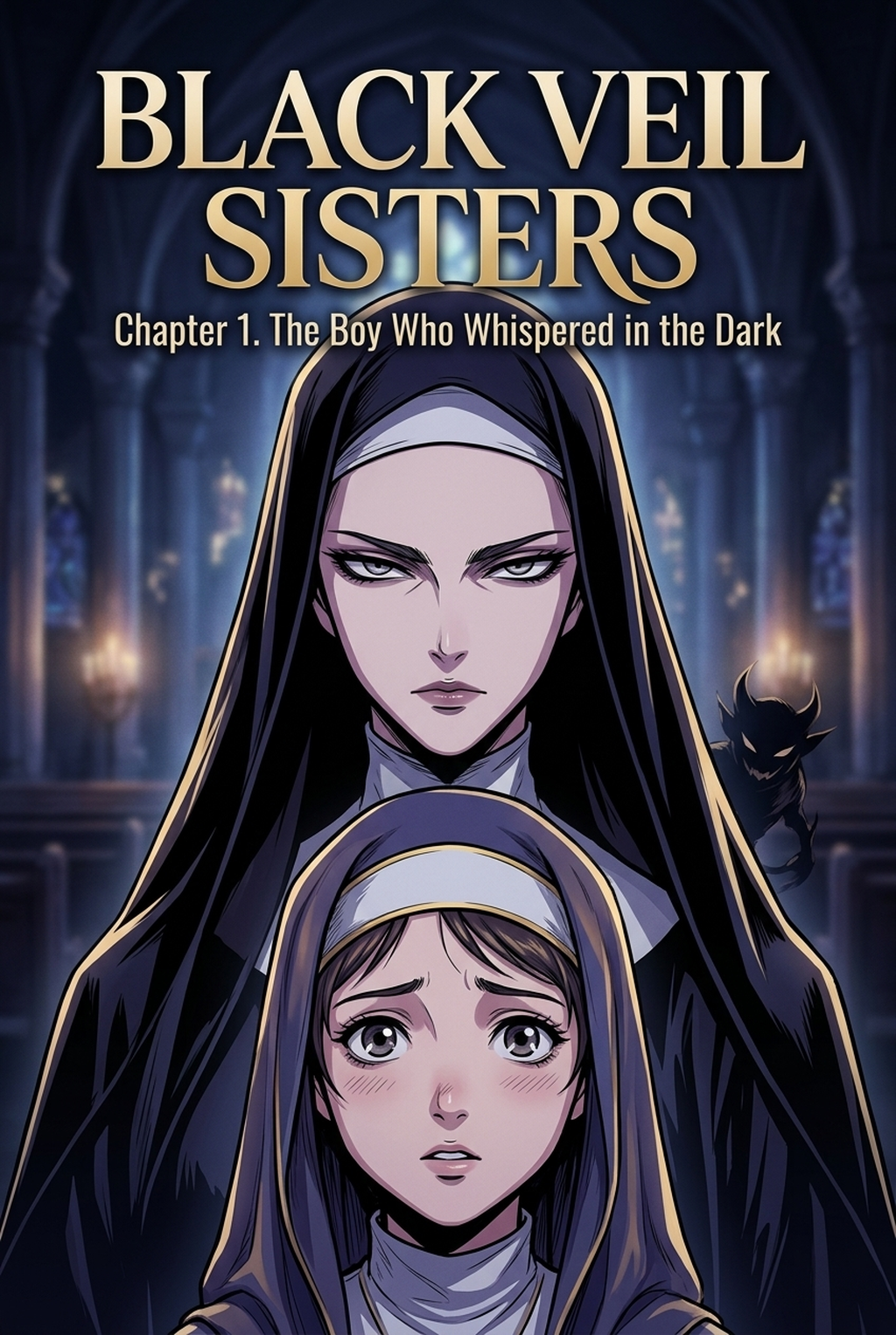
The core of this aesthetic relies on 'chibi-moe' proportions, characterized by oversized, emotive eyes and rounded facial contours that intentionally downplay realistic shading. By simplifying the facial anatomy, the style creates an immediate psychological bridge with the reader, establishing an 'innocent' persona that acts as a blank slate for the protagonist's upcoming, often brutal, actions.
The visual impact is delivered through a high-contrast format, where these soft designs are placed directly into hyper-violent, cinematic combat sequences. Unlike traditional shonen manga that uses grittier, hatching-heavy textures to show stress or tension, this style prioritizes clean, flat, and vibrant color palettes that mimic high-end promotional art, allowing the 'cute vs. Cruel' dynamic to pop off the page.
Why This Aesthetic Matters for Your Manga
The style serves as a sophisticated psychological hook, subverting reader expectations by forcing a confrontation between 'soft' character designs and dark-comedy violence. Because the visual cues suggest a lighthearted story, the sudden pivot into sharp, kinetic action sequences produces a jarring but highly engaging impact that traditional genre art fails to replicate.
Creators utilizing this aesthetic gain significant advantages in social-media markets where clarity and immediate recognition are paramount. The design logic here is:
- Instant Shareability: Characters with distinct, simplified silhouettes are more recognizable in digital feed layouts than complex, hyper-detailed characters. * Ironic Contrast: The juxtaposition of large, innocent eyes against dynamic, blood-splattered panel backgrounds keeps the audience engaged through narrative whiplash. * Visual Discipline: Maintaining the 'softness' of the character proportions during high-intensity scenes prevents the irony from becoming 'muddy,' ensuring the tone remains consistent throughout the chapter.
Maintaining the Look Using Mangaka
Mangaka functions as the anchor for your creative workflow, ensuring that your characters retain their specific design proportions even when you are generating complex, multi-layered action scenes. When you need to keep a protagonist’s signature hair volume or specific eye shape locked across a ten-page sequence, the tool removes the manual trial-and-error often associated with character-proportion drift.
You can lock in specific traits—such as hair volume and eye shape—using the platform’s character sheet feature, ensuring that your protagonists remain consistently 'cute' even when the surrounding combat environment grows increasingly complex. This is vital because if the character’s base traits shift during a perspective change, the reader’s emotional connection to that 'innocent' persona is broken, and the dark comedy fails to land.
The platform allows you to apply specific tone settings that maintain the clean, thick outlines required for this aesthetic. By separating the character line art from the background textures, you ensure the 'chibi-moe' elements remain sharp and legible, effectively bridging the gap between flat character design and detailed, gritty environments without losing the stylistic identity of the work.
Strategic Use Cases for This Art Style
Focusing on 'expressive silhouette' design is the most effective way to communicate action when your character proportions are intentionally simplified. If the reader cannot immediately tell what a character is doing from a glance at their silhouette, the kinetic energy of your fight scenes will be lost to visual noise.
- Palette Bridging: Create a unified identity by using consistent color schemes that connect a character’s 'cute' casual outfit to their combat-ready gear, making the transition between states feel natural. * Visual Hierarchy Control: Keep your character shading minimal compared to the heavier environmental textures, which forces the reader's eye to immediately focus on the character’s emotional state. * Panel Pacing: Use the simplicity of the chibi design to your advantage by shortening the time between reaction shots and action sequences, capitalizing on the 'cute' look to deliver faster, more impactful punchlines.
Getting Started with Mangaka for Action Layouts
Many creators assume that this specific 'chibi-action' blend is impossible to automate, but targeted character model locking makes it a reliable part of your production process. If you find your characters drifting toward a 'generic' look, focus on unique, silhouette-breaking accessories or specific color motifs that help distinguish your design from standard, run-of-the-mill moe archetypes. This style is not limited to comedy manga; it is exceptionally effective in any genre where emotional subversion or the 'cute vs. Cruel' dynamic acts as a central pillar of your storytelling architecture.
Creators should compare the generated line art with the original sketch and confirm that facial expressions, props, speed lines, and speech-bubble space still support the scene. A repeatable review pass should cover character consistency, panel readability, background clarity, and whether the final file is ready for coloring, lettering, or editor feedback.
Creators should save approved examples of line weight, face detail, clothing folds, and background density. Those references keep later chapters closer to the intended style. For collaboration, creators should mark which panels are final and which panels still need redraws. Clear status labels prevent an assistant, editor, or colorist from polishing the wrong version.
Creators can evaluate Kindergarten Wars art style with Mangaka mid-workflow when they need the product path tied directly to review, refinement, and export. A real test should use the same sketch, character goal, or panel sequence that would otherwise need manual cleanup after generation.
The Bottom Line
Mastering this art style requires a disciplined focus on the contrast between soft character design and harsh environments, proving that simplified proportions can carry just as much narrative weight as gritty realism. By ensuring your character designs remain consistent throughout every high-action panel, you create a visual hook that is both arrestingly cute and effectively sharp. Use Kindergarten Wars art style with Mangaka to keep your protagonist's proportions locked while you focus on the layout and pacing of your next dark-comedy sequence.