Essential Principles for Environment Layouts
Effective manga background design balances visual detail with narrative focus, ensuring that the architecture supports the emotional weight of a scene rather than overwhelming the reader’s eye. Achieving this requires a rigorous application of perspective and tone to establish depth without cluttering the panel. Maintaining legibility on mobile devices is the primary hurdle in modern production. Designing environments with exaggerated, wide-panoramic detail often fails when the page is scaled down to a smartphone screen, rendering fine linework into a muddy, unreadable texture.
- Rule of Thirds: Position architectural anchor points along the outer thirds of the panel to guide the eye toward the character's core action. * Depth Separation: Use varying screentone densities to differentiate the foreground from the background, preventing the character from blending into the environment. * Line Weight Discipline: Ensure that the linework weight for architectural elements remains thinner than the primary character outlines to maintain clear visual hierarchy.
Why Structural Stability Matters for Creators
Consistent environments act as essential anchor points that ground the reader in the story’s geography, preventing the disorientation that occurs when set pieces shift inexplicably between panels. When the architectural motifs—such as the exact placement of windows or the slope of a rooftop—remain stable across an entire chapter, the reader can subconsciously track movement without needing repetitive exposition.
Maintaining a consistent "visual library" for your world-building prevents the common error of perspective drift, where an interior room changes dimensions between a wide shot and a close-up. By developing a internal layout style sheet, you document the specific focal lengths and architectural motifs used for every major set piece.
| Feature | Manual Drafting | AI-Generated Backgrounds |
|---|---|---|
| Perspective Construction | Hours of grid work | Instant alignment |
| Line Weight Uniformity | High risk of drift | Consistent digital output |
| Iterative Changes | Requires full redraw | Rapid scene adjustment |
The transition from rough storyboard to finalized ink is the most time-consuming phase of a chapter. When a mangaka spends four hours on a single cross-hatched city street, they sacrifice the focus needed for key character facial expressions or the fluidity of action-line dynamics. Streamlining this phase is not merely a shortcut but a survival strategy for creators managing high-volume production schedules.
Integrated Production with AI Tools
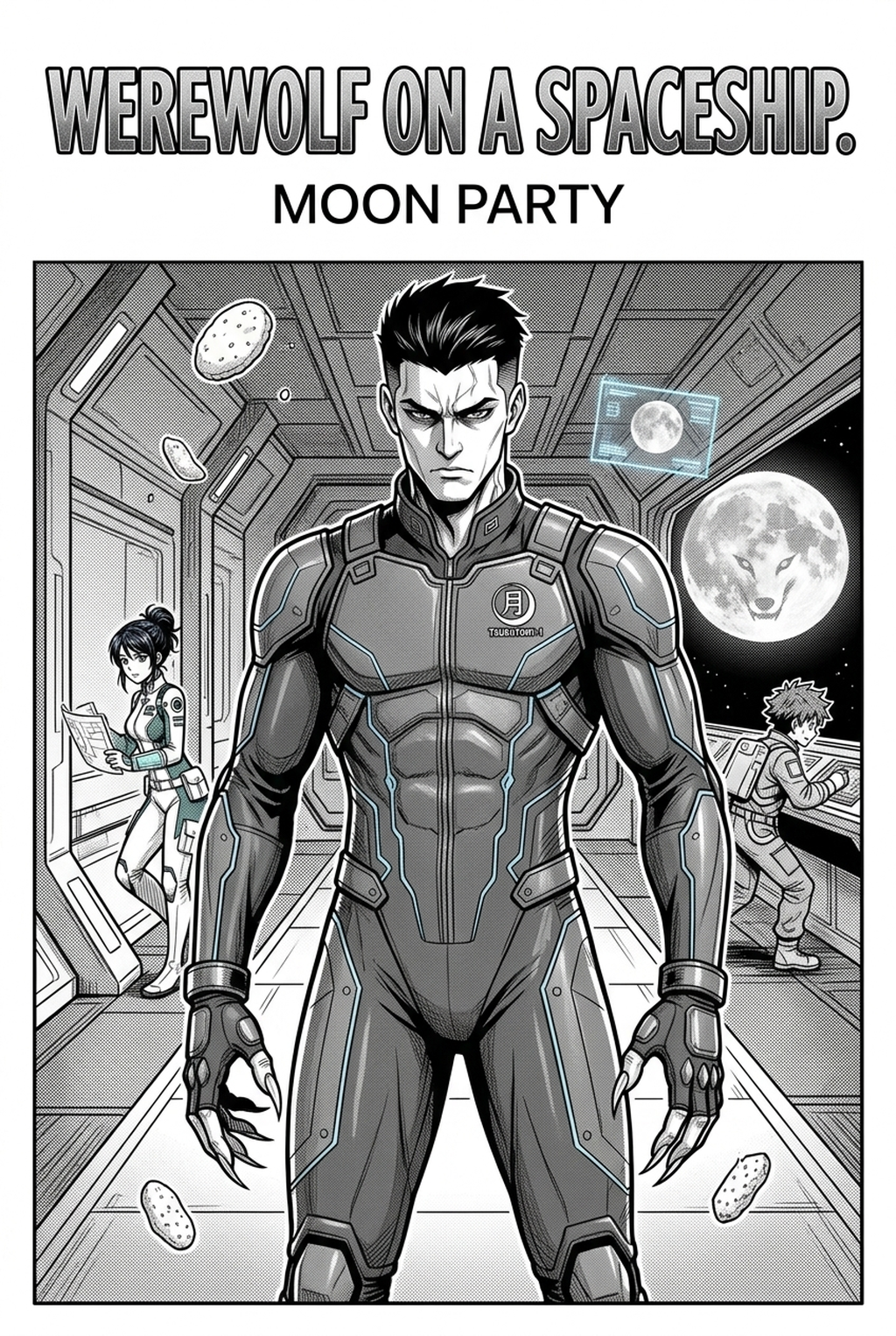
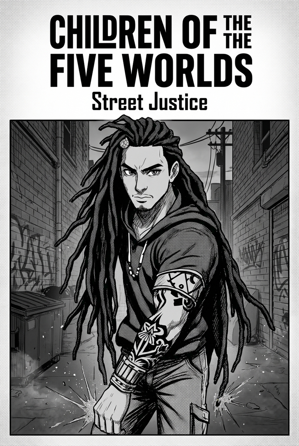
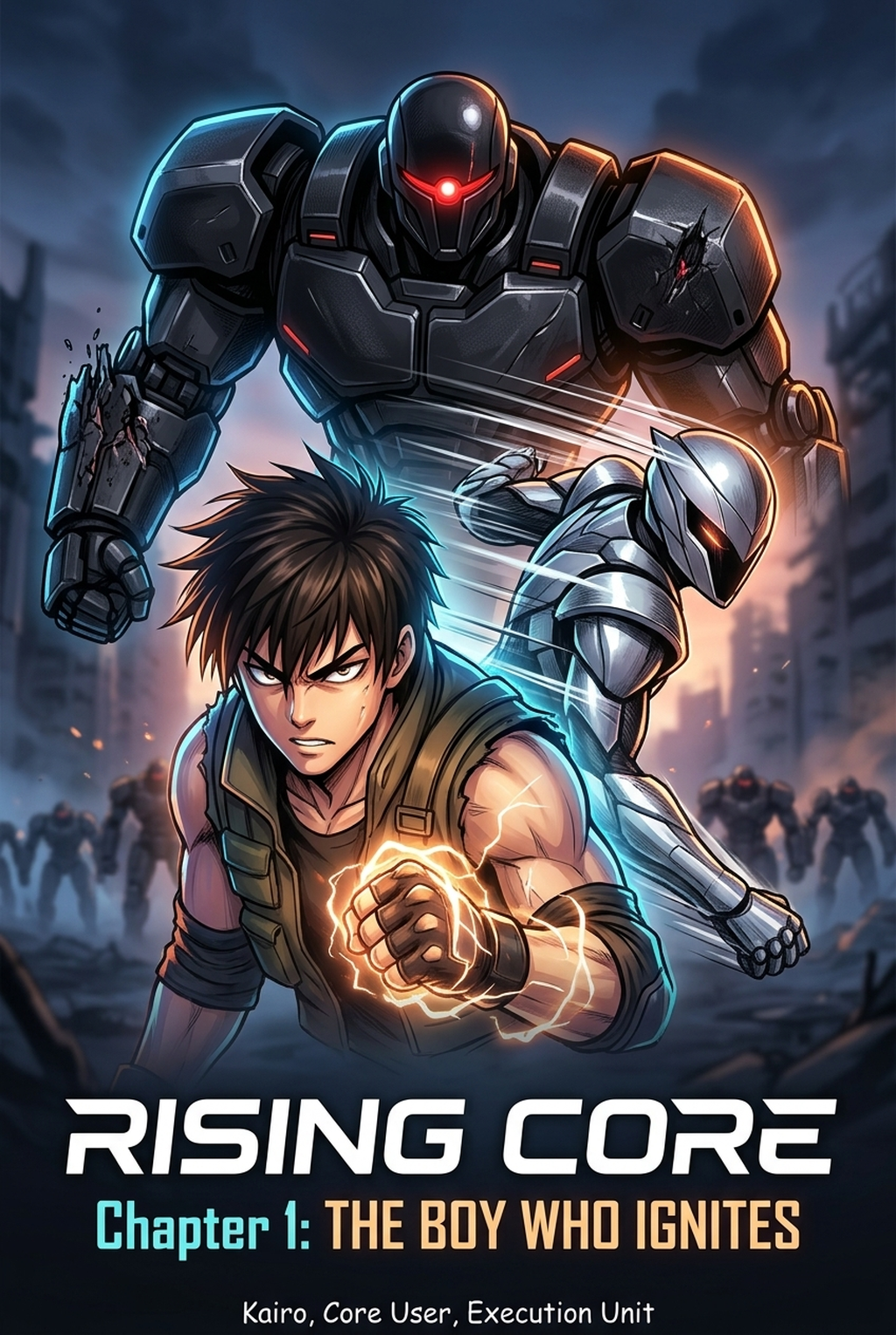
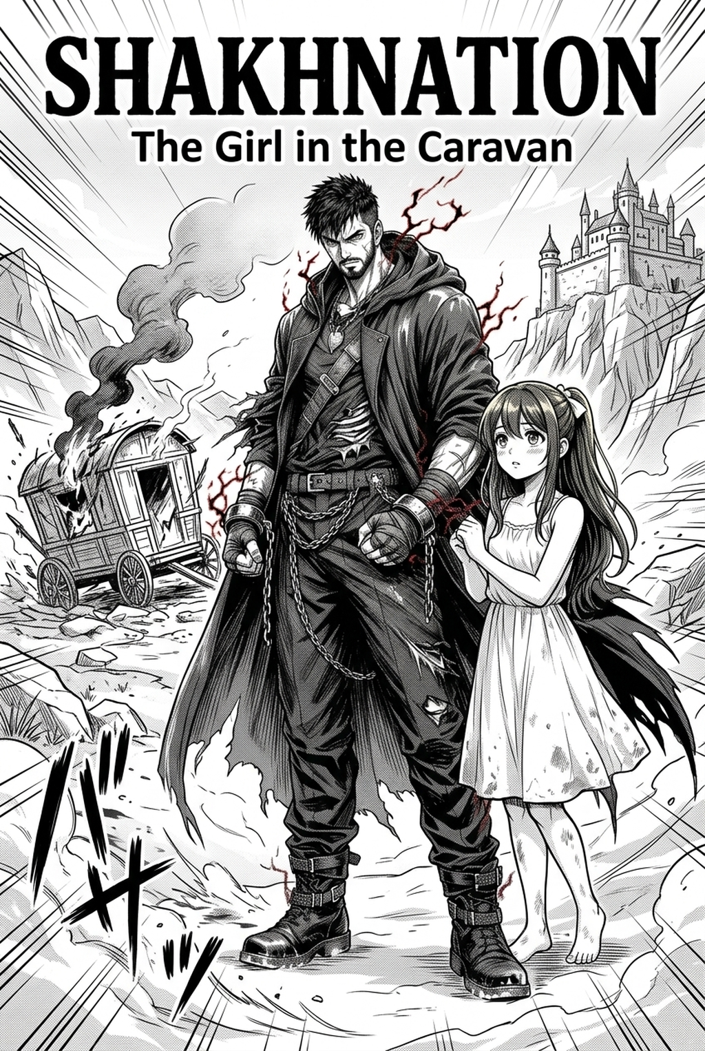
Mangaka allows creators to generate complex environments from precise scene descriptions, bypassing the tedious manual construction of perspective grids and vanishing points. By interpreting spatial creative briefs, this system converts your initial storyboard layout into a high-fidelity, inked background that retains the artistic style required for professional digital-first publications.
You can integrate these assets by utilizing specialized blending modes and post-processing filters that mirror the manual ink stroke of your character layers. This approach treats background generation as a foundation, allowing you to manually embellish the final export with custom details or localized screentones, ensuring the result feels authentic to your unique hand-drawn style.
- Export Fidelity: Generate backgrounds as high-resolution PNG or PSD files to preserve data integrity during the final composition pass. * Perspective Overlays: Utilize automated grid systems to ensure that your character positioning aligns perfectly with the generated environment, eliminating common spatial errors. * Adaptive Density: Adjust the "detail slider" based on the panel size; use high-density for splash pages and simplified architectural suggestions for intimate dialogue panels.
Strategic Application of Environmental Density
The most frequent mistake in background design is the inclusion of unnecessary detail that "crowds" the page, distracting the reader from the primary plot-advancing action. Failing to adapt the density of an environment to fit smaller digital panels is a recurring failure point that diminishes the overall quality of the chapter.
Perspective drift is a silent killer of immersion, occurring when artists lose track of their vanishing points during late-night drawing sessions. Using automated grid overlays acts as a safeguard against this, ensuring that every panel within a sequence shares a coherent, grounded focal point.
- The Over-Detail Trap: Avoid rendering every brick or window frame in distant shots, as these elements only create visual noise in a small panel. * Panel Gutters: Use the white space in the gutter to separate contrasting environments, preventing the viewer from feeling cramped by an over-saturated layout. * Dialogue Clearance: Always check that speech bubbles are placed over areas of low background density, or include a "white background" mask behind your bubbles to ensure legibility.
Getting Started with Current Workflows
You might ask if integrating automated tools undermines your artistic credibility. It is essential to recognize that professional studios have utilized 3D models and photo-bashing for decades to maintain efficiency; modern tools are simply a faster, more accessible evolution of these industry-standard shortcuts.
When working with generated backgrounds, the secret lies in the final composite pass. By applying a consistent digital "noise" or "paper texture" layer across both the generated background and your hand-drawn character ink, you visually unify the two elements. This creates a cohesive look that prevents the background from appearing "too clean" or out of place against your traditional character strokes.
- Style Control: Use style-specific creative briefs to match the era of your world-building, whether it is high-fantasy architecture, industrial sci-fi, or contemporary cityscapes.
- Format Readiness: Always export your backgrounds with a transparent layer or a base-toned mask to facilitate faster coloring in later production stages.
Creators can evaluate manga background design with Mangaka mid-workflow when they need the product path tied directly to review, refinement, and export. A real test should use the same sketch, character goal, or panel sequence that would otherwise need manual cleanup after generation.
The Bottom Line
Mastering your environment design is not about drawing every brick by hand, but about controlling the reader's focus across the entire page. By integrating manga background design with Mangaka into your production workflow, you reclaim the hours previously lost to perspective drafting and perspective drift, allowing you to channel your creative energy back into the emotional beats of your plot and the nuance of your character designs.