AI Manga Character Designer: Silhouette, Era, and Rank at First Glance
You identify a samurai from three agreeing cues, not from a detailed face in a small panel. When era or rank contradicts the silhouette, readers notice the costume error first. Chonmage is the folded topknot of a samurai in service, shown as neat, oiled hair close to the scalp.
Hakama are wide, pleated trousers whose volume widens the lower silhouette and whose color separates cast members at a distance. Daisho is the paired katana and wakizashi at the hip, the longer blade above the shorter one. Define each term once, pair it with that cue, and reuse the terminology unchanged as source context in every later brief, because a changed word can produce a changed garment, a wrong rank, and a silhouette readers cannot place.
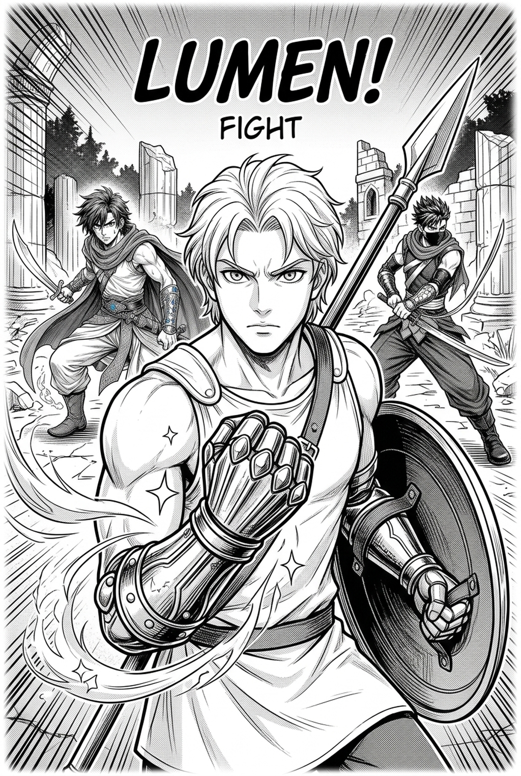
Sengoku battlefield dress uses lamellar armor, looser layers, and weathered cloth suited to mud, rain, and marching. Edo formal dress uses cleaner hakama, crested kimono, and restrained layers suited to household service and court rooms. Mixing lamellar plates with Edo formal crests creates an era error that looks wrong even when line art is clean. In one Shonen cast, a ronin with no mon and faded hakama, a clan retainer with a centered mon and dark hakama, and a rival with a shoulder mon are separated first by mon placement and hakama color, not by face alone.
Duel Readability at Small Panel Size
You keep Shonen duels readable by giving each fighter a shape readers can track during fast cuts. At thumbnail size, shape, weapon side, and sleeve volume matter more than facial detail. Creators can use each revision decision to clarify panel readability, character consistency, and export quality before publishing or sharing.
Give the rival an inverted silhouette so paired fighters never swap visually mid-exchange. The hero might carry a narrower hakama, a taller topknot, and a light mon field, while the rival carries a broader hakama, a shorter topknot, and a darker mon field. That inversion signals opposition without exposition and survives black-and-white inking, tone work, and small reproduction.
If both outlines match, careful dialogue layout cannot rescue a crossing panel where readers assign the winning strike to the wrong swordsman, because their eyes followed shape long before they read any names. The review owner checks every duel page at thumbnail size and rejects any page where hero and rival cannot be told apart in under two seconds. That test is stricter than a full-size check, because readers glance rather than study during action.
In a worked example, a 6-panel duel page in a 45-page chapter turns on panel 5, where the rival's broader hakama blocks the hero's step and silhouette, not speed lines, carries the reversal. The page passed only when that width difference stayed visible in all six panels after inking and tone were added.
Locked Sheets Built from One Text Brief
You build a locked sheet from one brief that fixes face, chonmage, layers, daisho side, and mon, then reuse it for later chapters. That reuse addresses the page 12 flip, because new poses inherit approved swords instead of inventing them.
- Step 1, exact brief: Name era, rank, hakama color and pleats, katana and wakizashi side, saya and tsuka color, and mon position. - Step 2, three views: Produce front, side, and action views from the same brief and compare the daisho across them. - Step 3, saved reference: Save the approved sheet as source context and set the delivery format, such as a 300-DPI PNG for print review and a lightweight PNG for panel reference.
Through the samurai manga character design with Mangaka , a written description becomes those three views with the same knot, blade order, and pleats, so a swordsman returns unchanged instead of drifting between poses.
Continuity Breaks in Draws, Crests, and Pleats
You prevent predictable breaks by comparing each chapter against the locked sheet before inking begins. Weapon flips, mon drift, and pleat changes look small on one page and damaging across a duel. For manga creators, the practical value comes from reducing redraw loops before the artwork reaches a reader-facing page or reusable asset. A left-side daisho worn for a right-handed draw cannot mirror in iai panels without changing the draw mechanics entirely. The right hand reaches across to the katana tsuka, the saya tilts, and the blade clears in one motion that depends on that hip. Flip the swords to the right hip and the same hand must draw awkwardly across the body or switch hands, breaking a technique readers have learned over earlier chapters. Locking saya and tsuka colors makes a flip visible at review, because the longer saya suddenly sits below the shorter one. The review owner compares three marks panel to panel before a chapter is released, using a checklist no school or sci-fi cast could reuse. - Mon position: centered, shoulder, or absent, matched against the sheet
- Pleat count: hakama pleats and fold depth, unchanged in standing and action poses
- Wear mark: a frayed sleeve, stained hand, or chipped tsuka tied to one character
- Knot and length: chonmage knot shape, daisho order with katana above wakizashi, and saya length relative to the hip
Skipping that comparison lets a centered mon wander to the chest in one chapter and disappear in the next, breaking clan identity without any story reason.
Starting with One Character and One Era
You start with one character and one era, run the thumbnail and daisho checks, and only then design the rival. Building the whole cast first spreads any era mistake across every sheet. A useful brief fits one paragraph and carries only visual information. Include age, rank, era, clan mon, weapon set, and one distinguishing flaw or wear mark, and omit plot summary, which adds no visual information at all. A strong starter is a 19-year-old Shonen ronin hero with faded indigo hakama, no mon, and a chipped tsuka, contrasted with a formal Edo retainer rival carrying a centered mon and pristine daisho.
That contrast gives the cast two readable silhouettes from chapter one without relying on different faces or hairstyles alone. Before chapter one, confirm the exported sheet matches how it will be used in panel production. Front, side, and action views must all be present, because a missing side view is exactly where a daisho flip hides from reviewers.
Resolution and delivery format must also match the job, with a high-resolution PNG ready for print review and a lightweight copy ready for daily panel reference. If the lightweight copy crops the hip, discard it, since the swords sit in the cropped area and reviewers lose their main continuity cue for draw panels.
The Bottom Line
Good samurai design is a continuity discipline, not a single striking drawing. Lock era, rank terminology, daisho side, and mon once, then let story and duels vary around that fixed sheet. You can samurai manga character design with Mangaka's AI Manga Character Designer by applying the brief, thumbnail check, and export choices covered above.
Related articles
Made in Abyss Manga Background Design Guide for 2026
Apothecary Manga Character Design Guide for Creators 2026
Geek and Crown Manga Character Design Guide for 2026