AI Manga Style Transfer: Visual Markers of the Bookworm Aesthetic
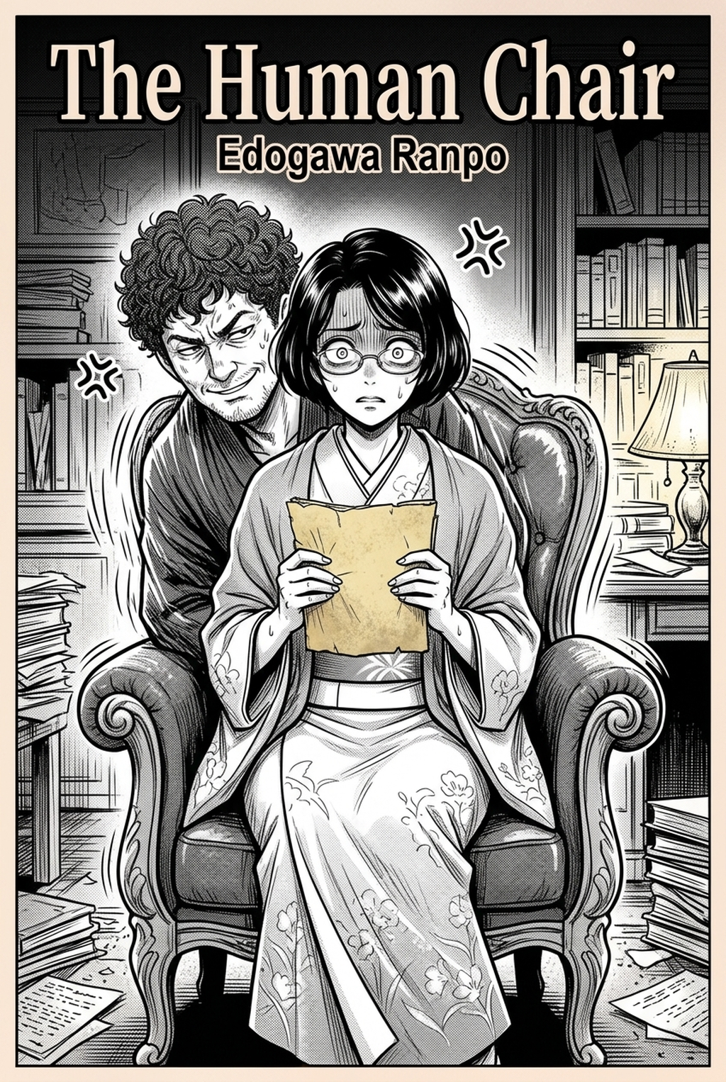
The core of this style lies in its commitment to environmental storytelling, where the library, study, and rustic townscape backgrounds hold as much narrative weight as the character's facial expressions. Creators focusing on this genre shift away from sharp, jagged ink lines in favor of softer, rounded strokes that feel organic and welcoming to the reader's eye.
- Soft Line Weights: Unlike action-heavy titles, this style favors medium-to-thin line widths that prevent the page from feeling cluttered, allowing for more detailed interior patterns without sacrificing readability. * Parchment-Inspired Color: The tonal palette moves away from brilliant, saturated hues, instead utilizing desaturated, warm brown and cream tones that evoke the sensory experience of handling antique paper. * Intricate Background Detail: Characters are often placed within dense, complex architectural settings—such as multi-story libraries or bustling markets—that require immense precision to draw without appearing flat or disjointed.
Why This Visual Language Drives Narrative Engagement
Adopting this aesthetic creates a powerful shorthand for readers looking for "slow-life" or "cozy" manga content. By prioritizing environmental immersion, you allow the reader to slow down and appreciate the setting, which is a structural requirement for fantasy series where the world itself is a protagonist.
Moving away from the sharp, high-octane tropes of battle manga gives you a distinct market advantage for character-driven narratives. Readers who gravitate toward this style expect high visual fidelity in interiors, as the "bookish" feel relies on the environment to anchor the historical or fantasy setting. If your panels lack this background density, the narrative may lose its sense of groundedness, leading to a disconnect in the reader’s perception of the world’s scale and history.
Applying the Aesthetic with Mangaka
Mangaka streamlines your workflow by applying the light-and-shadow behavior characteristic of this series directly to your rough sketches or digital storyboards. Instead of spending fifty hours manually inking intricate library shelves, you can use the Ascendance of a Bookworm art style with Mangaka tool to interpret your layout and re-render the composition with the target style's specific line quality and shading rules.
- Lighting Parameters: Define the scene’s light source during your sketch phase to ensure the AI generates shading that follows the soft, diffused aesthetic rather than harsh, high-contrast blocking. * Structural Consistency: By feeding your character drafts into the system, the model maintains your original anatomical proportions while layering the ornate costume designs and textures expected in this genre. * Workflow Efficiency: Artists can process a 5-panel page draft in minutes, refining line weights and tonal distribution across backgrounds that would otherwise require days of repetitive inking labor.
Strategic Use Cases for Long-Form Projects
Consistency is the primary hurdle in long-form projects, especially when managing ornate period costumes or complex library layouts. This style works best when you utilize reference-driven generation to ensure that specific recurring assets—such as a character’s study or a frequently visited marketplace—remain visually identical from chapter one to chapter fifty.
Generating panels that capture this slow-life atmosphere before committing to your final, time-intensive production allows for rapid iteration of your storyboard's pacing. For instance, if you are planning a sequence involving an extensive library search, you can test different camera angles for your background shots to see which layout best emphasizes the cozy, claustrophobic intimacy of the stacks. This pre-production check prevents the common error of drawing a perspective-heavy background, only to realize the character composition is obscured or misaligned during the final inking pass.
Starting Your Workflow with Professional Tools
Drawing this look manually is exceptionally taxing, often requiring an intense level of discipline to keep line weights consistent across hundreds of panels. Many creators discover that the "bookish" aesthetic is prone to "line weight drift," where early panels look refined and later ones lose their soft, cohesive structure due to fatigue. Using automated assistance ensures that the second panel of a dialogue exchange matches the fifty-second panel in tone, shading intensity, and stroke quality.
This aesthetic is highly adaptable beyond pure fantasy, as the soft line work and clean composition are perfect for slice-of-life or historical romance genres where you want to emphasize emotional closeness over kinetic energy. Mangaka supports custom style mapping, allowing you to merge your personal creative brief with the aesthetic markers of high-detail manga to produce a unique, proprietary look that still honors the readability standards of the genre.
Creators should compare the generated line art with the original sketch and confirm that facial expressions, props, speed lines, and speech-bubble space still support the scene. A repeatable review pass should cover character consistency, panel readability, background clarity, and whether the final file is ready for coloring, lettering, or editor feedback.
Creators should save approved examples of line weight, face detail, clothing folds, and background density. Those references keep later chapters closer to the intended style. For collaboration, creators should mark which panels are final and which panels still need redraws. Clear status labels prevent an assistant, editor, or colorist from polishing the wrong version.
The Bottom Line
Capturing the detailed, cozy atmosphere of a world-building-heavy series requires a balance of precise line weight and consistent environmental design that can easily overwhelm a solo creator. By leveraging Ascendance of a Bookworm art style to handle the heavy lifting of background inking and tonal shading, you can maintain the high production standards of your narrative without the burnout of manual, repetitive labor. Start applying this aesthetic to your next project by uploading your storyboards to the Mangaka creation portal today.
Related articles
What Is a Manga Storyboard? The Essential Guide to Flow 2026
How to Plan Your Fantasy Romance Manga Storyboard in 2026
How to Build a School Mystery Manga Storyboard: A 2026 Guide