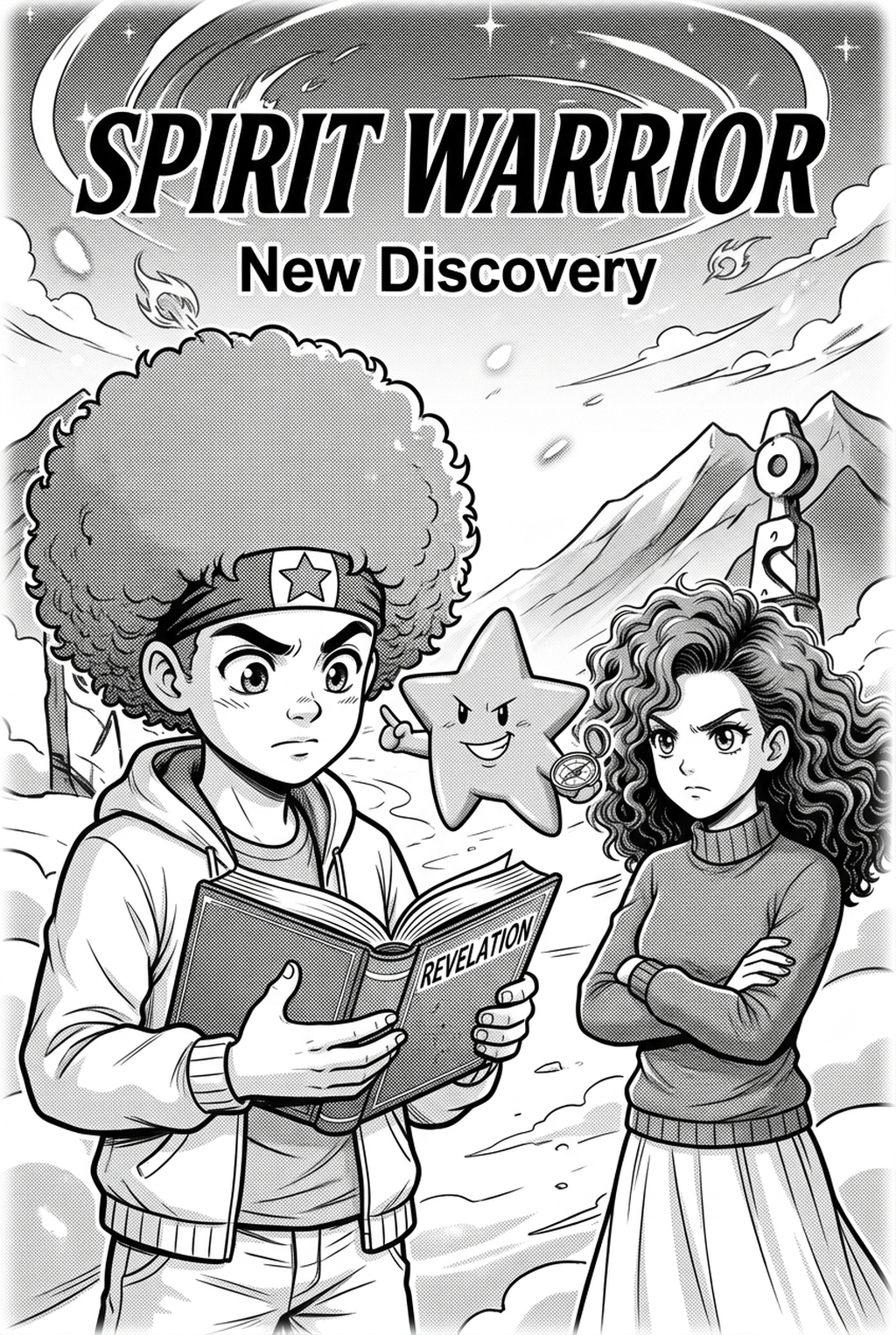
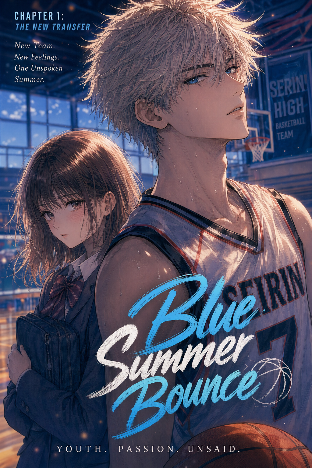
Designing dynamic action panels in modern vertical webtoons demands a radical departure from traditional horizontal multi-panel comic pages. For Indian digital artists and sequential visual storytellers in 2026, mastering visual rhythm, mobile screen aspect ratios, and rapid eye flow enables local mythologies, martial arts epics, and high-octane sci-fi battles to captivate millions of mobile readers across the globe.
In this masterclass handbook, we explore the essential principles of vertical webtoon action choreography, perspective distortion, visual momentum, and sound effect typography using tools like Mangaka AI Comic Studio .
<script type="application/ld+json"> { "@context": "https://schema.org", "@type": "Article", "headline": "How to Design Dynamic Action Panels in Webtoons: Visual Flow Guide for Indian Manga Artists 2026", "description": "Comprehensive guide for Indian manga artists and digital comic creators to design dynamic vertical webtoon action panels, visual flow, and impact frames.", "image": "https://media.doctranslate.io/mangaka/output/570bf044-1ce8-4b5c-a5a2-58cce13dca39/processed_0.jpg?X-Amz-Algorithm=AWS4-HMAC-SHA256&X-Amz-Credential=qa0e1UFJ0Trmajw8ttCM%2F20250505%2Fus-east-1%2Fs3%2Faws4_request&X-Amz-Date=20250505T215851Z&X-Amz-Expires=604800&X-Amz-SignedHeaders=host&X-Amz-Signature=af158ca640724f5c5edf47ff496cfd6ef0aa2f828567a11a92ec7f3fb465c3c7", "author": { "@type": "Organization", "name": "Mangaka Research Team" }, "publisher": { "@type": "Organization", "name": "Mangaka", "logo": { "@type": "ImageObject", "url": "https://www.mangaka.app/logo.png" } }, "datePublished": "2026-10-06T02:40:00Z", "dateModified": "2026-10-06T02:50:00Z" } </script>
Table of Contents
- What is Vertical Action Pacing in Webtoons?
- The Optical Mechanics of Smartphone Scroll Reading
- Core Principles of Visual Flow and Eye Direction
- Camera Angles and Dramatic Perspective Distortion
- Gutter Spacing and Reading Cadence on Mobile Displays
- Color Palette Theory and Lighting Dynamics for Action Webtoons
- Scene Transitions and Narrative Flow Between Battle Encounters
- Integrating Indian Cultural Elements and Martial Arts Traditions
- Speed Lines, Screentones, and Impact Frames
- Sound Effects (SFX) and Lettering Placement
- Technical Checklist for Webtoon Pre-Flight QA
- Case Studies: Analyzing Kinetic Sequences in Popular Action Webtoons
- End-to-End Production Workflow with Mangaka
- Frequently Asked Questions
What is Vertical Action Pacing in Webtoons?
Vertical action pacing is the sequential choreography of visual panels specifically optimized for the continuous downwards scrolling gesture on smartphone touchscreens. Unlike traditional Japanese manga where reader gaze travels from right-to-left across fixed print dimensions, vertical webtoons utilize vertical screen displacement to dictate physical velocity, suspense intervals, and dramatic reveals. By controlling panel heights and negative gutter spaces, creators manipulate reading tempo from rapid staccato combat exchanges to breathless cliffhangers.
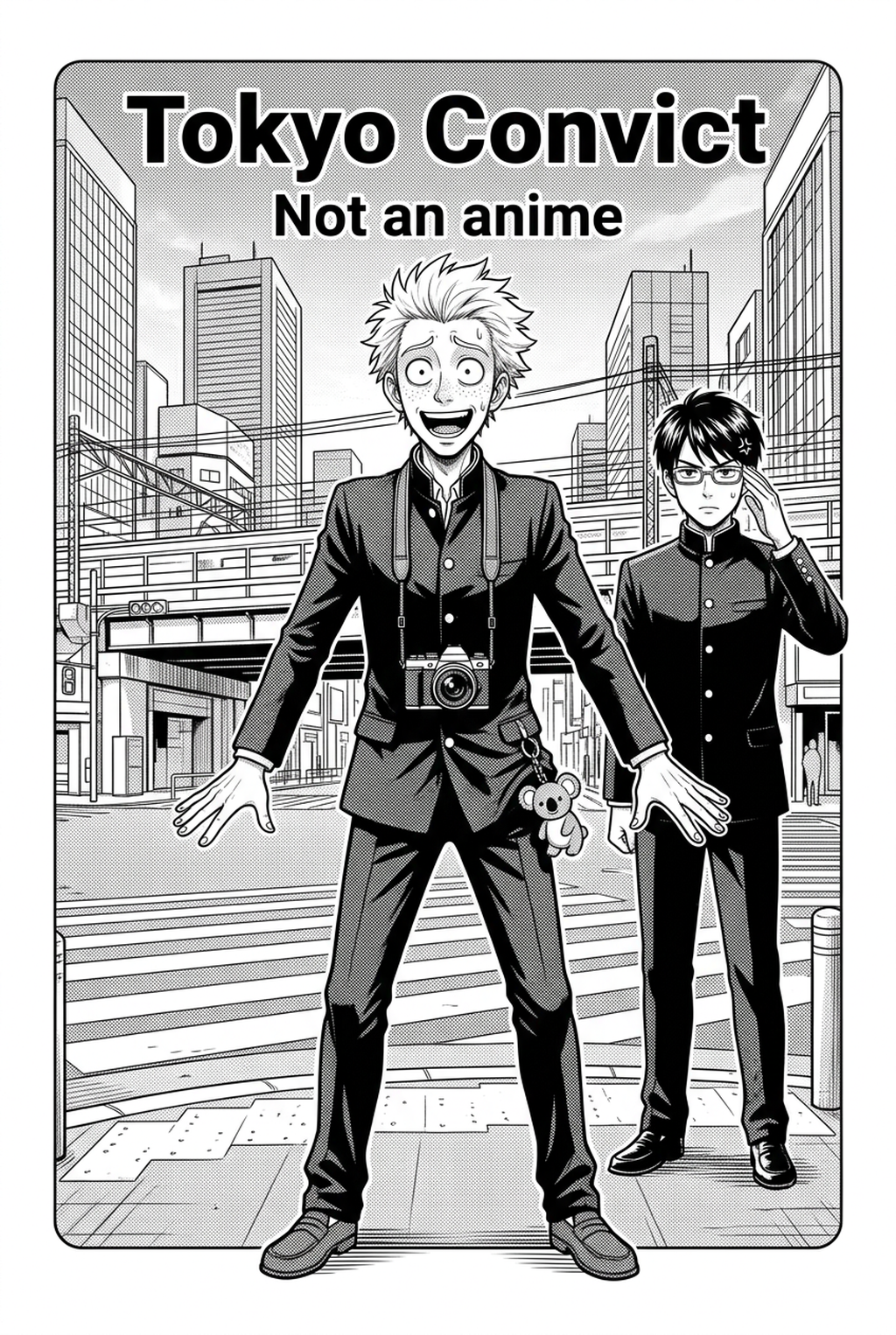
<p align="center"> <img src="33406" alt="Dynamic Manga Action Panel Layouts - Mangaka Discovery" style="max-width:100%; height:auto; border-radius:8px;" /> <br/><em>Source artwork created via <a href="https://www.mangaka.app/en/discovery">Mangaka Discovery</a> public library.</em> </p>
Action pacing operates as the fundamental heartbeat of graphic storytelling. When readers engage with action-oriented narrative art, their cognitive processing shifts from reflective analytical contemplation into immersive kinetic empathy. If a combat sequence is drawn with uniform square panels separated by standard equal borders, the visual tempo flatlines. The battle feels mechanical, robotic, and emotionally detached. Conversely, when an artist stretches a downward flying kick across three full vertical screen heights, the physical sensation of falling and impending concussive doom becomes visceral and palpable.
The Optical Mechanics of Smartphone Scroll Reading
The human eye processes vertical digital comic feeds through a combination of saccadic scanning movements and continuous peripheral scroll tracking. When reading on a physical print page, the entire layout is immediately visible within the reader's broader peripheral visual field, requiring the cartoonist to employ careful page-turn reveals to conceal major narrative shocks. In vertical webtoons, the 9:16 mobile display viewport acts as a moving camera aperture, concealing whatever lies beyond the bottom pixel margin until the reader's thumb physically advances the feed.
Understanding this biological visual constraint is paramount for action staging. If two opposing martial artists strike simultaneously across a single horizontal frame, a mobile reader must scan horizontally back and forth on a compact 6.5-inch screen, causing visual friction. However, by stacking the attacker in an upper panel diving downward, followed by a vertical negative gutter that accelerates downward scroll momentum, followed by an explosive subterranean crater panel, the artist aligns the narrative action vector directly with the mechanical scroll gesture.
Key optical parameters to configure during initial canvas setup include:
- Viewport Ratio Awareness: Design every major action beat knowing that standard smartphone viewports range between 19.5:9 and 21:9 aspect ratios. Important character silhouettes, expression changes, and weapon trajectories must never be clipped by rounded screen corners or top speaker notches. Keep vital combat interaction points within a central 80 percent safety bounding zone.
- Peripheral Leading Vectors: Incorporate vertical streaks of falling dust, downward-pointing speed lines, or trailing energy ribbons that subtly guide reader peripheral awareness downward, creating an irresistible subconscious psychological impulse to continue scrolling.
- Focal Anchor Persistence: Prevent optical disorientation by maintaining consistent visual anchors across successive panels. If the hero wields a luminous emerald blade, ensuring that the radiant tip remains the brightest luminance value on screen across three consecutive scrolling frames prevents reader gaze from wandering aimlessly.
- Reading Velocity Calibration: High-tension dialogue should demand 3 to 5 seconds per viewport, whereas blistering combat trades should be readable in 0.8 to 1.5 seconds per viewport. By varying panel heights and informational density, the creator dictates the exact reading speed of their audience.
Core Principles of Visual Flow and Eye Direction
Visual flow in digital comics represents the unseen directional trajectory that a reader's pupils follow naturally across sequential imagery. In high-speed combat sequences, chaotic visual noise causes mental disorientation and reader fatigue, causing audiences to scroll past pivotal narrative climaxes without emotional resonance.
To engineer effortless visual flow, action choreographers employ three foundational mechanics: leading diagonal trajectories, directional contrast vectors, and predictive gaze anchors. When a protagonist launches an overhand punch in panel one, the angle of the arm and fist must point diagonally towards the top edge of the defender's incoming reaction in panel two. This vector continuity creates an intuitive kinetic highway that carries the reader down the page effortlessly.
Furthermore, contrasting values between background geometry and active character silhouettes ensure that the focal point remains instantly identifiable. In high-speed mobile reading contexts where each screen is viewed for merely 1.2 to 2.4 seconds, high-contrast separation between foreground characters and background speed lines prevents visual ambiguity. Creators should leverage digital inking techniques covered in our Manga Inking Guide to establish clean outline hierarchies.
Detailed structural rules for dynamic visual flow:
- The 60-30-10 Compositional Ratio: Dedicate 60 percent of the frame area to active kinetic forms, 30 percent to atmospheric negative space or motion lines, and 10 percent to punchy focal punctuation such as impact bursts or sound lettering.
- Downward Funneling Architecture: Structure background architectural beams, horizon angles, or debris particles so they subtly converge toward the bottom-center of the mobile viewport, prompting immediate thumb scrolling.
- Anticipation Panels and Kinetic Tension: Before delivering a crushing physical impact, insert an elongated vertical panel depicting the drawn back limb, tightening breath, or pupil constriction. This brief rhythmic pause heightens the explosive kinetic release of the subsequent strike.
- Z-Axis Diagonal Crossings: In complex multi-combatant melees, alternate attack vectors diagonally (from top-left to bottom-right in frame A, followed by top-right to bottom-left in frame B). This zigzag cadence creates rhythmic visual dynamism that keeps reader adrenaline elevated without sacrificing spatial orientation.
- Eye-Path Continuity: Position the terminal focal point of panel A (such as an explosive muzzle flash) in direct vertical alignment with the primary starting focal point of panel B (the shattered helmet of the adversary). Eliminating horizontal eye travel between vertical scrolls dramatically enhances perceived narrative velocity.
Camera Angles and Dramatic Perspective Distortion
Dramatic perspective distortion involves deliberately exaggerating focal lens curvature (often replicating 14mm to 24mm ultra-wide-angle camera optics) to amplify the perceived proximity and physical menace of combatants. When illustrating high-stakes martial arts sequences, placing the virtual camera at extreme ground level—commonly referred to as an extreme worm's-eye view—magnifies the heroic stature of a rising warrior against towering skyscraper backdrops or ancient temple stone pillars.
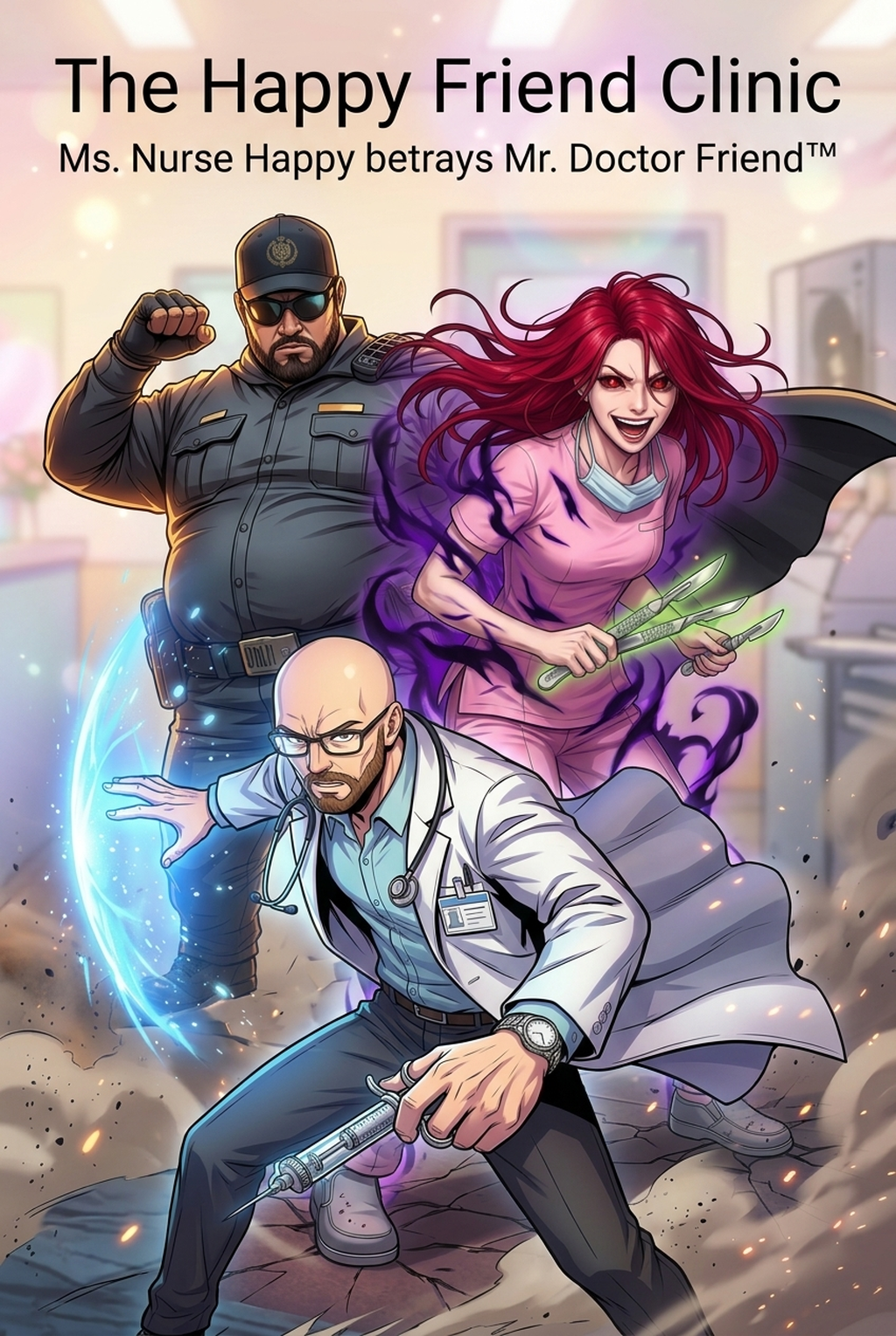
<p align="center"> <img src="33411" alt="Perspective Distortion in Vertical Manga Panels - Mangaka Discovery" style="max-width:100%; height:auto; border-radius:8px;" /> <br/><em>Perspective architectural composition demonstrated on <a href="https://www.mangaka.app/en/story/the-mummy">The Mummy Comic Chapter</a> on Mangaka.</em> </p>
Conversely, Dutch tilt angles (tilting the camera horizon 15 to 30 degrees off true horizontal axis) inject instant psychological instability and visceral panic during ambushes or supernatural intrusions. When an antagonist unleashes a demonic shockwave, tilting the frame breaks the predictable horizontal baseline, subconsciously signaling to the reader that ordinary gravitational physics have been suspended.
To execute 3-point perspective grid systems accurately without spending dozens of hours constructing manual vanishing lines, modern digital illustrators utilize automated environment engines. Artists can reference our detailed breakdown on Fantasy Manga Background Design to master vanishing point alignment across multi-tier combat sets.
Essential camera principles for action sequences:
- Foreshortening of Striking Limbs: Enlarge the incoming fist or blade tip by 300 to 500 percent relative to the torso to create the physiological illusion that the weapon is penetrating forward into the reader's physical space.
- Fish-Eye Impact Spheres: In panels depicting massive seismic impacts, curve vertical wall lines and horizon contours outward in a convex spherical grid centered exactly on the strike point.
- Dynamic Scale Juxtaposition: Place an ordinary civilian or fragile environmental object (such as a shattering ceramic tea glass or splintering wooden cartwheel) in the immediate foreground to anchor the monumental scale of supernatural titans colliding in the middle distance.
- Over-the-Shoulder Tracking Shots: Position the virtual lens right behind an dodging character's collarbone as a projectile hurtles past, giving mobile readers the visceral sensation of narrowly escaping decapitation alongside their protagonist.
- Birds-Eye Tactical Overviews: After a dizzying sequence of claustrophobic close-ups, pull the camera upward into a high-altitude aerial perspective. This panoramic reset clarifies battlefield geography, showing troop placements, crater dimensions, and escape routes.
Gutter Spacing and Reading Cadence on Mobile Displays
Gutter spacing in vertical webcomics functions as temporal pacing intervals, operating identically to musical rests in a symphony score. A wide white or black vertical gap between panels forces the reader's thumb to perform extended scrolling motions, simulating real-time pauses, spatial travel, or agonizing suspense. Conversely, touching panels with zero gutter clearance indicate simultaneous occurrences or lightning-fast tactical reactions executed within fractions of a second.
On standard high-definition smartphone displays (such as 1080x2400 or 1440x3120 pixel resolutions), gutter spacing should be calibrated with mathematical precision:
- Micro-Gutters (20 to 60 pixels): Used exclusively for high-speed combo blows, parries, and counter-attacks where actions occur within split seconds.
- Standard Narrative Gutters (120 to 240 pixels): Applied during ordinary combat dialogue, tactical weapon swaps, or positional repositioning.
- Temporal Chasm Gutters (400 to 800+ pixels): Deployed when a hero falls unconscious, when an ultimate attack charges across multiple screen scrolls, or when dramatic shock freezes time.
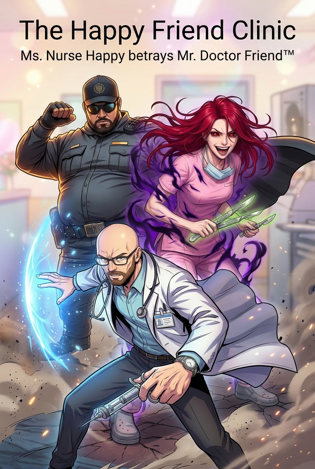
<p align="center"> <img src="33452" alt="Vertical Gutter Spacing and Panel Continuity - Mangaka Discovery" style="max-width:100%; height:auto; border-radius:8px;" /> <br/><em>Vertical scrolling flow study from <a href="https://www.mangaka.app/en/story/underdogs">Underdogs Action Webtoon</a>.</em> </p>
Furthermore, background color modulation within gutters enhances emotional atmosphere. Transitioning gutter fills from stark clean white during sunlight academy sparring sessions into ominous charcoal blacks or deep crimson gradients as villainous intentions unfold provides subliminal environmental cues that heighten reader immersion without cluttering panel borders.
Consider these rhythmic pacing scenarios:
- The Staccato Burst: Six ultra-short horizontal panel slices stacked closely with only 15 pixels of gutter between them, each showing an extreme micro-detail of a clash (eyes widening, sword sparks, heel pivoting, teeth gritting, blade sliding, shoulder blood spray). The reader absorbs all six in one fluid thumb motion.
- The Endless Descent: A massive vertical gutter spanning 1200 pixels of pure empty dark fog, through which tiny embers drift slowly downward, followed at the very bottom by a full-screen splash panel of the fallen hero lying among ruins. The extended scroll builds solemnity and grief.
- The Interrupted Scroll: Breaking panel borders by allowing a spear tip or lightning arc to slice vertically through two empty gutters and puncture directly into the lower frame. This border-breaking technique shatters the safety of panel compartmentalization, shocking the reader.
Color Palette Theory and Lighting Dynamics for Action Webtoons
Color dynamics in vertical action webtoons operate far beyond mere decorative aesthetics; they constitute a functional storytelling language that dictates emotional intensity, physical temperature, and spatial depth across rapid vertical scrolls. Unlike black-and-white manga where artists rely exclusively on screentones and hatching to sculpt volume, full-color webtoons require creators to establish clear chromatic hierarchies that prevent high-speed sequences from dissolving into muddy chaos.
When designing lighting palettes for explosive martial arts and supernatural showdowns, digital colorists employ three essential illumination methodologies:
- The Key-Fill-Rim Action Trio: Establish an intense colored key light (such as a blazing golden aura or crackling azure lightning) positioned along the primary kinetic vector. Counterbalance this with a muted, cool-toned ambient fill light across shadow zones, and cap the character silhouette with a razor-thin rim light (white or complementary neon) to detach the warrior cleanly from dark background environments.
- Atmospheric Perspective and Depth Layering: Desaturate and cool down background architecture as distance increases from the active combat plane. In a massive palace battle scene, foreground combatants should feature rich, warm, saturated pigments with crisp dark contours, while towering stone columns and spectators in the middle ground receive a 25 percent atmospheric fog wash, and background mountains recede into soft bluish-grey silhouettes.
- Monochromatic Climax Flashes: During the single decisive strike of a chapter, strip away multi-colored environmental noise and reduce the palette to two stark contrasting tones—such as pitch black and incandescent electric magenta. This sudden color reduction shocks reader perception, signaling an extraordinary concentration of physical energy.
- Chromatic Grading by Character Allegiance: Assign signature color motifs to opposing combatants. When hero A (radiant warm saffron and gold) clashes with antagonist B (deep bioluminescent violet and obsidian), the physical contact boundary becomes an electrifying battleground of complementary color blending. Readers can track complex choreography effortlessly based solely on color brush strokes.
For colorists seeking systematic guidance on color palettes and digital brush workflows, review our comprehensive breakdown on Manga Colorist Workflow .
Scene Transitions and Narrative Flow Between Battle Encounters
Seamless narrative transitions between ferocious combat encounters and contemplative aftermaths prevent reader fatigue and maintain dramatic tension throughout serialized webtoon runs. In print manga, chapter breaks and page turns naturally signal temporal shifts; in continuous vertical scroll comics, creators must invent organic visual cues within the endless vertical canvas.
Effective transition techniques include:
- The Environmental Decrescendo: Following a thunderous seismic collision, transition downward through three panels of diminishing scale: first a wide shot of the cratered battlefield, followed by a medium shot of floating ash particles settling on a dropped scabbard, followed by a tight macro close-up of a single water droplet dripping from a bamboo leaf into a silent puddle. This visual decrescendo allows the reader's pulse to normalize before introducing dialogue.
- The Match-Cut Motif: Align the circular curvature of an exploding energy sphere in panel A with the circular outline of the full moon or a round temple window in panel B directly below. This geometric rhyme links disparate scenes with cinematic elegance.
- Temporal Gutter Gradients: Fade the negative gutter background from deep nocturnal midnight blue into soft amber dawn tones over an 800-pixel vertical span, effortlessly communicating the passage of hours without needing awkward explanatory narration boxes.
- Symbolic Framing Motifs: Frame conversational recovery panels inside natural architectural arches, broken tree branches, or trailing incense smoke to create psychological comfort zones after the jagged, borderless chaos of full-tilt battle panels.
- Dialogue Anchor Bridging: Place a single lingering line of introspective internal monologue across an extended black gutter connecting two battlefields. As the text floats downward, it bridges two distinct physical locations through shared psychological resonance.
Integrating Indian Cultural Elements and Martial Arts Traditions
Indian visual literature possesses an exceptionally rich repository of indigenous martial traditions, mythic weaponry, and cinematic visual conventions that offer unparalleled originality in the global webtoon ecosystem. Integrating indigenous disciplines such as Kalaripayattu, Gatka, Silambam, and Kushti pehlwani grappling distinguishes creator works from conventional European medieval fantasy or generic urban fantasy tropes.
When choreographing Kalaripayattu combat in webtoons:
- Urumi (Flexible Ribbon Sword): Depicting the deadly serpentine trajectory of the steel ribbon sword requires continuous sweeping arc-lines that loop through multiple panels, guiding the reader's eye vertically downward in spiral rhythms.
- Meypayattu (Physical Conditioning Acrobatics): Low squatting stances (Gaja Vadivu / Elephant stance) paired with explosive aerial leaps create dramatic vertical contrasts, allowing creators to draw tall vertical panels where heroes vault high over enemy spear phalanxes.
- Aesthetic Costuming and Ornaments: Rendering intricate traditional armor motifs, bronze armlets, and flowing dhoti folds during fast-paced movements requires strong understanding of drapery physics. Artists can consult Shonen Character Design to balance ornamental authenticity with streamlined, reproducible character turnaround sheets.
Incorporating recognizable historical architectures—such as intricately carved Dravidian temple stone pillars, Mughal jali lattice screens that cast patterned geometrical shadows across combatants, or rugged Aravalli hill fort ramparts—infuses high-stakes battlegrounds with majestic cultural grandeur.
Furthermore, integrating authentic regional folklore and celestial energy dynamics (such as Prana channeling, Yogic mudras activating elemental auras, or celestial Astra summonings depicted as colossal ethereal mandalas rotating behind warriors) allows creators to produce high-concept mythological fantasy that resonates deeply with Indian domestic audiences while offering fresh, exotic worldbuilding to global manga enthusiasts.
Speed Lines, Screentones, and Impact Frames
Speed lines (Kōka-sen) and radial concentration lines (Shūchū-sen) provide the kinetic punctuation marks that translate static digital drawings into thunderous acoustic phenomena. In vertical webtoons, vertical speed lines aligned parallel to screen edges produce exhilarating sensory illusions of terminal velocity, such as characters free-falling from sky fortresses or charging headlong along elevated transit monorails.
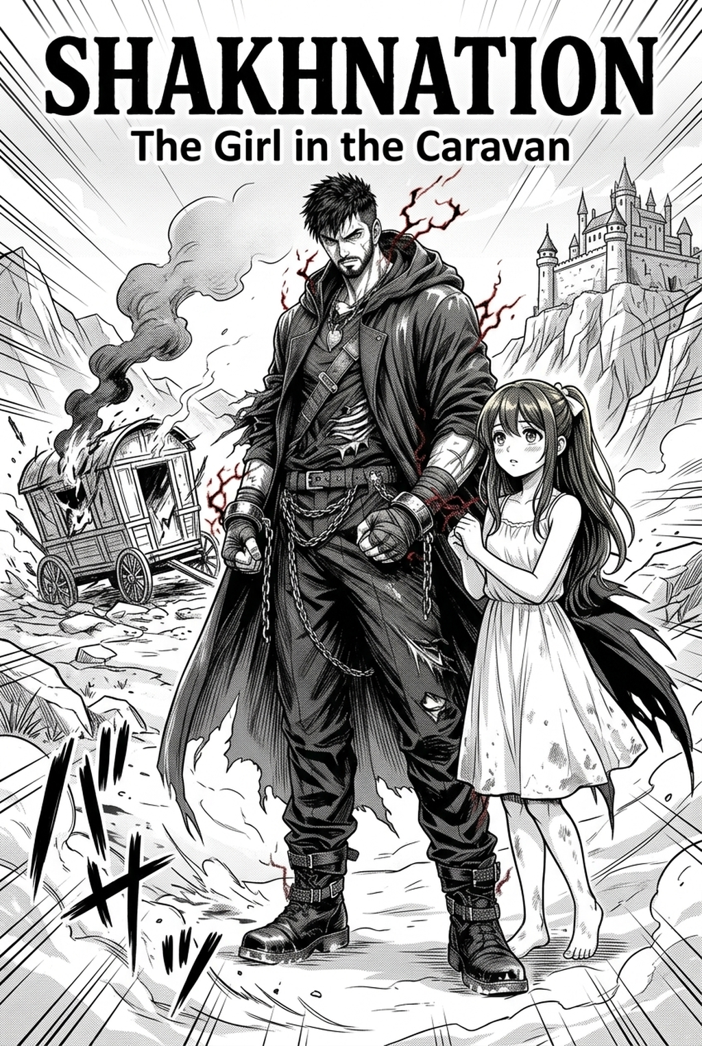
<p align="center"> <img src="33408" alt="Action Screentones and Motion Speed Lines - Mangaka Discovery" style="max-width:100%; height:auto; border-radius:8px;" /> <br/><em>Kinetic line art and speed lines from <a href="https://www.mangaka.app/en/discovery">Mangaka Artwork Showcase</a>.</em> </p>
For impact frames (the single climactic drawing capturing the exact millisecond of physical collision), modern professional webtoons utilize negative-inversion flashing. Inverting black line art on white backdrops into stark pure white silhouettes against solid pitch-black voids shocks the reader's optical nerves, replicating the blinding sensory flash experienced during intense blunt trauma or concussive explosions.
To maintain professional screentone aesthetics without introducing digital moiré distortion artifacts on varying smartphone OLED displays, artists should configure halftone dot pitches between 45 and 60 LPI (lines per inch) at 300 to 600 DPI document resolutions. For extensive tutorials on digital halftoning, see our dedicated guide on Mastering Digital Screentones .
Key line art techniques for maximum velocity:
- Tapered Pressure Trailing: Lines must originate thick at the point of origin and feather smoothly into hair-thin whispers, illustrating aerodynamic friction.
- Directional Motion Blur Filtering: Lightly blurring secondary background elements while maintaining razor-sharp line work on the character's facial focus point mimics high-end anamorphic motion picture camera lenses.
- Radial Shatter Dispersal: Radiate broken debris chunks along exact mathematical vectors originating from the impact epicenter, varying fragment sizes exponentially to convey three-dimensional depth.
- Negative Space Framing: Withhold speed lines entirely in moments of silent, hyper-precise lethality. When a master swordsman cleanly severs a stone monolith without a sound, drawing razor-sharp calm lines with zero motion blur emphasizes unnatural supernatural mastery.
Sound Effects (SFX) and Lettering Placement
Sound effects (SFX / Onomatopoeia) in webtoon action sequences do not merely convey audio; they function as active architectural and kinetic elements within the frame. In Indian multilingual reading environments, rendering sound effects through stylized Latin typographic lettering while incorporating phonetic cadence from Indian languages (such as sharp percussive clangs 'DHAM!', slicing whistling 'SAR-R-R!', or earth-trembling rumbles 'GARRR-DHOOM!') adds resonant regional flavor.
Critical rules for sound lettering placement:
- Never Obscure Primary Action Vectors: Place lettering behind striking fists or flying debris rather than over contact points. Lettering should support the action, never mask anatomical craftsmanship.
- Dynamic Scale Variations: A distant sniper shot deserves a whisper-thin, elegant vertical 'T-I-N-G', whereas an apocalyptic titan fist should occupy 70 percent of the viewport with jagged, distressing drop shadows.
- Integrated Color Harmonization: Tint sound effect lettering with ambient environmental palettes—electric cyan for lightning spells, ember orange for incendiary blasts, or noxious toxic purples for poisoned blade parries.
- Distorted Typography Contours: Skew, curve, and twist font outlines along the physical trajectory of the shockwave so the letters themselves appear physically buffeted by supersonic shock currents.
- Speech Bubble Tail Mechanics: Keep dialogue during combat razor-sharp and concise (maximum 5 to 8 words per bubble). Bubble tails should be jagged and sharply directed toward the vocalizing character's mouth to prevent reader confusion during fast-paced exchanges.
- Layered Sound Planes: Place quiet ambient sounds (such as the whistle of wind 'FWOOSH') behind background architectural pillars, while placing explosive foreground impacts ('KRA-BOOM') in front of all character layers. This simple layering trick introduces authentic three-dimensional acoustic depth.
Technical Checklist for Webtoon Pre-Flight QA
Before exporting and scheduling any action webtoon episode for distribution, professional production teams run a rigorous pre-flight quality assurance protocol. Skipping pre-flight checks often results in corrupted file slices, unreadable typography on compact screens, or jarring color shifts across differing monitor profiles.
Ensure your digital canvas passes every item on this master checklist:
- Canvas Dimensions: Master project files set to 1600x25600px (or minimum 800px width with 300 DPI print-ready archival resolution).
- Slice Boundaries: Cut vertical slices strictly at natural gutter gaps, never through character faces, speech bubbles, or intricate environmental linework.
- File Format & Weight: Export slices as progressive WebP or AVIF images under 250 KB per slice to ensure rapid mobile loading on 4G and 5G cellular networks.
- Color Profile Standardization: Embed sRGB IEC61966-2.1 color profiles across all exported assets to guarantee chromatic consistency across iOS Super Retina and Android AMOLED screens.
- Contrast Ratios for Accessibility: Maintain a minimum 4.5:1 luminance contrast ratio between speech bubble text and bubble fill backgrounds.
- Mobile Readability Test: Preview the complete episode on a physical smartphone held in one hand, executing natural thumb scrolling at varying speeds to verify narrative legibility.
- Asset Integrity Audit: Ensure all background elements, character turnarounds, and prop designs maintain scale consistency throughout the episode.
Case Studies: Analyzing Kinetic Sequences in Popular Action Webtoons
Examining acclaimed action sequences across legendary webcomics reveals recurring compositional formulas that any independent creator can adapt and master.
Case Study 1: The Multi-Floor Vertical Fall Breakdown In modern urban fantasy battles, a staple sequence involves combatants smashing through multiple floors of a skyscraper. Master creators execute this by drawing an extraordinary continuous vertical panel extending over 4000 pixels in height. As the reader scrolls downward, they travel alongside the falling characters through concrete slabs, shattered fluorescent tubes, and raining glass shards, experiencing real-time gravitational momentum that a static book page could never simulate.
Case Study 2: The Ethereal Weapon Manifestation When an ancient celestial blade or spiritual aura manifests, top webtoon artists employ progressive color saturation. The sequence begins with monochromatic black-and-white sketch panels, gradually introducing faint luminous particles in the gutters, building up to a vibrant full-color splash illustration with radiant bloom lighting. This visual crescendo creates an electrifying sense of divine awe.
Case Study 3: The Rapid Counter-Parry Rhythm To depict high-tier swordsmanship where dozens of strikes occur in a single second, artists avoid drawing full character bodies in every frame. Instead, they zoom in on extreme micro-details: a sparking hilt, a severed braid of hair, a boots sole gripping stone, a pupil tracking a blade tip. By alternating these micro-panels at lightning scroll speeds, the reader's brain synthesizes overwhelming martial prowess and precision.
Case Study 4: The 360-Degree Orbital Smash To convey immense physical force hurling an enemy into a distant mountain peak, creators use three descending panels arranged in an orbital rotational sequence. Frame 1 shows the winding rotation of the striker's hips from the left. Frame 2 rotates the camera behind the striker as the hit lands. Frame 3 cuts instantly to an extreme wide shot from behind the target as they skip across water like a stone. This cinematic rotational coverage gives the strike monumental physical credibility.
End-to-End Production Workflow with Mangaka
Transitioning from raw script ideation to final serialized webtoon chapters previously required months of manual drafting. With the comprehensive suite of tools inside Mangaka , Indian solo creators and creative studios can streamline their end-to-end production pipeline into an efficient 5-step workflow:
- Script Decomposition and Beat Mapping: Parse screenplay dialogue and action descriptions into vertical screen scrolling beats, allocating estimated pixel heights to each story moment.
- Automated Storyboard Synthesis: Generate preliminary thumbnail camera layouts, establishing character positioning and sightline vectors using automated layout tools.
- Character Consistency Enforcement: Maintain facial structures, hair silhouettes, and costume details across dozens of consecutive combat angles using persistent model anchor sheets.
- Environment and Perspective Asset Integration: Seamlessly composite high-detail fantasy temples, cybernetic neon streetscapes, and natural mountain passes directly into panel perspectives.
- Lettering, SFX, and Export Optimization: Finalize speech bubbles, kinetic sound lettering, and export vertical slices standardized at 800x1280px WebP formats ready for immediate digital serialization.
By adopting this integrated methodology, creators cut production cycles from weeks down to days while maintaining elite visual craftsmanship.
Frequently Asked Questions
What is the ideal canvas width and resolution for vertical webtoons?
The industry standard width for vertical webtoon distribution on modern mobile platforms is 800 pixels wide at 300 DPI, typically compiled in vertical slice heights ranging between 1280 and 2000 pixels to ensure seamless progressive loading without mobile browser memory crashes.
How do I maintain visual clarity in chaotic multi-character battle scenes?
Visual clarity is maintained by applying strict value contrast hierarchies: keep background environments rendered in muted low-contrast midtones, while reserving stark pure whites and deep shadow blacks for foreground combatants and focal contact points.
Can Indian creators publish webtoons globally without traditional studio backing?
Yes, digital platforms like Mangaka empower independent Indian writers, illustrators, and animators to storyboard, produce, and serialize full-color vertical webtoons directly to an international audience without needing multi-million dollar publishing contracts.
How much gutter space should be left between consecutive high-speed action panels?
For fast-paced combat exchanges, gutters should measure between 20 and 60 pixels on standard 800px-wide canvas templates. This tight spacing forces the reader's eye to process successive actions almost simultaneously, heightening perceived adrenaline and momentum.
What are the best external resources to study sequential action cinematography?
Creators should study master cinematographers and sequential illustrators by exploring educational archives like the Society of Illustrators , comprehensive guides on W3C Web Art Specifications , cinematography case studies on Library of Congress Comic Collections , comic art anatomy tutorials on Drawsh Academy , historical action layout essays on Anime News Network , and narrative pacing lectures from the School of Visual Arts .
How do sound effects differ between horizontal manga and vertical webtoons?
In horizontal manga, sound effects generally read diagonally across fixed print pages. In vertical webtoons, sound effects are elongated vertically along the downward scroll axis, physically leading the reader's thumb into the subsequent narrative panel below.