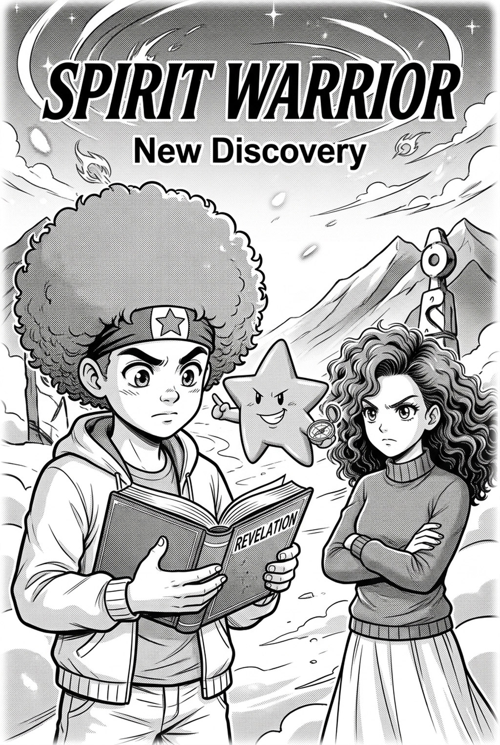
AI Manga Style Transfer: Understanding the TCG Aesthetic Composition
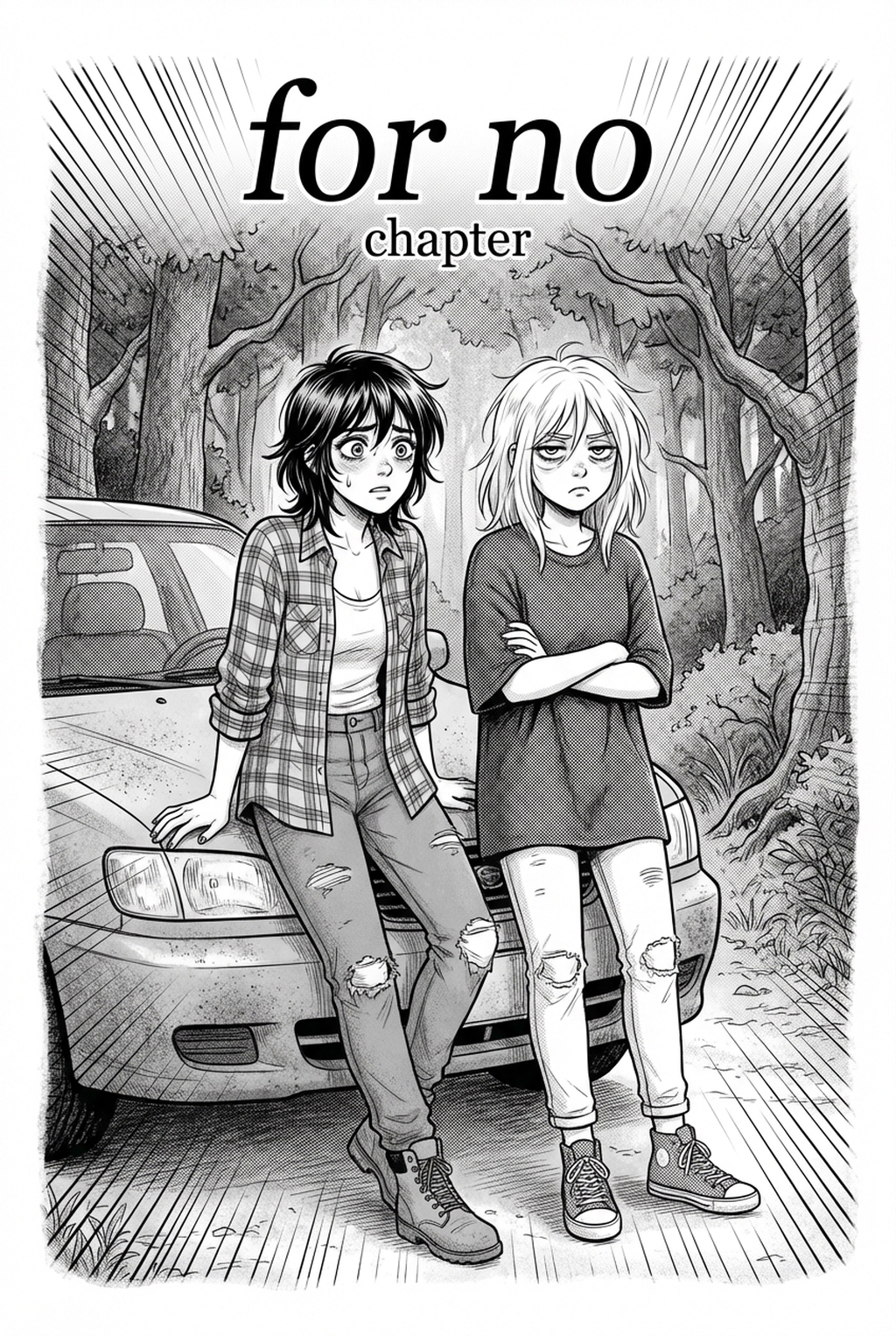
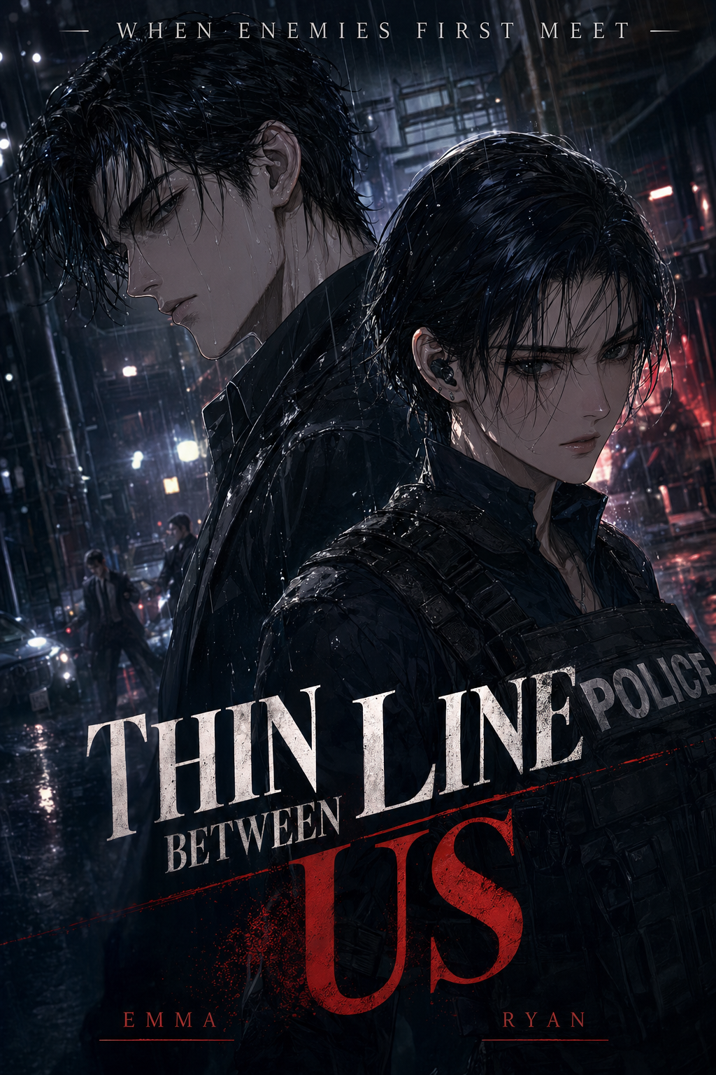
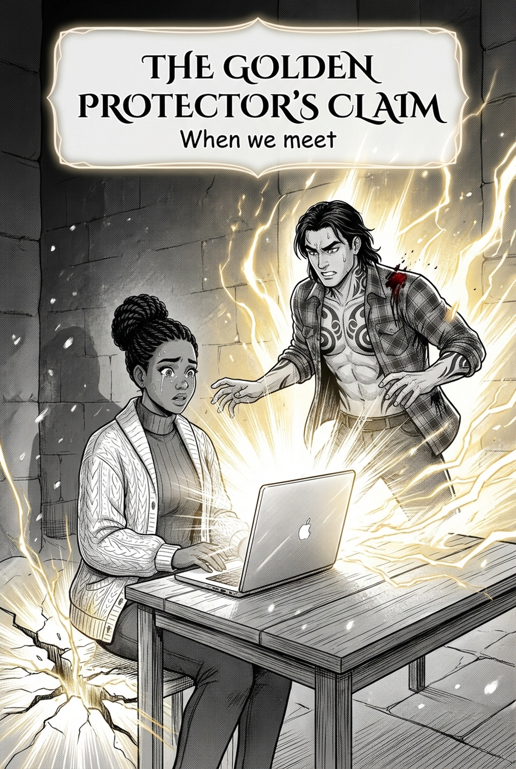
The style is fundamentally defined by a hybrid nature, pairing clean, intentional linework reminiscent of traditional shonen manga with medium-agnostic shading techniques like watercolor or gouache. Unlike standard digital cel-shading, this look forces a hierarchy of visual weight, where background environments are treated with softer, muted textures to allow the character’s focal points to pop instantly.
Visual markers of this high-stakes aesthetic include:
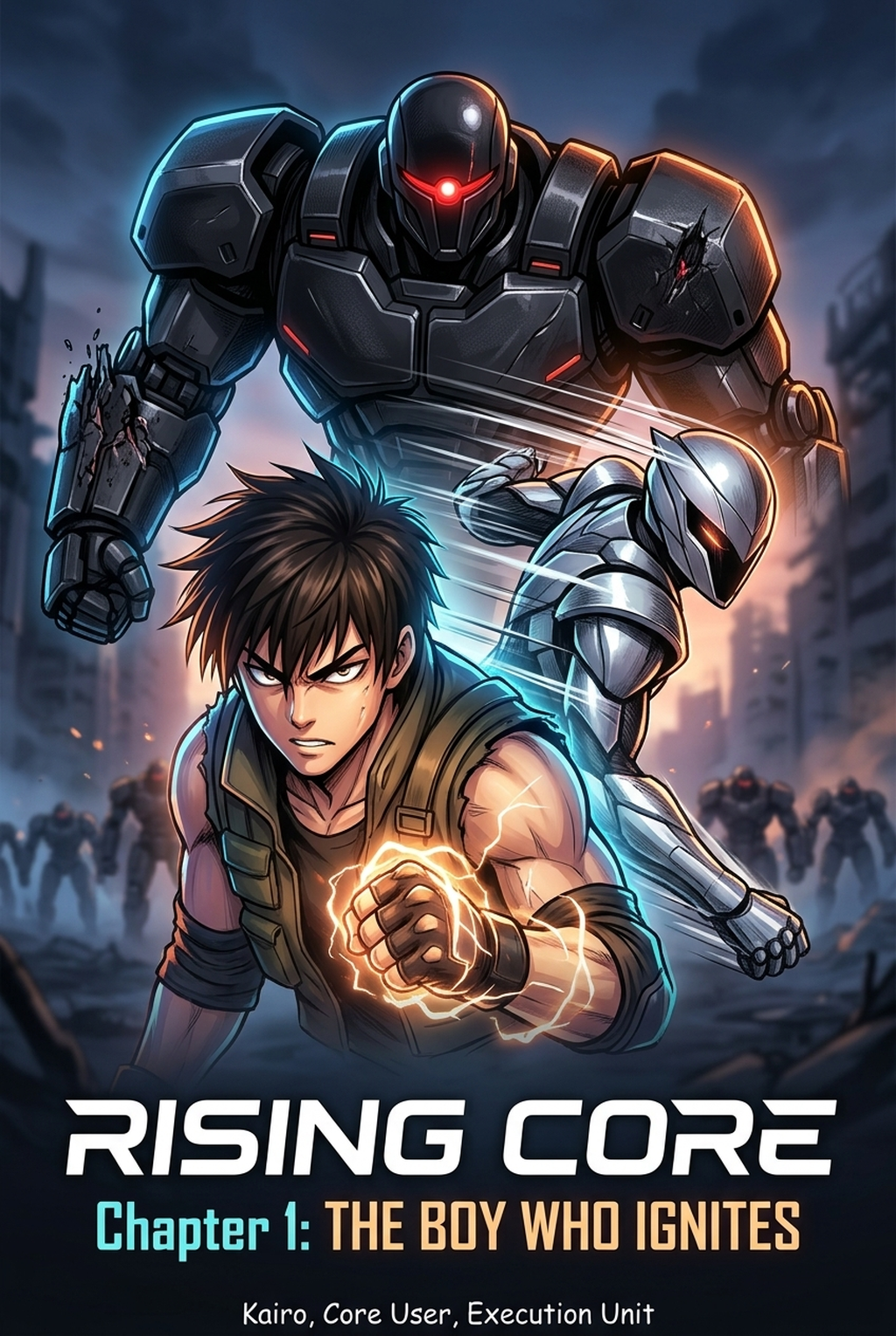
- Exaggerated Perspective: Framing that utilizes dramatic foreshortening to turn a static character pose into an action-focused, three-dimensional composition. * Emotional Color Theory: Palettes are chosen to reflect the intensity of a specific narrative moment rather than sticking to a rigid, photorealistic color grade. * Depth-in-Layering: The intentional separation of foreground characters from environmental elements, ensuring the reader’s eye locks onto the protagonist or central creature immediately. * Action-Focus Framing: Every single panel is treated like a standalone splash page designed for maximum collectability, regardless of its size on the printed page.
Impact of TCG Visuals on Independent Manga
Adopting a TCG-inspired aesthetic helps independent manga move beyond the "flat" look of standard digital art, adding professional-grade visual weight to key story beats. Many indie creators struggle with a lack of visual "punch" when publishing in vertical-scroll or traditional black-and-white formats; the TCG style bridges this gap by mimicking the tactile, premium feel of high-end card illustrations.
- Splash Page Authority: Your cover art or major climactic panels gain an immediate, high-value signature look that captures attention in saturated discovery feeds. * Genre Signature: Moving away from standard digital flat-fills allows your series to develop a unique, painterly brand identity that readers recognize as high-effort. * Print-to-Digital Versatility: The high contrast of these illustrations translates exceptionally well from high-resolution digital screens down to physical print, maintaining color vibrance even on lower-quality paper stock.
Applying Mangaka to Your Production Flow
Mangaka enables creators to translate rough sketches into the TCG-style aesthetic by analyzing the geometric structure of your line-weight and color depth, allowing for rapid iteration of complex battle scenes. This tool removes the manual trial-and-error involved in matching atmospheric light sources to your original line art, effectively "re-rendering" your pencil drafts into professional assets.
When you struggle with inconsistent rendering across a sequence of five or six panels, the style transfer engine maintains the underlying structure of your characters while applying the painterly, high-contrast textures characteristic of professional card art. You can now take a rough 1,500px sketch and push it through the refinement engine at Pokemon TCG art style with Mangaka to generate a fully shaded, TCG-ready image in under two minutes, saving you the three-to-four hours of manual inking and blending typically required for a complex promotional splash.
Strategic Use Cases for Card-Centric Design
You can leverage this specific look to standardize your promotional assets without redrawing every character pose from scratch. For example, by creating a Character Concept Card" series, you can build lore-heavy marketing material that functions like a collectible set, which helps drive reader engagement on social platforms during the weeks between full chapter releases.
- Emotional High-Points: Apply a TCG-inspired texture pass specifically to climactic battle sequences, emphasizing the sheer impact of an ability or a character’s transformation state. * Promotional Asset Uniformity: Instead of relying on varied, loose sketches for social media banners, use your primary character designs as base inputs for a consistent, high-end illustration set. * Climax Readability: Use the atmospheric shading to guide the reader’s focus during complex, multi-character combat, preventing the page from feeling "cluttered" or visually noisy.
Implementation Guidance for Creators
While the AI Manga Style Transfer workflow is a visual trend, you should treat it as a framework for your own unique storytelling rather than a direct copy of specific intellectual property. The "style" itself—that combination of high-density color layering and intentional linework—is a universal design language that you can legally interpret and adapt into your own creative workflow.
- Style vs. Copyright: Focus on the mechanical elements of the shading and lighting patterns; Mangaka interprets your input geometry to apply these qualities, ensuring your work remains your own distinct aesthetic. * Efficient Iteration: Traditional painting is manual and time-intensive, often leading to "burnout" by the time you reach the final coloring phase; AI-driven style transfer processes your geometric source context to apply professional-grade textures dynamically. * Avoiding Line-Weight Drift: By utilizing a consistent source sketch for your style transfer, you prevent the common failure of "drifting," where character proportions or line-thickness vary wildly between individual panels on a single page.
Creators should compare the generated line art with the original sketch and confirm that facial expressions, props, speed lines, and speech-bubble space still support the scene. A repeatable review pass should cover character consistency, panel readability, background clarity, and whether the final file is ready for coloring, lettering, or editor feedback. For longer projects, creators should save approved examples of line weight, face detail, clothing folds, and background density. Those references keep later chapters closer to the intended style.
The Bottom Line
The creator workflow offers a powerful visual template for modern manga creators who want to combine traditional narrative impact with a high-end, painterly finish that readers find inherently collectible. By utilizing the advanced AI-style transfer features found at Pokemon TCG art style , you can integrate these high-impact stylistic elements into your production workflow, ensuring visual consistency and professional quality without sacrificing the artistic soul of your work.
Related articles
4-Koma Comedy Manga Structure: The Ultimate Guide for 2026
Best Manga Colorist Tools: 2026 AI Software Comparison
Understanding 4-Koma Manga: The Essential Creator Guide 2026