AI Manga Paneling Guide: How to Structure Pages That Hook Readers
TL;DR (Quick Takeaways) * Panels are timing, not decoration: Manga paneling (koma-wari) decides how fast a reader moves, where they pause, and what they feel at the turn of the page. * Reading order comes first: Traditional manga reads right to left and top to bottom, so every panel, balloon and page-turn has to be placed with that path in mind. * AI speeds up drafts, you keep the judgement: An AI layout tool can propose several page structures from a script in moments, but the beat you choose to make big is still your decision as the author. Direct Answer: AI manga paneling means using software to turn a script beat into a set of panel frames on a page: how many panels, how large each is, how the gutters run, and in which order the eye should read them. Good results come from the same rules human mangaka use: one clear focal panel per page, a readable path, enough room for lettering, and a hook at the page turn. The AI produces drafts quickly; you test them against those rules.
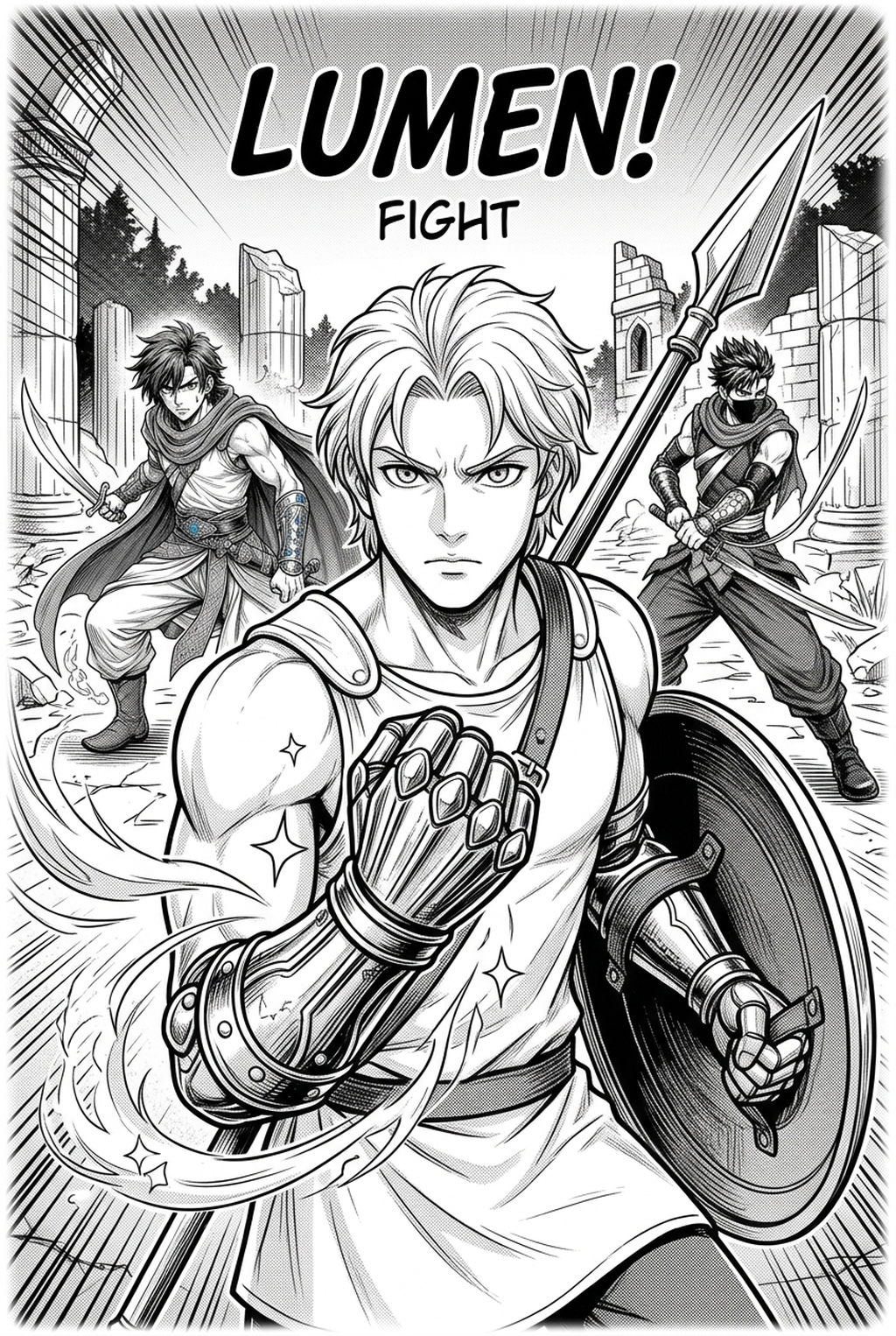
! Cover Image: Technical Geometry and Structural Paneling Rules for Professional Manga Caption: Figure 1.0 - Page geometry is the skeleton of a manga: panel sizes, gutters and the path the eye takes from the first frame to the last.
What Manga Paneling Actually Does
A panel is a unit of time. In prose, the author controls duration through sentence length. In film, the director controls it with editing and frame rate. In comics, the reader holds the remote control: they can stare at one quiet landscape for half a minute or fly through a fight in a couple of seconds. The artist's only tool for influencing that speed is the layout of the page.
In Japan, the craft of arranging those units is called koma-wari (コマ割り), literally "dividing into frames". It is learned the way a drummer learns rhythm. A tall narrow panel feels quick. A wide panel feels calm and slow, because the eye travels farther along it. A panel with no border at all feels open and airy. A cluster of small, similar squares feels like a ticking clock. None of these effects require a single extra line of detailed drawing; they come entirely from shape, size and spacing.
That is why paneling is worth studying separately from drawing. Two artists can draw the same fight scene with the same characters and the same poses, and one version will feel electric while the other feels like a slideshow. The difference is almost always the page layout. If you want a deeper historical overview of the form itself, the manga article on Wikipedia is a good neutral starting point, and the long-running weekly magazines on MANGA Plus by Shueisha let you read professional layouts for free and study them page by page.
Why this matters more on screens
Most new creators do not print their first chapters. They post them: on WEBTOON , on Tapas , on pixiv , or in a social feed. On a phone, a page is a small rectangle and a reader's thumb is always ready to move on. Weak paneling there does not just look amateur; it loses the reader in the first swipe. The same grammar still applies, but the margin for error is smaller.
What an AI layout tool changes
Before AI tools, trying a different layout meant redrawing thumbnails by hand, or re-cutting panel borders in your drawing software. That is slow enough that most people stop at the first arrangement that "works". When a tool can generate a panel layout from your script and let you swap it for another in a few clicks, you can compare three or four structures for an important page instead of one. That comparison is where the quality gain comes from, not from the machine "knowing" manga better than you do.
Mangaka.app is built around that workflow: you write or paste a script, the tool generates panels and page layouts from it, you adjust speech bubbles and screentones, and you export the finished pages. You can try the process on your own scene at Mangaka.app . The rest of this guide gives you the rules to judge what comes out.
Reading Direction and the Inverted Z Path
Before you place a single frame, decide the reading direction, because everything else depends on it.
Traditional Japanese manga is read right to left, top to bottom. The first panel of a page sits at the upper right. The eye moves left along the top tier, then drops down and jumps back to the right edge to start the next tier. Western comics read left to right, and the path is the familiar "Z". Manga's path is the mirror image, often called an inverted Z.
This has direct consequences for how you build a page:
- The speaker on the right talks first. If two characters face each other in the same panel, the one on the right side of the frame is read first, so their balloon should be placed higher or further right.
- Balloons inside a panel follow the same order. Within one panel, place the first balloon at the top right and the last one at the lower left.
- Motion reads differently. A character running toward the left edge of the page feels like they are moving forward in the story. A character running toward the right feels like they are going back, which is why many artists have heroes advance leftwards in manga.
- The last panel on the page is at the lower left. That is where the eye finishes, and it is the natural spot for a page-turn hook.
Quick comparison of the two reading paths
| Feature | Right-to-left manga | Left-to-right comics and webcomics |
|---|---|---|
| First panel position | Upper right | Upper left |
| Eye path on a tier | Right to left | Left to right |
| First balloon in a panel | Upper right | Upper left |
| "Forward" motion direction | Usually toward the left | Usually toward the right |
| Final panel before page turn | Lower left of the page | Lower right of the page |
| Typical use | Japanese print manga and its translations | Western comics, many webcomics, most vertical-scroll series |
If you publish translated or localised editions, reading direction becomes a production setting rather than an artistic choice. Design the page once with the target direction in mind, and check every balloon order again if you ever mirror a layout. Mirroring images is not enough: lettering, speech order and even objects such as watches and written signs need review.
Six Layout Laws That Hold a Manga Page Together
These are working rules used by many professionals. They are not laws of nature. Break them on purpose, never by accident.
1. Give every page one dominant panel
A page made of six equal rectangles is flat, because nothing tells the reader what matters. Choose the one beat that carries the emotional or narrative weight and give it clearly more space than the others, often a third of the page or more. The remaining panels become setup and aftermath around it. If you cannot name the dominant panel of a page, the page probably contains two scenes or no scene.
2. Keep the reading path obvious
The reader should never wonder what to read next. Avoid placing a large, eye-catching panel in a position that pulls the gaze away from the correct order, and avoid ambiguous arrangements where two panels sit side by side but belong to different tiers. When a layout is unusual, make sure the balloon order and the gutter widths remove the ambiguity.
3. Use gutters to signal time
The white space between panels is part of the storytelling. A narrow gutter says "this follows immediately". A wide gutter says "time has passed" or "we are somewhere else". Consistency matters more than exact measurements: pick a pair of widths, one for tiers and one for neighbouring panels, and keep them across the chapter.
4. Vary the scale of shots
Alternate wide establishing views with medium shots and close-ups. A page that is all faces becomes claustrophobic, and a page that is all landscapes feels distant. A common pattern is wide, medium, close-up, then a reaction, but let the scene decide.
5. Break the frame sparingly
Panels that bleed off the page edge, characters stepping out of borders, and diagonal cuts all draw attention precisely because they are rare. If every page has them, none of them lands. Reserve them for two or three moments in a chapter.
6. Leave room for lettering
Lettering is not an afterthought. Dialogue, narration boxes and sound effects take real space, and when you squeeze them in at the end they cover faces and hands. Plan the balloon areas while you are planning the panels, and keep quiet areas such as sky, walls or flat backgrounds near the top of each panel where balloons can sit without hiding the drawing.
Panel Counts and Tier Structures for Different Scenes
There is no single correct number of panels per page. What works depends on the scene's tempo, on whether the page is print or scroll, and on your own drawing speed. The ranges below are practical starting points that many artists use, not statistics.
| Scene type | Typical panels per page | Tier structure that tends to work | What to emphasise |
|---|---|---|---|
| Quiet dialogue | 4 to 6 | Three tiers of similar height | Reaction close-ups, small gestures |
| Slow emotional moment | 2 to 4 | Two or three tiers with one wide panel | Silence, a wide shot, empty space |
| Fast action | 3 to 5 | Two tiers with diagonal cuts | Motion lines, one large impact panel |
| Big reveal | 1 to 3 | One large panel, optionally a splash | Scale and surprise |
| Comedy beat | 4 to 6 | Even grid, with a break at the punchline | Timing and reaction |
| Exposition | 4 to 6 | Three tiers with varied panel widths | Visual variety so text does not feel heavy |
| Flashback or memory | 3 to 5 | Looser borders, softer or irregular frames | A clear change from the present timeline |
Seven panels is usually the upper limit before pages feel crowded, especially on a phone. Use more only if your style relies on small, dense frames and your readers expect that density.
Three tier structures worth knowing
- The three-tier grid. Three horizontal rows, each holding one to three panels. This is the workhorse of dialogue-driven and slice-of-life manga. It gives you enough rows for pacing and enough room for close-ups.
- The two-tier impact layout. Two tall rows, usually with a wide top panel and a split bottom row, or the reverse. It is more dramatic, gives space for big gestures, and suits fights, chases and discoveries.
- The four-panel strip (yonkoma). Four equal panels stacked vertically, built around setup, development, twist and punchline. It remains a staple for gag comics and works well for short posts.
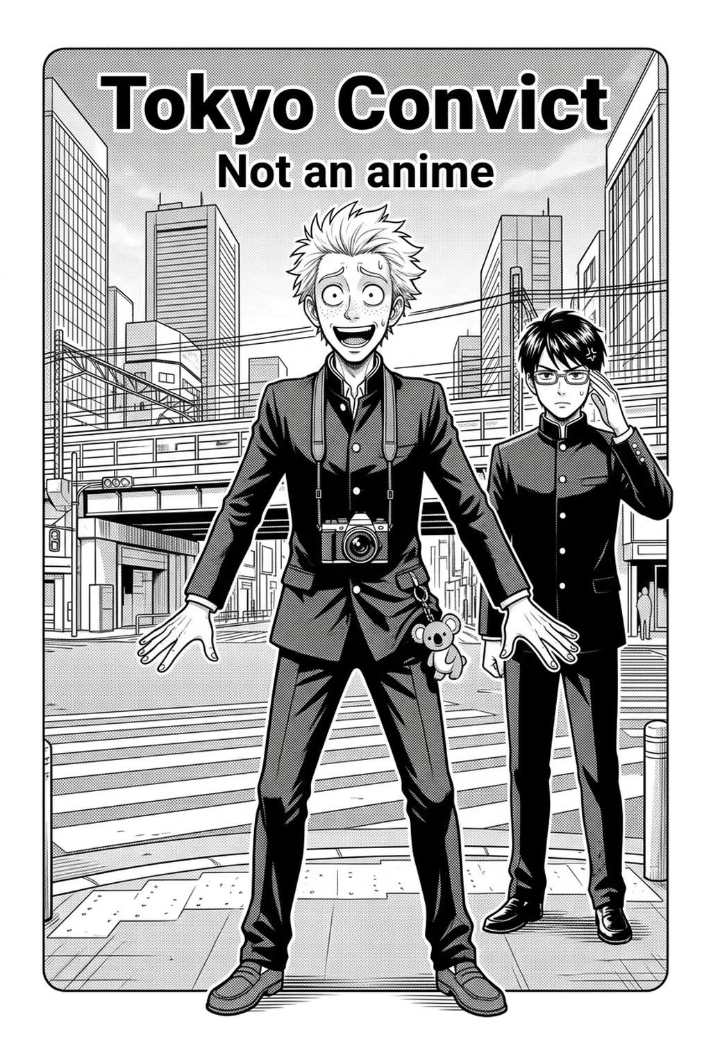
! Content Image 1: Analyzing Neural Eye-Tracking and Reading Path Flow Across Manga Pages Caption: Figure 2.0 - Tracing the reading path across uneven tiers: the layout works when your own finger can follow it without hesitating.
Gutters, Bleeds and Margins: The Spacing Rules
Gutters are the quietest part of a layout and the part beginners most often get wrong. Two simple habits solve most problems.
First, make the horizontal gutters (between tiers) a little wider than the vertical gutters (between neighbouring panels in the same tier). The wider space gives the eye a clear signal that a new row begins, which supports the right-to-left path. Second, keep the values constant across a chapter. Readers do not measure gutters, but they notice inconsistency as a vague sense that the pages are messy.
Exact widths depend on your page size, your publisher's template and whether the work is for print or screen, so treat the numbers below as a way to think about proportions, not as industry standards. If you are submitting to a publisher or print service, their template wins.
| Spacing element | Purpose | Practical guidance |
|---|---|---|
| Tier gutter (between rows) | Signals a new beat or pause | Visibly wider than the panel gutter |
| Panel gutter (inside a row) | Links near-simultaneous actions | Narrow, tight and consistent |
| Zero-width gutter | Hard cut or sudden shock | Rare; use for one or two moments per chapter |
| Outer margin | Keeps content safe from trimming | Follow your print or platform template |
| Bleed area | Lets art run to the page edge | Extend art past the trim line, but keep text away from it |
| Safe area for text | Protects lettering from being cut | Keep balloons well inside the trim line |
Bleed panels
A bleed panel runs all the way to the trimmed edge of the page. It makes the image feel larger than the page, so it is the right tool for a skyline reveal, an explosion, or a moment when a character's emotion overflows the frame. If you plan for print, extend the artwork beyond the trim line, as your printer or the print-on-demand service you choose will specify. Services such as Kindle Direct Publishing publish their own trim, bleed and margin guidance, and you should read the current version before setting up files.
White space is a tool
New creators often fill every panel to the edge with background detail. Experienced artists leave areas calm on purpose. A pale wall behind a speaker is not a lazy choice; it is where the balloon sits. Planning those quiet areas up front means you never have to cover a face to fit dialogue.
How to Structure a Manga Page, Step by Step
This is the working sequence for planning one page, whether you sketch it by hand or generate it with an AI layout tool. Follow it for each page and your chapters will feel consistent.
- Read the script beat out loud. A beat is one action or one emotional change, not a full scene. Say it in a single sentence, for example "Mei notices the letter is already open". If you need "and then" to describe the page, split it into two pages.
- Pick the dominant moment. Decide which instant the reader must remember. That moment will receive the largest panel. Everything else supports it.
- Count the beats around it. List what happens before and after the dominant moment in short phrases. Keep it to three to six supporting beats. If you have more, move some to the next page.
- Choose a tier structure. Use the scene table above: a three-tier grid for dialogue, a two-tier impact layout for action, a loose arrangement for memory. Sketch two alternatives and compare them.
- Place the focal panel on the path. Put the dominant panel where the eye lands naturally. It often works well at the end of a row or at the bottom of the page, where the reader's anticipation has built up. Avoid placing a huge panel first unless it is a deliberate opening shot.
- Draw the gutters and check the order. Set the wide and narrow gutters, then read the page right to left, tier by tier, with your finger. Ask a friend to do the same without explanation and see if they ever hesitate.
- Reserve balloon space. Mark where each balloon goes in reading order. Keep the first balloon near the top right of each panel. Make sure no balloon sits over eyes, hands or the point of the action.
- Review the page turn. Look at the final panel. If the page is a left-hand page in a print book, does it make the reader want to turn? If it is a vertical-scroll episode, does the last frame create a reason to scroll further?
- Test it small. Shrink the page to thumbnail size or view it on your phone. If the dominant panel does not stand out at that size, enlarge it or simplify the others.
- Export and compare. Export the page, view it where your readers will, and fix what you notice. Then keep the settings so the next page matches.
If you work in Mangaka.app, steps 3 to 7 are where the tool helps: you can generate a page layout from the script, try another arrangement, adjust the speech bubbles and screentones, and keep the character look steady across panels. You can start a page in the editor and apply this checklist to the result.
Where AI Helps in Paneling and Where You Decide
AI tools are good at producing options quickly and bad at knowing what your story needs. The healthiest way to work is to let the tool do the first draft and then edit like an editor would.
| Task | What the tool can do for you | What you still decide |
|---|---|---|
| Turning a script into panels | Generates a draft set of panels for the page from your text | Which beat is dominant and what gets cut |
| Layout options | Offers panel arrangements you can compare | Which arrangement fits the scene's tempo |
| Character appearance | Keeps a character recognisable across panels, which is what character consistency is for | Costume, expression and acting choices |
| Speech bubbles | Gives you bubbles to place and adjust | Reading order, wording and what to trim |
| Screentones | Applies tone to areas of the page | How much tone is too much for readability |
| Export | Produces the finished pages in a shareable form | Which platform and format you target |
The pattern is clear. The tool handles the mechanical part. You handle the judgement. A tool that generates a page layout in moments is valuable because it lets you reject bad structures cheaply, not because it removes the need to look.
A fair warning about "perfect" layouts
An AI-generated layout can be technically tidy and still be dull. Look for these symptoms:
- Every panel is about the same size.
- The biggest panel does not correspond to the most important moment.
- The page ends on a calm panel when the next page begins with a shock.
- Balloons are packed into the same corner of every panel.
If you see any of these, ask for another arrangement or edit the frames yourself. Treat each generated layout as a thumbnail from an assistant, not as a finished decision.
Page-Turn Hooks and Reader Retention
The most important boundary in print manga is not between panels—it is between pages. Specifically, in physical manga and two-page digital spreads, the bottom-left panel of an even-numbered page (in a right-to-left layout) is the last image the reader absorbs before physically flipping paper or swiping to the next spread. In Japanese editorial terminology, this mechanic is known as mekuri (めくり, the page turn).
A successful page turn relies on incomplete information. If the climax of a scene or the answer to a riddle is resolved on the bottom-left frame, reader momentum drops immediately. The reader has satisfied their curiosity, meaning the subsequent page begins from a standstill. Professional mangaka deliberate over mekuri placement during the earliest rough thumbnail phase (nemu).
Practical techniques for the bottom-left frame
- The Reaction Without the Cause: Show a character's widened eyes, trembling hands, or sudden gasp, but crop out what they are looking at until the top-right frame of the following page.
- The Interrupted Statement: Cut a line of dialogue off mid-sentence with an em-dash, placing the revelation over the turn.
- The Approaching Shadow: Introduce an ominous silhouette, weapon tip, or incoming footstep entering the edge of the panel frame, forcing the reader to turn to see the intruder.
- The Question Beat: End the spread with a difficult question or a strategic ultimatum delivered by the antagonist.
By deliberately aligning your panel distribution so that narrative questions land on the page-turn corner, you transform passive scrolling into active page turning.
! Content Image 2: Dynamic Diagonal Border Slicing for Shonen Action Choreography Caption: Figure 3.0 - Diagonal gutters and asymmetric frames guide the eye downward while accelerating scene tension toward the page turn.
Diagonal Gutters, Speed Lines, and Action Choreography
Not every manga page suits peaceful 90-degree orthogonal grids. In shonen battle sequences, sports manga, and thriller climaxes, rigid horizontal borders can drain kinetic energy from high-velocity movements. To inject visual momentum, artists employ diagonal panel slicing and specialized sound line geometry.
How diagonal slicing alters perception
A horizontal border represents stability, calm, and resting gravity. When a gutter is tilted diagonally:
- Directional Acceleration: An angled border tilted from top-right to bottom-left subliminally accelerates the downward trajectory of an overhead axe strike, downward kick, or crashing meteor.
- Instability and Danger: Off-axis panels create psychological unease, mimicking the Dutch angle technique in cinematography. They communicate that the characters have lost control of their environment.
- Leading the Eye Across Complicated Choreography: Diagonal frame borders can act as visual funnels, pointing directly toward the character's weapon or facial reaction.
However, diagonal panels must be used with restraint. If every frame on a page is tilted in random directions, the inverted Z-reading path breaks down completely, leaving the reader unable to determine which panel follows next.
Tooling for digital manga creation
When building action layouts digitally, professional artists often combine specialized layout engines with established desktop creative suites. Software like Clip Studio Paint offers vector panel rulers and frame border folders that allow creators to slice panels with scissors tools and adjust gutter widths numerically. Free open-source alternatives like Krita and MediBang Paint provide comic page templates, perspective grid aids, and raster screentone brushes. Many illustrators rely on professional drawing hardware from Wacom to hand-draw speed lines and organic frame overlaps that break the panel border cleanly.
! Content Image 3: Digital Halftone Screentone Application and Moiré Prevention Filters Caption: Figure 4.0 - Digital screentone dot frequency, density balancing, and crisp vector frame borders under magnification.
Responsive Manga: Adapting Print Grids for Vertical Webtoons
In modern digital publishing, an author rarely produces a comic for a single distribution channel. A series might debut as a vertical scroll episode on WEBTOON or Tapas , later be compiled into a printed B5 tankōbon graphic novel, or appear on portfolio communities like pixiv .
Adapting between these two formats is not a matter of simply stacking print pages end to end. The cognitive rhythm of vertical scrolling differs radically from a two-page spread.
| Architectural Dimension | Traditional Print Manga Page | Vertical Webtoon Canvas |
|---|---|---|
| Reading Direction | Right to left, top to bottom (inverted Z) | Top to bottom continuous vertical scroll |
| Gutter Sizing | Narrow vertical (3–5mm), wider horizontal (8–12mm) | Expansive vertical gaps (typically 80px to 300px) |
| Pacing Control | Page-turn reveals (mekuri) | Scroll distance and scroll speed (thumb pacing) |
| Focal Point Distribution | Asymmetric tiers balanced across two facing pages | Centered or alternating left-right staggered focal points |
| Panel Count per View | 4 to 6 panels visible simultaneously | 1 to 2 panels visible on screen at any single moment |
| Bleed Handling | Physical paper trim margin and bleed zone | Full screen edge-to-edge mobile width |
When using Mangaka.app, creators can leverage AI generation from script directly into tailored panel layouts, maintain character consistency across panels, place speech bubbles and screentones cleanly, and export ready-to-publish files. You can explore the platform's paneling workflows directly through our AI manga creation suite .
Frequently Asked Questions (FAQ)
What is the ideal number of panels per manga page?
The standard range for commercial manga is 4 to 6 panels per page. Action sequences often compress to 3 or 4 kinetic panels, while dialogue-heavy or mystery scenes can use 6 to 7 panels. Exceeding 7 panels usually leads to cramped artwork and reader fatigue.
What is the difference between Western and Japanese manga reading order?
Western comics read left-to-right, top-to-bottom in a standard Z-path. Japanese manga reads right-to-left, top-to-bottom in an inverted Z-path. When creating manga, ensure your panel order and speech bubble placements follow your chosen target direction consistently.
How do AI manga paneling generators prevent visual confusion?
Professional AI paneling engines analyze scene beats and apply gutter hierarchies, making tier gutters wider than internal panel dividers. They position focal points along natural eye paths so readers do not have to guess which frame comes next.
What is a bleed panel and when should I use it?
A bleed panel extends beyond the trimmed page edge to the physical border of the sheet. It should be used sparingly for major climactic moments: large-scale landscape reveals, massive explosion impacts, or intense emotional beats that break the normal frame boundaries.
Can AI manga paneling tools convert print pages into mobile webtoons?
Yes. Modern suites like Mangaka.app feature layout engines that can reflow multi-panel print pages into vertical scrolling columns with appropriate spacing between frames for comfortable mobile reading.
Do I need professional vector software to create custom manga panel borders?
No. While specialized software like Clip Studio Paint or Krita offers vector tools, web-based AI tools allow you to generate, slice, and adjust panel borders directly in your browser without requiring complex manual vector configuration.
Start Paneling Your Manga Today
Strong page architecture is the invisible craft that transforms good character art into an unputdownable story. By understanding the inverted Z-reading path, maintaining clear gutter hierarchy, giving each page a dominant focal beat, and engineering suspenseful page turns, you keep your readers engaged from the first tier to the final cliffhanger.
Whether you are drawing your frames manually or accelerating your storyboard phase using automated layout tools, keeping these foundational rules in mind ensures your pages remain clear, dynamic, and emotionally resonant.
Ready to turn your script beats into professional manga page layouts? Create your next chapter effortlessly with Mangaka.app and start building pages that hook readers today.