Manga Sound Effects (Onomatopoeia) Typography and Placement Guide (2026)
Language: English (EN) Status: Complete English draft, awaiting Phương Thảo Tô’s review; not published to CMS.
TL;DR
- Sound effects are visual art, not merely captions for audio.
- Size, slant, line weight and negative space define physical force and volume.
- Always test lettering inside the panel at final mobile reading dimensions.
Direct Answer: Select lettering geometry according to the nature of the sound (angular for impacts, soft for ambient tones), anchor it near the sound source without obstructing reading flow, and calibrate distortion and contrast after inspecting the image at scaled-down dimensions. Every sound effect must reinforce panel rhythm without overpowering character performance.
Functions of manga onomatopoeia
Onomatopoeia in manga visually articulates duration, volume, shockwaves and psychological tension. Sharp, jagged edges convey cutting impacts; rounded, fluid characters evoke stealth or moisture; dramatic slants aligned with action vectors accelerate reading velocity.
Lettering classification matrix
| Category | Lettering traits | Optimal placement | Primary risk |
|---|---|---|---|
| Impact | Heavy weight, fractured edges, sharp angles | Direct point of contact | Obscuring character anatomy |
| Motion | Tapered strokes, slanted along action vectors | Parallel to movement path | Opposing the natural eye path |
| Ambient / Atmospheric | Thin, feathered, dispersed strokes | Panel borders or deep background | Visual noise |
| Psychological / Tension | Trembling, distorted, vibrating contours | Near the character's face | Covering facial expressions |
Seven-step lettering workflow
- Identify the sound source and determine whether physical force or emotional resonance takes priority.
- Choose font or hand-drawn geometry: rigid, soft, broken or distorted.
- Establish the lettering baseline aligned with the vector of motion.
- Test temporary placement, ensuring speech bubbles and expressive facial features remain unobstructed.
- Apply a knockout rim or outer stroke to separate lettering cleanly from dark backgrounds.
- Apply tone, transparency or surface texture when required by the scene.
- Scale the panel down to 25% to confirm that both the action and the sound remain instantly legible.
Cross-language lettering and translation
When adapting manga for global distribution, creators must choose between preserving original Japanese sound kanji/katakana for artistic authenticity or substituting localized English typography. A balanced modern practice preserves original artistic lettering on the illustration layer while placing discreet translated pronunciation and meaning notes adjacent to the main glyph.
Pre-export verification checklist
- Lettering does not obstruct eyes, mouths or key anatomical landmarks.
- Stroke slant coincides with the direction of physical action or natural reading scan.
- Outer borders provide sufficient contrast against busy background linework.
- Lettering scale accurately mirrors the volume and narrative stakes of the panel.
- Restraint is maintained: silent emotional panels are kept free of unnecessary sound typography.
CTA
Experiment with three distinct sound lettering treatments on a single action panel using Mangaka and evaluate visual impact in the mobile reading preview.
FAQ
- Should manga sound effects be drawn by hand or set with fonts? Hand drawing provides unique perspective integration; fonts suit recurring mechanical or digital UI sounds.
- How do I prevent sound effects from obscuring important artwork? Use clean white knockout borders or lower opacity where the lettering overlaps character lines.
- Do all sound effects need to be translated into English? Not necessarily; preserving original kanji artwork with subtle translated subtext preserves artistic nuance.
- Why do sound effects look clear on desktop but muddy on mobile? Fine strokes or low contrast lose clarity when downsampled for mobile viewports.
- How large should onomatopoeia be? Scale should reflect narrative volume and relative dramatic weight within the scene.
- How can I depict sound echoing into the distance? Taper lettering size progressively toward the background vanishing point and reduce stroke opacity.
<script type="application/ld+json">{"@context":"https://schema.org","@type":"FAQPage","mainEntity":[{"@type":"Question","name":"Should manga sound effects be drawn by hand or set with fonts?","acceptedAnswer":{"@type":"Answer","text":"Hand drawing provides unique perspective integration; fonts suit recurring mechanical or digital UI sounds."}},{"@type":"Question","name":"How do I prevent sound effects from obscuring important artwork?","acceptedAnswer":{"@type":"Answer","text":"Use clean white knockout borders or lower opacity where the lettering overlaps character lines."}}]}</script>
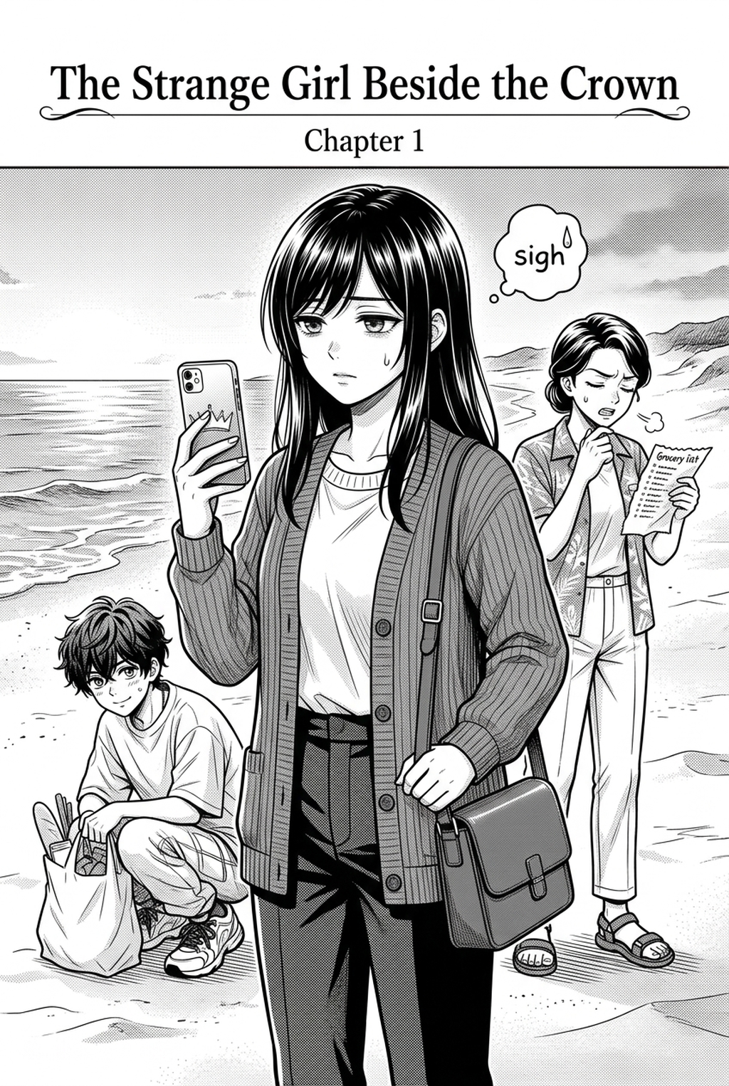
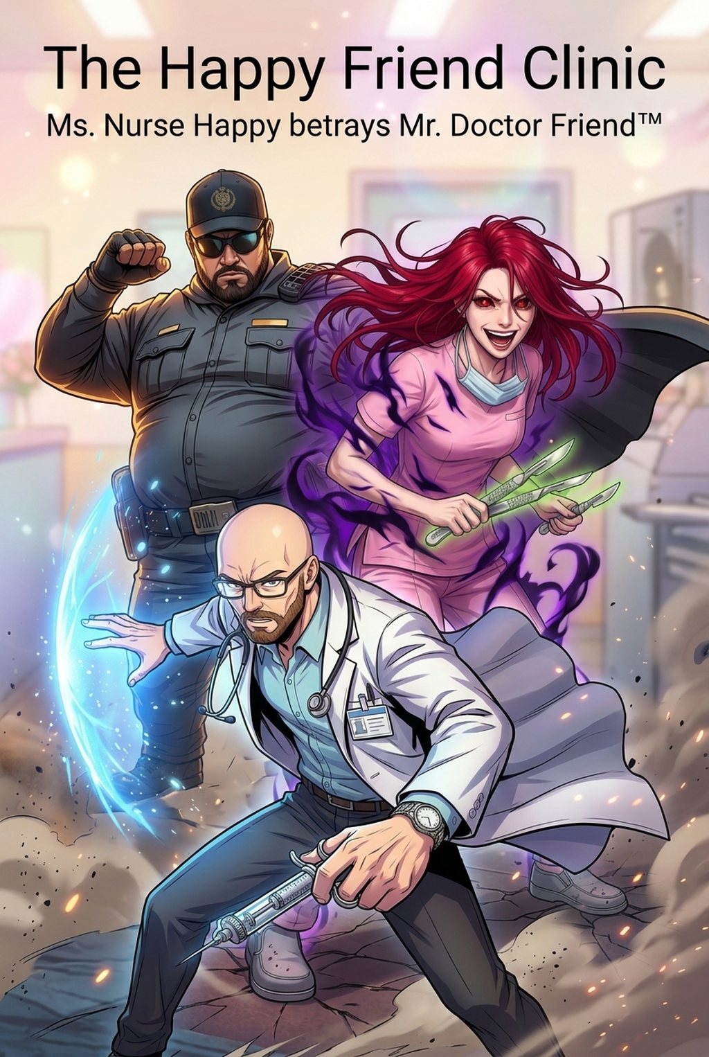
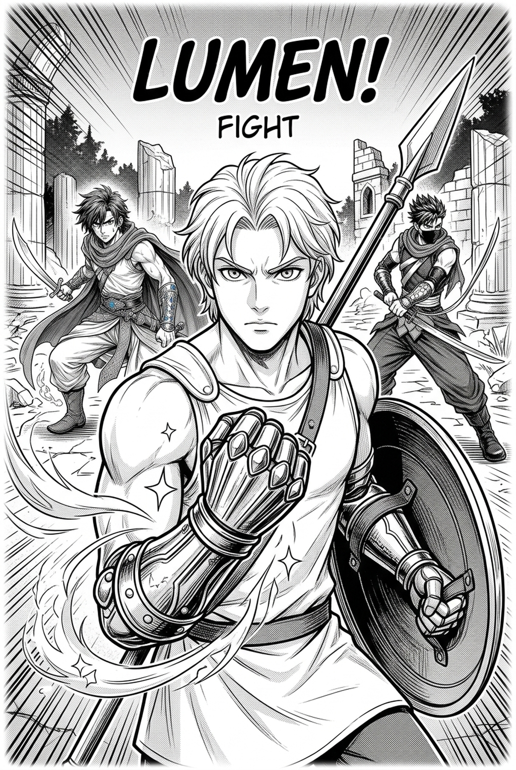
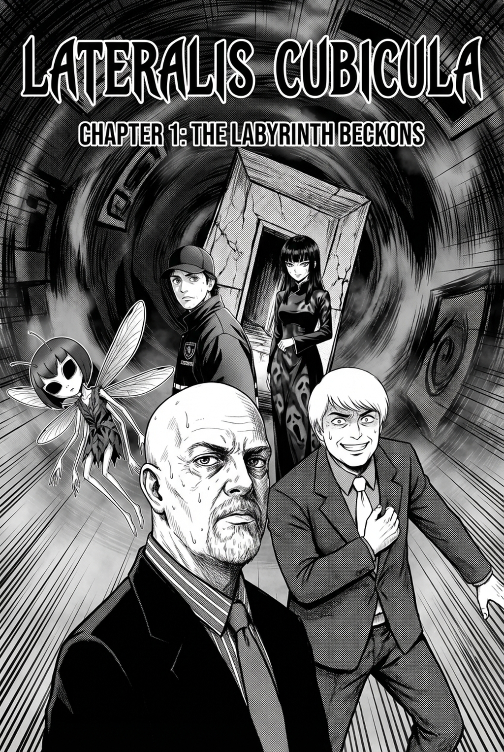
Image plan: five approved library images are reserved as cover plus four process illustrations; image URLs will be inserted after asset mapping is confirmed. Internal link: https://www.mangaka.app