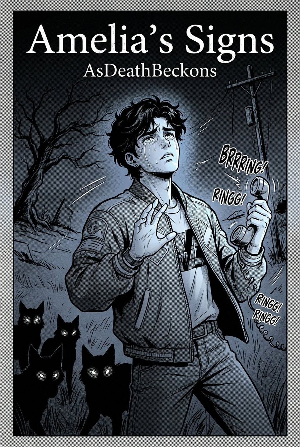
Designing digital comics has fundamentally transformed over the past decade. Traditional print layouts, once constrained by physical page turns, rigid trim boundaries, and fixed aspect ratios, have given way to the endless vertical canvas. Today, an online webtoon maker empowers independent creators, digital artists, novelists, and storytellers worldwide to format, design, and publish mobile-first digital comics with unprecedented speed, consistency, and visual clarity.
Whether you are transitioning from classic manga page construction or starting your very first digital comic series from scratch, mastering vertical scroll formatting is essential. Modern readers engage with webtoons primarily on smartphones, scrolling continuously with a thumb. This unique reading dynamic requires a complete reimagining of visual pacing, panel distance, dialogue placement, and emotional rhythm.
In this comprehensive, definitive guide, we unpack the technical standards, narrative mechanics, and practical workflows for creating professional vertical-format comics. We will explore how modern platforms like Mangaka streamline this entire process—combining intelligent layout generation, character consistency, and automated vertical paneling so you can focus entirely on storytelling.
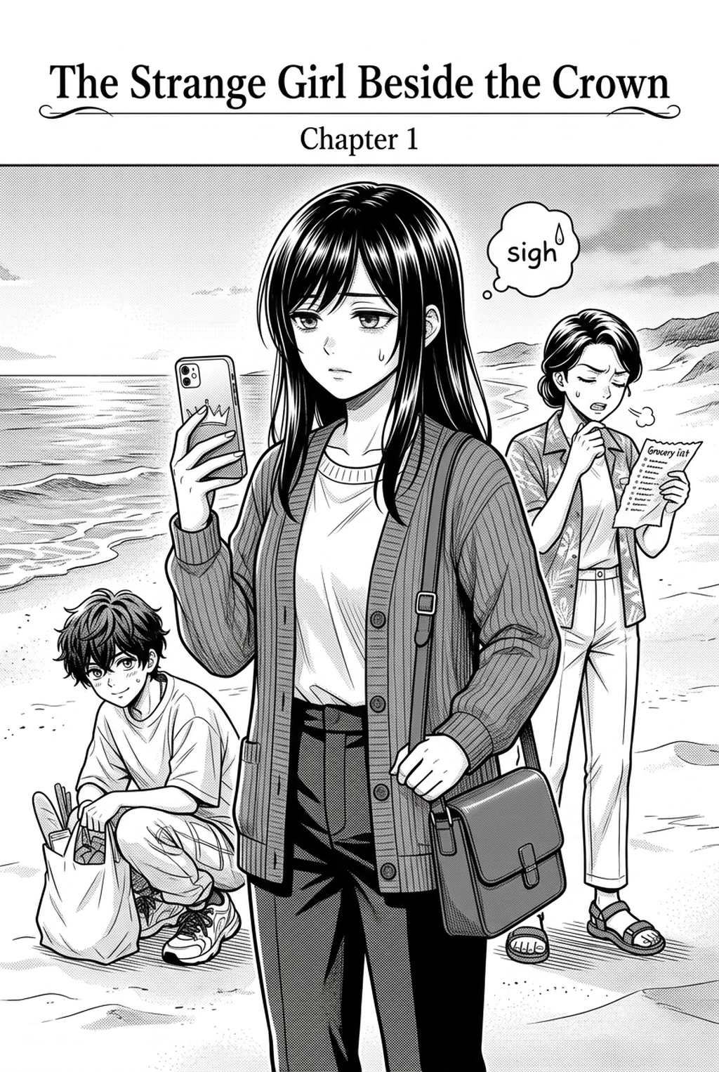
! Mangaka Discovery Catalog Figure 1: Exploring community webtoon projects on Mangaka Discovery , showcasing varied vertical layout aesthetics.
1. Understanding Vertical Scroll Dynamics: The Mobile-First Paradigm
The vertical scrolling format emerged as a direct response to mobile screen geometry. Unlike traditional print media, where readers scan two-page spreads horizontally from right-to-left (as in classic Manga ) or left-to-right (Western comics), Webtoon storytelling operates along a single temporal axis: continuous downward motion.
1.1 The Infinite Canvas Principle
The concept of the "infinite canvas," originally popularized in digital comic theory and formalized within the broader evolution of Digital comics , treats screen space as an unbroken continuum. Instead of turning pages to reveal plot twists, the author guides the reader's eyes through vertical progression.
In practical webtoon production, the canvas is technically divided into standardized image slices (commonly 800px wide by 1280px or 800px wide by 2000px high) to ensure swift loading over cellular networks. However, to the reader, these slices merge seamlessly into an uninterrupted stream. An effective online webtoon maker manages these slice transitions automatically, eliminating visible seam artifacts and ensuring that background gradients, speed lines, and character figures flow without distortion.
1.2 The Anatomy of Thumb-Paced Reading
On average, a mobile comic reader scrolls through a single panel in 1.2 to 2.5 seconds during dialogue scenes, and less than 0.8 seconds during rapid kinetic sequences. This reading speed dictates panel spacing:
- Compressed spacing conveys rapid interaction, overlapping dialogue, chaotic combat, or sudden realization.
- Extended gutters (vertical white or black space) signify temporal pauses, character isolation, emotional weight, atmospheric transition, or the passage of physical distance.
When you assemble panels using an online webtoon maker, manipulating gutter height is equivalent to controlling cinematic timing. A distance of 400 to 600 pixels between panels introduces a palpable beat of silence—giving the reader space to absorb dramatic revelations before revealing the consequence in the next panel.
1.3 The Psychological Impact of Continuous Vertical Flow
Reading horizontally mirrors the scanning pattern used in standard Western literature, which tends to encourage rational, analytical comprehension. In contrast, vertical scrolling mimics descending motion, falling, exploration, and immersive tracking. Neurologically, vertical mobile scrolling stimulates sustained dopamine-driven curiosity: each thumb swipe uncovers hidden visual information lurking just beneath the lower fold of the mobile viewport.
When artists design vertical comics, they are choreographing a continuous sequence of micro-reveals. If a character looks downward in horror, the reader naturally swipes downward to discover what terrified them. If an arrow is released, the trailing speed line drags the reader down the canvas, culminating in the point of impact three viewports below. This visceral tactile connection between the physical touch of the user's thumb and the on-screen narrative flow creates an intimacy that horizontal print pages simply cannot replicate.
2. Technical Specifications: Canvas Sizing, Slicing, and Aspect Ratios
Before diving into narrative composition, establishing standard technical baselines prevents costly rework during export and publishing.
2.1 Standard Resolution and Dimensions
Across major publishing hubs and digital platforms, standard dimensions have coalesced around specific dimensions:
- Base Canvas Width: Standard webtoon publishing width is fixed at 800 pixels (or 1600 pixels at 2x retina scale for ultra-crisp display).
- Working Resolution: 300 DPI is strongly recommended if you ever plan physical collector prints or art books, though digital screen display renders at 72 DPI to 150 DPI.
- Slice Height Limits: Most mobile webtoon engines require image slices between 800 x 1280 pixels and 800 x 2000 pixels. Slices exceeding 4096 pixels in height often trigger memory bottlenecks on mid-tier mobile browsers or cause aggressive image compression artifacts.
- Aspect Ratio Awareness: Familiarizing yourself with mobile display Aspect ratios )—predominantly 19.5:9 on modern OLED devices—allows you to plan full-bleed panels that completely occupy the reader's view.
2.2 Standard Layout Comparison Table
| Parameter / Element | Traditional Manga Page | Vertical Scroll Webtoon | Automated AI Webtoon Workflow |
|---|---|---|---|
| Reading Direction | Right-to-Left (Z-path) | Continuous Top-to-Bottom | Linear Top-to-Bottom with Smart Anchors |
| Standard Canvas | B4 (approx 250 x 353 mm) | 800px width × variable height | 800px / 1600px responsive vector/raster |
| Panels Per View | 4 to 8 panels per spread | 1 to 2 panels visible simultaneously | Dynamic scrolling container adaptation |
| Gutter Function | Structural separation (2–5mm) | Narrative pacing & temporal beats (100–800px) | Automated pacing algorithm based on script tension |
| Lettering & Bubbles | Vertical or horizontal text | Horizontal mobile-optimized (14–18pt minimum) | Auto-wrapping responsive dialogue bubbles |
| Color Model | Grayscale / Screentones | Full RGB digital color | 24-bit RGB with atmospheric gradient presets |
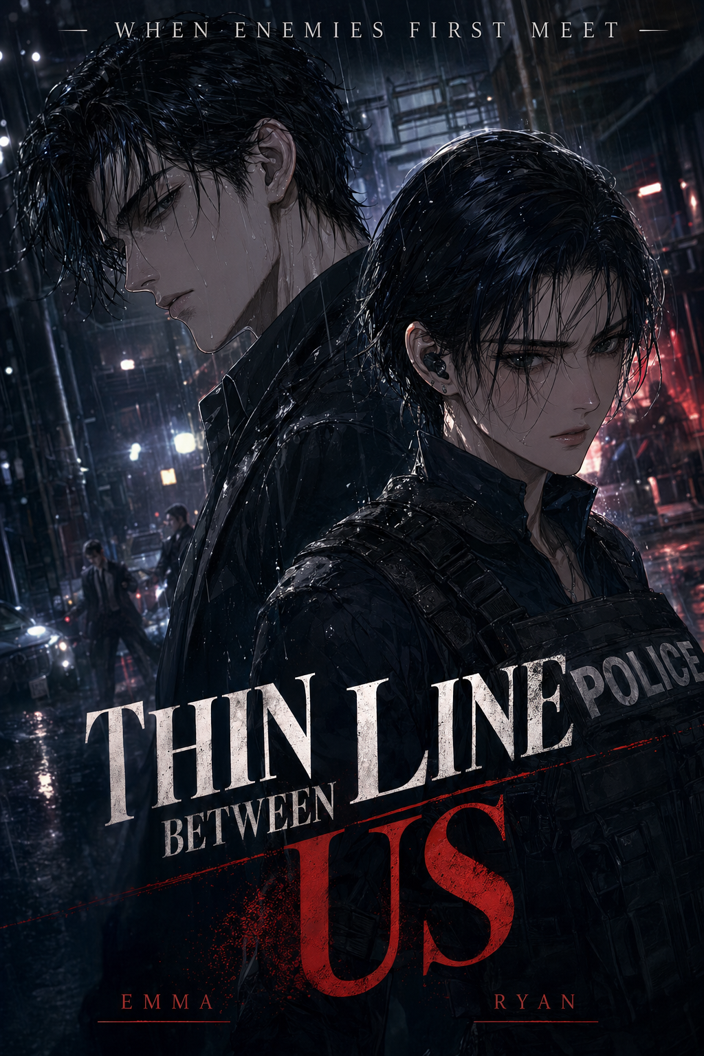
! Sacred Isle Cover Art Figure 2: Cover illustration from the community webtoon The Sacred Isle , illustrating dynamic vertical character composition.
2.3 Color Profiles, Export Formats, and Compression Benchmarks
Digital webtoons exist entirely within the RGB color space. Working in CMYK by mistake results in dull, desaturated neon hues when rendered on vibrant OLED mobile phone displays.
- Color Profile: Always set your working document to sRGB IEC61966-2.1. This ensures uniform color fidelity across iPhones, Samsung Galaxy devices, Xiaomi screens, and desktop displays.
- Compression Artifacts: Comic line art features razor-sharp contrast between pure black ink lines and vibrant flat colors. Traditional JPEG compression algorithms often introduce noisy "mosquito noise" around high-contrast edges. To mitigate this, set JPEG quality to at least 85%, or utilize modern WebP compression at 80% to 88% quality.
- File Sizing Thresholds: A standard 50-panel episode composed of 20 to 30 sequential slices should not exceed 15MB to 20MB in aggregate weight. Excessively heavy files lead to buffering pauses that destroy dramatic tension during continuous scrolling.
3. Core Composition Principles for Vertical Webtoons
Constructing a compelling vertical comic requires deliberate adherence to cinematic flow. Below are the foundational rules applied by top professional webtoon studios.
3.1 The One-Screen, One-Focus Rule
Because the reader's viewport is physically restricted by smartphone dimensions, displaying more than one primary focal point simultaneously leads to cognitive overload.
- In action scenes: Never place two critical impacts in the same vertical screen frame unless they are explicitly designed as an immediate cause-and-effect split screen.
- In dialogue scenes: Position the speaker in the upper half of the viewport and the listener's reaction in the lower half, or separate them entirely across sequential downward panels.
3.2 Diagonal Eye-Flow Guidance
While the overall reading vector is strictly downward, reader eye motion within individual panels follows a subtle zigzag or diagonal flow. The natural pattern moves from top-left to bottom-right (in Western scripts) or top to bottom.
- Place speech bubbles at the entry point of the frame (top-left or top-center).
- Guide the eye downward through character posture, gaze direction, or leading environmental lines.
- Terminate the gaze at an action point or cliffhanger element situated at the lower-right margin of the frame.
- Use the subsequent gutter space to reset the reader's gaze toward the center of the screen before introducing the next panel.
3.3 Dynamic Panel Shapes and Borderless Transitions
A common beginner error is treating an online webtoon maker as a stack of identical rectangular boxes. While standard rectangles provide stability during expository dialogue, dynamic vertical comics leverage creative panel manipulation:
- Borderless Panels: Characters emerging outside panel boundaries create an illusion of depth and physical presence, making the scene feel immediate.
- Diagonal Slanted Cuts: Angular panel edges communicate speed, urgency, tension, and kinetic impact.
- Torn or Dissolving Edges: Soft feathering or disintegrating panel borders effectively convey flashbacks, dream states, psychological distress, or magic dissolution.
- Full-Bleed Climactic Drops: A massive vertical illustration stretching across 3000 to 5000 continuous pixels without panel borders forces the reader to scroll slowly, creating a breathtaking sense of monumental scale (e.g., a towering colossus, an endless subterranean chasm, or a catastrophic magical explosion).
+------------------------------------------+
|  Top Safe Zone (60px padding)            |
|                                          |
|  [Speech Bubble 1]  ---> Eye Entry Point |
|         \                                |
|          \  (Character Focal Gaze)       |
|           \                              |
|            v                             |
|       [Action Climax] ---> Eye Exit      |
|                                          |
+------------------------------------------+
|  Gutter Space (200px - 500px)            |
|  *Reader thumb swipes; eye resets*       |
+------------------------------------------+
|  Next Panel Header / Speech Bubble 2     |
|  ...                                     |
3.4 Spatial Anchoring and Negative Space
Negative space in vertical comics is not empty real estate; it is an active storytelling tool. In manga, background screech tones and cross-hatching fill the page to denote intensity. In webtoons, vast expanses of pitch black, pristine white, or ambient sky blue serve as emotional resonators:
- A lone character positioned in a tiny panel surrounded by 800 pixels of pure white gutter conveys overwhelming grief, profound abandonment, or physical exhaustion.
- A silhouette plummeting through 1200 pixels of continuous dark gradients evokes claustrophobia, deep dread, or bottomless falling.
- In romance and slice-of-life titles, floating floral petals, sparkling light leaks, and dust particles drifting through the gutters bridge separate panels together, establishing an unbroken lyrical atmosphere.
4. The Step-by-Step Production Workflow with an Online Webtoon Maker
Producing a serialized vertical comic requires an efficient, repeatable pipeline. Here is how modern creators utilize digital platforms and online webtoon generators to execute a complete chapter from script to publication.
[Raw Script / Story Outline]
            │
            ▼
[Panel Breakdown & Beat Sheet]
            │
            ▼
[Automated / Manual Layout Assembly]
            │
            ▼
[Character Asset & Background Generation]
            │
            ▼
[Lettering, Speech Bubbles & Sound FX]
            │
            ▼
[Slice Export & Mobile Preview QA]
Step 1: Script Structuring for Vertical Rhythm
Transforming a standard prose story into a vertical comic begins with calculating panel count per narrative beat. A standard webtoon episode typically contains between 45 and 75 panels.
- Opening Establishment (Panels 1–8): Establish location, ambient weather, mood, and current situation using wide atmospheric panels and generous gutter spacing.
- Inciting Development (Panels 9–25): Character interaction, exposition, subtle conflict escalation.
- Climax / Kinetic Turning Point (Panels 26–45): Dramatic clash, revelation, dynamic diagonal panels, high contrast color palettes.
- Resolution / Episode Hook (Panels 46–55): Lingering emotional resonance followed by an irresistible narrative cliffhanger right at the bottom edge.
Step 2: Storyboard Roughs and Digital Layout
In classic comic production, this stage is known as the "name" (thumbnail draft). When utilizing an online webtoon maker:
- Select your primary canvas template (e.g., 800px width with automatic continuous height extension).
- Block out dialogue bubbles first. Placing text bubbles before finalizing character poses prevents cramped lettering and ensures dialogue never obscures critical facial expressions.
- Adjust panel margins. Ensure at least 60px padding between panel borders and the canvas edge to avoid clipping on mobile displays with rounded corners or camera punch-holes.
Step 3: Generating Visuals and Consistent Characters
Maintaining character consistency across dozens of panels has historically been the highest hurdle for indie creators. Traditional digital drawing requires hundreds of hours of manual inking and coloring.
On platforms like Mangaka , creators can leverage integrated AI drawing engines that respect character design sheets. By supplying reference profiles and stylistic prompts, you can generate character variations in various emotional states—joy, rage, terror, contemplation—all rendered in consistent line art and coloring. For example, popular community titles like Kem Lives Alone and Tran Viet demonstrate how consistent visual motifs can be achieved across diverse creative genres, ranging from cartoon slice-of-life to dramatic historic fantasy.
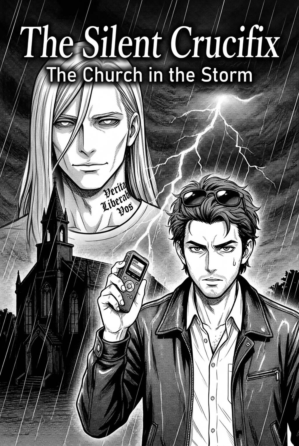
! Sacred Isle Action Scene Figure 3: Dynamic panel action sequence from The Sacred Isle , highlighting kinetic effects and vertical speed lines.
Step 4: Adding Lettering and Visual Sound Effects (SFX)
Lettering in webtoons is not merely functional text; it is an active visual component of the artwork:
- Font Selection: Use clean, highly legible sans-serif or comic dialogue fonts (e.g., CC Wild Words, Anime Ace, or Komika Axis) at a minimum size of 15pt at 800px width.
- Bubble Architecture: Keep dialogue concise—rarely exceed 20 to 25 words per individual speech bubble. If a character speaks an extended monologue, divide the dialogue across three or four smaller bubbles cascading vertically down the gutter.
- Sound Effects (Onomatopoeia): Render sound effects directly integrated into the environment. Large, stylized typography that interacts with characters or bends around objects enhances spatial immersion.
Step 5: Slicing and Compression Optimization
Once your chapter layout is complete, export the project using automated slicing routines:
- Standard slice parameters: 800px wide by 1280px tall.
- File format: WebP or optimized JPEG at 85% quality. WebP offers approximately 30% smaller file sizes than JPEG with zero perceptual loss in line sharpness, significantly speeding up mobile loading times.
- Verify total episode package size: Aim to keep an entire 50-panel episode under 15MB to ensure seamless reading on 4G and mobile connections worldwide.
5. Overcoming Common Vertical Formatting Mistakes
Even experienced illustrators frequently stumble when adapting to vertical comic composition. Here are the five most prevalent errors and practical solutions for each:
Mistake 1: The "Wall of Panels" (Insufficient Gutters)
Placing panels back-to-back with only 20 or 30 pixels of separation creates severe visual exhaustion. Readers feel rushed, and dramatic moments lose their impact.
- Solution: Enforce a minimum gutter rule. Maintain at least 150px to 250px between standard conversational panels, and expand to 500px to 800px when transitioning between scenes or underscoring solemn story beats.
Mistake 2: Cramped Text Bubbles
Attempting to fit lengthy narrative exposition into tiny bubbles forces font sizes down below comfortable mobile readability limits (under 12px), causing readers to pinch-zoom or abandon the series.
- Solution: Edit dialogue ruthlessly. Show, don't tell. Let character expressions convey emotion and distribute necessary exposition across progressive scrolling beats.
Mistake 3: Disregarding Screen Safe Zones
Placing crucial text or focal points right at the extreme outer edges (within 30px of the canvas border) risks visual clipping on smartphones with bezel cutouts, rounded corners, or platform UI overlays.
- Solution: Establish an internal 60px safe margin on both left and right edges. Restrict speech bubbles and focal character eyes within this protected central column.
Mistake 4: Static Perspective and Headshots
Relying exclusively on medium headshots across dozens of scrolling panels leads to visual monotony.
- Solution: Alternate camera elevation and focal distance continuously. Follow an extreme wide establishing shot with a close-up on eyes, followed by a dramatic Dutch-angle low shot looking upward, followed by an over-the-shoulder reaction frame.
Mistake 5: Neglecting Color Continuity Across Slices
When a background gradient spans across two separate image slices, imprecise slicing or mismatched compression settings can create an ugly horizontal seam.
- Solution: Use integrated online webtoon export tools that calculate slice breaks along solid color planes or naturally empty gutter segments rather than cutting through complex illustrated gradients.
6. Real-World Creator Case Studies: Lessons from Mangaka.app
The creator ecosystem on Mangaka offers compelling real-world evidence of how modern online tooling elevates webtoon storytelling.
Case 1: The Cozy Atmosphere in "Kem Lives Alone"
In the slice-of-life comedy Kem Lives Alone , creator pacing relies on expansive white gutters and deliberate rhythmic beats. Rather than crowding the canvas with rapid panels, the creator allows small, expressive character vignettes to float amidst clean space. This formatting choice mirrors the protagonist's quiet, solitary existence, creating a soothing and charming reading experience perfectly suited to evening mobile scrolling.
Case 2: Historical Drama and Dense Pacing in "Tran Viet"
Conversely, historical epic Tran Viet demonstrates vertical composition in high-stakes dramatic storytelling. The creators utilize deep earth tones, textured parchment backgrounds that extend continuously through gutters, and diagonal panels that break into the reading path during intense martial confrontations. By utilizing Mangaka's high-resolution asset pipeline, fine architectural details and traditional armor patterns remain sharp and vivid on mobile screens.
Case 3: Emotional Resonance in "My Hazel"
In the romance narrative My Hazel , vertical distance is used metaphorically. When the two central characters experience emotional distance, panel gutters stretch downward over several full screen swipes, physically emphasizing separation. When they reconcile, panels converge, overlapping one another in a warm, unified color palette.
7. Advanced Technical Nuances: Asset Libraries and Mobile Optimization
Creating webtoons at scale demands robust asset management and performance optimization. Professional webtoonists build extensive libraries of recurring assets to accelerate weekly serialization.
7.1 Reusable Asset Silos
- Background Silos: Recurring interior sets (classrooms, fantasy taverns, throne rooms, modern apartments) can be rendered in 3D or generated in 2D from multiple camera angles. Keeping consistent ambient lighting across these assets ensures that scene changes feel natural.
- SFX Typography Banks: Pre-rendered sound effect lettering (impact crashes, whispers, ambient rain, blade clashes) with translucent drop shadows can be rapidly dragged and dropped into gutters.
- Chibi and Reaction Stamps: Stylized miniature reaction figures inject humor into transitional gutters without requiring full background rendering.
7.2 Web Accessibility and Mobile Readability
Making your vertical webtoon accessible to all audiences expands your readership dramatically:
- High-Contrast Text: Ensure that dialogue text maintains a minimum contrast ratio of 4.5:1 against the interior background of the speech bubble.
- Font Kerning and Line Spacing: Use line-height multipliers of 1.3 to 1.5 to prevent overlapping descenders and ascenders, ensuring smooth readability for readers with dyslexia or low vision.
- Screen Reader Friendly Scripts: Maintaining a structured text transcript alongside your visual comic allows visually impaired fans to experience your story via accessibility screen readers.
8. The Future of Webtoon Creation: AI Integration and Generative Canvas Tools
The integration of artificial intelligence into online webtoon makers is redefining the boundaries of indie comic production. AI assistance does not replace the author's creative voice; rather, it dismantles technical bottlenecks that previously required large studio backing.
- Automated Layout Suggestions: Analyzing script emotional tags to propose optimal gutter distances and panel shapes automatically.
- Instant Translation and Localization: Translating sound effects and dialogue bubbles into multiple languages while automatically resizing text containers to maintain aesthetic balance.
- Responsive Dynamic Panels: Future webtoon engines are experimenting with responsive comic panels that adjust padding and flow dynamically according to the reader's specific screen dimensions.
- Interactive Scroll Triggers: Integrating parallax motion and subtle ambient sound effects triggered precisely as specific panel coordinates cross the mobile viewport.
By mastering the principles of vertical scroll formatting today, you position your creative work at the forefront of digital literature and entertainment.
9. Comprehensive Comparison: Traditional Desktop Software vs. Cloud-Native Webtoon Makers
Many creators wonder whether to stick with legacy desktop graphics suites (such as Clip Studio Paint, Photoshop, or SAI) or migrate toward browser-based, cloud-native webtoon makers. Below is an objective operational breakdown:
| Feature / Capability | Legacy Desktop Software | Cloud-Native Webtoon Maker (Mangaka) |
|---|---|---|
| Hardware Requirements | Powerful PC/Mac, dedicated GPU, drawing tablet | Any modern web browser (Laptop, Chromebook, Tablet) |
| Asset Collaboration | Manual file transfers, cloud folder sync, version conflicts | Real-time cloud autosave, multi-user workspace sharing |
| Slicing Pipeline | Manual slice tool configuration, third-party export scripts | 1-Click automated responsive slicing with smart boundaries |
| Character Consistency | Requires 100% manual redraws and design reference checks | AI model anchoring, prompt-consistent character generation |
| Publishing Integration | Manual upload to each hosting platform one by one | Direct API publishing to webtoon hubs and creator portals |
| Learning Curve | High (dozens of nested menus, brush calibrations) | Low to Medium (intuitive canvas drag-and-drop, smart presets) |
For solo creators and agile indie storytelling teams, cloud platforms remove technical overhead, allowing uninterrupted artistic iteration.
10. Frequently Asked Questions (FAQ)
What is the ideal width and resolution for creating an online webtoon?
The industry standard width for vertical webtoons is 800 pixels (or 1600 pixels for high-density 2x displays). The working resolution should be set between 150 DPI and 300 DPI during asset preparation, while exported image slices are optimized for web delivery at 72 to 150 DPI. Keeping width standardized at 800px ensures universal compatibility across all major mobile webtoon apps and browser readers.
How much vertical spacing (gutter) should I leave between webtoon panels?
For standard conversational dialogue, leave between 150px and 300px of vertical gutter space. For scene transitions, temporal shifts, or intense emotional beats, increase spacing to 500px to 800px (equivalent to roughly half to a full mobile screen swipe). Fast-paced action sequences can reduce gutter spacing down to 50px to 100px or use overlapping diagonal panels to convey rapid speed.
Can I create a vertical webtoon if I cannot draw?
Yes. Modern online webtoon platforms like Mangaka allow creators to produce professional webtoons using AI-assisted generation. By supplying written character descriptions, script outlines, and stylistic prompts, the platform helps you generate consistent characters, background art, and dynamic panel layouts. You maintain complete creative control over storytelling, pacing, and dialogue while the system handles technical execution.
How should I slice long vertical webtoon canvases for publishing?
Divide long vertical episodes into individual image slices measuring 800px wide by 1280px to 2000px high. Slices should not exceed 4096px in height to prevent memory allocation errors and lag on mobile web browsers. Modern online webtoon makers and image editing suites provide automated slicing tools that batch-export and sequentially number each segment seamlessly.
What file format is best for webtoon image slices?
WebP is the superior modern format, offering 25% to 35% smaller file sizes than traditional JPEGs while preserving razor-sharp line art and vibrant digital colors. If your publishing target does not yet support WebP, use JPEG compressed at 80% to 85% quality. Avoid uncompressed PNG files for full-color webtoon episodes, as their large file sizes cause noticeable loading delays on cellular networks.
How many panels should a typical webtoon episode contain?
A standard commercial webtoon episode typically contains between 40 and 60 panels, which translates to approximately 10,000 to 20,000 pixels of total vertical canvas height. For independent creators releasing weekly or bi-weekly episodes, a concise pacing of 25 to 40 panels provides an engaging story chunk without risking creator burnout.
11. Conclusion and Actionable Roadmap for Creators
Vertical scroll formatting represents far more than a technical specification; it is an organic, cinematic visual language engineered specifically for our connected mobile world. By understanding gutter timing, respecting screen boundaries, optimizing mobile typography, and leveraging powerful online webtoon tools like Mangaka , anyone with a compelling story can reach a global audience.
Creator Action Checklist:
- Define Your Canvas: Set width to 800px and initialize 60px lateral safe margins.
- Structure the Beat Sheet: Map out 40 to 50 panels per chapter with clear narrative pacing arcs.
- Establish Gutter Rhythm: Apply 200px gutters for dialogue and 600px gutters for emotional pauses.
- Enforce Readability: Keep font sizes above 15pt and dialogue under 25 words per speech bubble.
- Optimize and Slice: Export into WebP slices under 2000px height and confirm overall file weight under 15MB.
Ready to bring your story to life? Explore inspiring stories on Mangaka Discovery , study the visual flow of community works like Tran Viet and Kem Lives Alone , and start constructing your first vertical webtoon chapter today!