Manga SFX Generator: Adding Dynamic Japanese Onomatopoeia
TL;DR (Quick Takeaways) * Sound effects are drawn, not typed: Japanese onomatopoeia (giongo, giseigo, gitaigo, gijougo) works as part of the artwork. It has weight, direction and depth, and it can even change how a reader feels about a silent panel. * Match the lettering to the energy: Heavy impacts want thick, angular strokes. Creeping dread wants thin, quiet ones. Placement, scale and a clean outline matter more than owning an exotic font. * Plan the sound before you letter it: Decide which two or three sounds on a page deserve visual emphasis, leave room for them when you stage the panels, then add them last so they sit on top of finished art, tones and bubbles. Direct Answer: A manga SFX generator is any workflow or tool that turns an acoustic event, an atmosphere or a feeling into stylised Japanese phonetic lettering (usually katakana, sometimes hiragana or kanji) and places it inside the panel with the right size, angle, outline and layering. Used well, it makes a hit feel heavier, a silence feel emptier and a heartbeat feel closer.
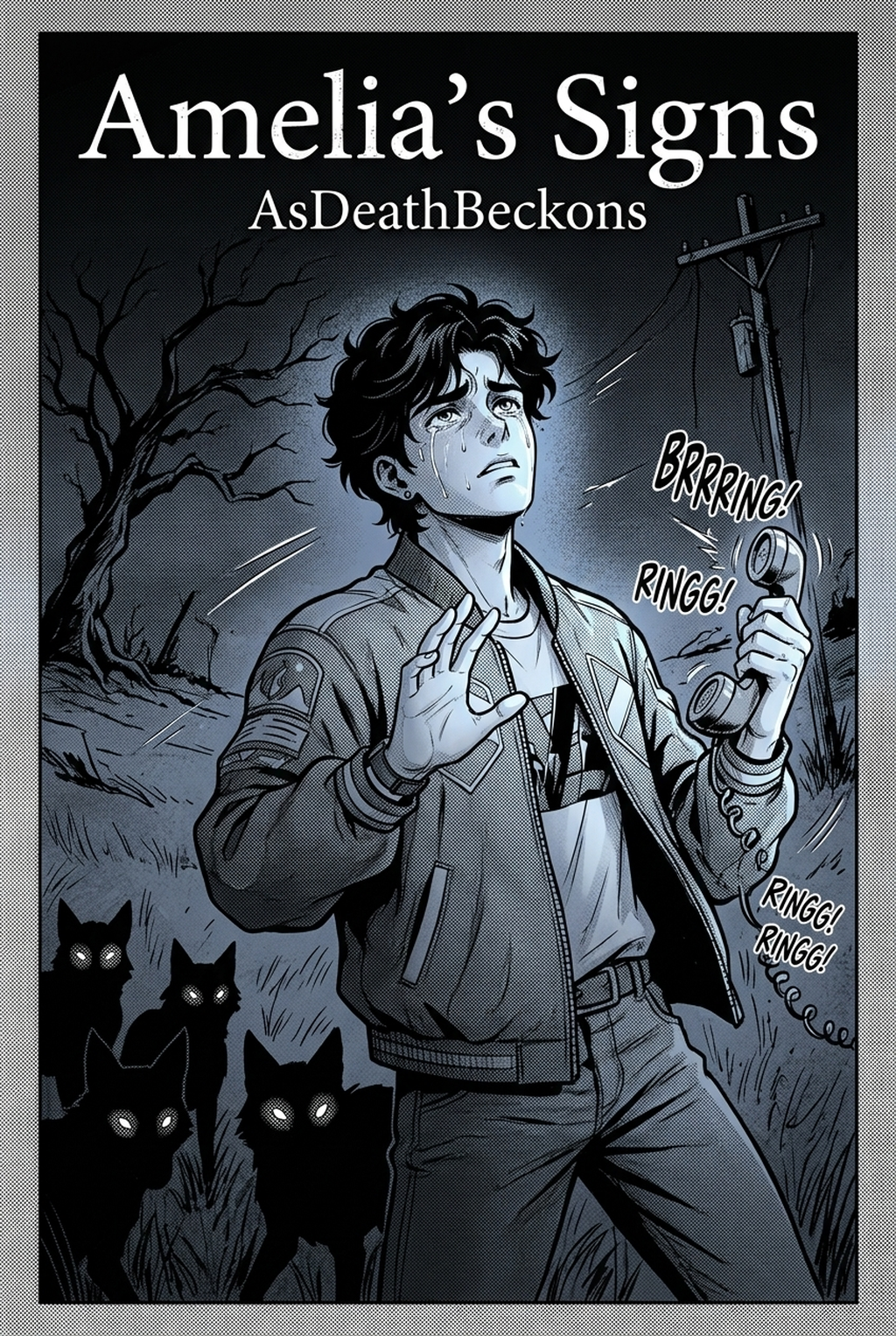
! Cover Image: Dynamic Japanese Manga Sound Effects and Kinetic Typography Caption: Figure 1.0 - The typographic anatomy of Japanese manga sound effects: analyzing katakana brush deformation, perspective skewing, and kinetic impact vectors.
1. Why Japanese Sound Effects Are Part of the Picture
Open any action chapter and look at the loudest panel. Chances are the biggest thing on the page is not a face or a fist but a few chunky characters that look as if they were hit with a hammer. In a lot of Western comics a sound effect is a caption: "CRASH!" floats near the damage and tells you what you already see. In manga the lettering often is the damage. It cuts across the frame, breaks the border, sits behind a flying character and in front of the debris, and carries speed and weight that the line art alone cannot.
That difference is partly linguistic. Japanese has a huge stock of sound-symbolic words, and many of them describe things that make no noise at all. A character does not need to say anything for the page to read "awkward silence", because the word for it, シーン (shiin), can simply be drawn in the empty space above their heads. The same goes for a creepy grin, a sudden shiver or a heart that skips. If you have only ever treated sound effects as decoration, the first lesson is that in this tradition they are closer to a second layer of storytelling.
The vocabulary is usually grouped into four families:
- Giongo (擬音語): sounds made by non-living things, such as metal clashing, a door slamming or thunder rolling.
- Giseigo (擬声語): voices of living creatures, such as a roar, a sob or a bark.
- Gitaigo (擬態語): silent states, textures and appearances, such as a sticky surface, a sleepy blink or a menacing glare.
- Gijougo (擬情語): inner feelings and bodily sensations, such as a pounding heart, a chill down the spine or a nervous stomach.
Many dictionaries and teachers simply fold giseigo into giongo, and some do not use gijougo as a separate label, so do not worry if you see the categories drawn differently elsewhere. For a working artist the useful split is simpler: sounds you could record and feelings you could only draw.
If you want the broader background on how manga developed its visual language, the Wikipedia overview of manga is a reasonable starting point, and reading a few free chapters on MANGA Plus shows professional sound lettering at work far better than any description can. Pay attention to how the same studio treats a punch, a footstep and a long silence in completely different ways.
This guide is written for anyone who wants to add that layer to their own comics: webtoon makers, students, hobbyists and small teams. It covers what the effects mean, how they behave inside a panel, a reference table of common sounds, a step-by-step production routine, ways to handle readers who cannot read katakana, practical placement rules, common mistakes and a short practice plan. A browser-based studio such as Mangaka.app can handle the groundwork (generating panels from your script, laying them out, keeping characters consistent, adding speech bubbles and screentones, and exporting the pages), which leaves you free to concentrate on where the sound goes.
2. Reading a Sound Effect: Writing Systems and Meaning
Before you generate or letter anything, it helps to know what you are actually writing. Japanese uses three scripts, and sound effects borrow from all of them.
Katakana: the default for hard, external sounds
Most sound effects in action and comedy manga are written in katakana, the angular script that Japanese also uses for foreign loanwords and emphasis. Its straight, sharp strokes suit impacts, and it is easy to distort into spikes and splatters without losing legibility. When you see ドン (don), バキッ (baki) or ザッ (za) in a battle scene, you are looking at katakana doing what it does best.
Hiragana: softer, rounder, more intimate
Hiragana is the curvier script. Sound effects for gentle or organic things, such as ふわふわ (fuwafuwa, fluffy or floaty) or すやすや (suyasuya, sleeping peacefully), are often written in hiragana because the rounded shapes match the mood. Romance and slice-of-life titles lean on it heavily, but it can also appear in tense scenes when the artist wants something creepy to look soft.
Kanji: rare, but dramatic
Kanji turns up in a few memorable cases, especially in older or highly stylised work, where a single large character can stand in for a whole sound or concept. Unless you read Japanese confidently, treat kanji sound effects as a specialist technique. A wrong or awkward character is much more obvious than a slightly clumsy katakana string.
Repetition and small marks carry meaning
Two details are worth learning early:
- Repetition adds duration or rhythm. ドキドキ (dokidoki) is a continuing, fast heartbeat. A single ドクン (dokun) is one heavy beat. ゴゴゴ works by repeating the same symbol until the page seems to rumble.
- Small characters and symbols change the sound. A small ッ (tsu) at the end of a word, as in バキッ, cuts it short and makes it sharp. A long dash ー stretches a sound out, as in シーン or ザーザー (steady heavy rain).
Once you can spot those two signals, you can read most sound effects on a page without a dictionary, and you can start varying your own: more repeats for something sustained, a hard stop for something sudden, a stretched vowel for something that lingers.
What the table below is for
Think of the next table as a pocket reference, not a complete dictionary. It lists a handful of effects you will meet often, the situation each suits and the lettering style that tends to work. The readings are standard, but individual artists invent their own variants all the time, which is part of the fun.
| Japanese | Romaji | Rough meaning | Typical use | Lettering style that tends to work |
|---|---|---|---|---|
| ドン | don | Heavy thud, boom | Impact, drum, sudden arrival | Thick, blocky katakana with a hard black fill |
| ドドド | dododo | Rumbling, charging | Approaching crowd, engine, mounting pressure | Repeated blocks with speed lines behind them |
| ゴゴゴ | gogogo | Ominous rumble | Menacing presence, a shift in power | Large, trembling strokes with heavy outlines |
| バキッ | baki | Snap, crack | Breaking bone, wood or ice | Fractured, jagged edges with sharp points |
| ザッ | za | Quick step or sweep | Dash, landing, drawing a weapon | Long horizontal strokes that lean with the movement |
| ドキドキ | dokidoki | Fast heartbeat | Nerves, attraction, suspense | Rounded characters near the chest, slightly bouncing |
| シーン | shiin | Dead silence | Awkward pause, shock, empty room | Thin, widely spaced strokes in a lot of white space |
| ガシャン | gashan | Crash of metal or glass | Smashed window, dropped tray | Splintered strokes scattering outwards |
| ゴロゴロ | gorogoro | Rolling rumble | Thunder, something rolling | Wide, low strokes spread across the sky |
| ニヤリ | niyari | Sly grin | Villain's smirk, private joke | Narrow, curved strokes beside the mouth |
! Content Image 1: Visual Comparison of Giongo, Gitaigo, and Gijougo Lettering Styles Caption: Figure 2.0 - Evaluating font weights and perspective distortion across physical impact versus psychological atmosphere SFX.
3. Spatial Anatomy: How Sound Sits Inside the Panel
A common beginner mistake is to draw or generate an entire manga page, admire the line art, and then drop a sound effect wherever an empty patch of screen happens to remain. That approach turns the lettering into an afterthought. In professional manga, the sound effect is designed into the panel's perspective, reading flow, and tonal depth from the very beginning.
To achieve this natural integration, you need to understand three core spatial rules:
1. Vector Perspective Alignment and Vanishing Points
Sound in sequential art has physical volume, origin, and velocity. When a cannon fires down a narrow stone corridor toward the horizon, the accompanying sound effect (ドカーン / dokaan) should not sit flat against the camera lens. Instead, the characters should taper down in three-dimensional perspective, snapping along the vanishing lines of the corridor walls.
- Outgoing Action (Moving Away): The first katakana glyph begins large near the foreground source and progressively shrinks toward the distant vanishing point.
- Incoming Threat (Approaching the Camera): A charging beast or flying fist starts small in the background and explodes in scale as it nears the panel frame, forcing the sound effect characters to expand dramatically over the foreground.
- Rotational and Angular Torque: If a martial artist performs a spinning roundhouse kick, curve the baseline of the sound effect along the arc of the kick. The typography itself reinforces the circular kinetic motion of the limb.
2. Kinetic Stroke Deformation and Tonal Fill
The stroke architecture of the glyph must embody the physical texture of the acoustic event. A sound effect describing a laser beam should look fundamentally different from one depicting a wooden chair breaking:
- Heavy Physical Impacts and Explosions: Heavy katakana characters require thick, blunt stems with dry-brush edges, cracked textures, or ink splatters. Filling the glyph with solid black or a coarse 20% screentone gives it visual mass.
- Sharp Cutting Edges and Slashes: Slicing sounds (ザシュッ / zashu) call for elongated, needle-sharp triangular strokes that taper into razor points, emphasizing sudden, lethal speed.
- Atmospheric and Psychological Dread: Rumbles and tremors (ゴゴゴ / gogogo) demand jagged, quivering, uneven outlines that look as if the letters themselves are vibrating under low-frequency sonic resonance.
- Liquid Splashes and Trickles: Water or blood droplets (ポタポタ / potapota) benefit from softer, rounded terminals with fluid droplet splatters breaking off the character stems.
3. Depth Layering and Masking Hierarchies
One of the most powerful visual cues in Japanese manga is depth interweaving. If a sound effect sits entirely on top of every character and background element, it looks like a flat graphic sticker pasted onto the page. If it is buried completely behind everything, it loses its punch.
The standard professional layering hierarchy operates across three distinct planes:
- Foreground Overlap: Primary character silhouettes, fists, weapon tips, or immediate foreground scenery should overlap and cut into the sound effect characters. This instantly pushes the sound back into the physical scene behind the subject.
- Intermediate Sound Plane: The sound effect lettering sits directly behind the primary action point but in front of secondary characters, midground walls, and environmental details.
- Background Screentone Plane: Background speed lines (nagare or shūchūsen), ambient screentones, and distant sky textures sit behind the sound effect lettering.
When sound effects must overlap busy background crosshatching or screentone dots, always apply a crisp, opaque white border (outer stroke) around the black lettering. This clean negative-space halo prevents visual confusion, ensuring the sound effect remains instantly legible without destroying the intricate artwork underneath.
4. Comparing Digital Lettering Tools and SFX Workflows
Manga creators in 2026 have access to a wide spectrum of software options for handling sound effects, ranging from standalone raster drawing packages to modern browser-native comic studios. Choosing the right tool depends heavily on your production speed, artistic background, and hardware setup.
| Software / Platform | Primary SFX Method | Perspective & Warping Capabilities | Japanese Font Support | Learning Curve & Accessibility | Ideal Creator Profile |
|---|---|---|---|---|---|
| Mangaka.app | Browser-based AI generation, automated paneling, vector lettering, and sound presets | Snaps to panel perspective grids; kinetic warp tools inside the web browser | Integrated Katakana, Hiragana, and dual-layer English subtitle modes | Low; runs instantly on any laptop or desktop browser | Writers, solo indie creators, and webtoonists needing rapid end-to-end production |
| Clip Studio Paint | Vector text layers with mesh transform, custom raster calligraphy brushes | Full 3D perspective ruler snapping and vector control point manipulation | Excellent; supports full Japanese typography libraries and third-party font packages | Moderate to steep; desktop or tablet subscription required | Professional manga illustrators and studio assistants doing hand-inked lettering |
| Krita | Open-source SVG vector text tools and raster brush engines | Basic 2D transform, cage warp, and freehand drawing | Good; relies on system-installed Japanese fonts and manual calligraphy | Moderate; free desktop software | Budget-conscious creators and open-source advocates working on desktop hardware |
| MediBang Paint | Cloud-synced comic creation with pre-bundled comic text tools | Free transform and basic rotation; manual hand lettering | Strong library of commercial Japanese comic fonts included in cloud tier | Low to moderate; available on desktop and mobile | Manga hobbyists and mobile tablet artists seeking simple panel-to-panel lettering |
While full-featured desktop packages like Clip Studio Paint excel at complex hand-drawn calligraphy for high-end print publishing, they often overwhelm beginners with dense toolbars and steep subscription costs. Conversely, browser-native suites allow creators to generate consistent scenes, configure speech bubbles and screentones, and drop dynamic sound lettering directly into place without managing complex layer stacks across separate software programs.
5. Step-by-Step Production Guide: From Script to Finished Manga SFX
Lettering dynamic Japanese sound effects is a structured discipline combining narrative pacing, typography, and graphic design. Follow this comprehensive six-step workflow to integrate high-impact onomatopoeia into your comic pages:
Step 1: Audit the Panel Script and Establish Acoustic Hierarchy
Begin by reviewing your panel script and thumbnail sketches. Resist the urge to assign sound lettering to every minor movement. If a character steps forward, opens a door, gasps, and drops a cup in one panel, adding four separate sound effects will create deafening visual noise that halts the reader's eye.
Establish an acoustic hierarchy:
- Primary Acoustic Event (Dominant SFX): The central narrative climax of the panel (e.g., the cup shattering against marble tiles: ガシャン!). This receives 60% to 80% of your lettering scale and dynamic brush styling.
- Secondary Acoustic Event (Subordinate SFX): Subtle environmental or background motion (e.g., the door sliding shut: ピシッ). This is rendered in small, unobtrusive characters tucked near the panel edge.
- Omitted Actions: Minor, self-evident movements (e.g., blinking or foot shuffling) that the reader naturally infers from the line art without needing sound effects.
Step 2: Choose the Script System and Linguistic Nuance
Determine whether the acoustic event calls for katakana or hiragana. If your scene involves heavy physical collisions, machinery, or sudden shocks, default to katakana. If the scene focuses on soft emotional intimacy, creeping bodily shivers, or light fluttering breezes, test hiragana for a gentler, more organic touch.
For creators targeting an international readership across platforms like Webtoon or Tapas , decide on your localization strategy:
- Pure Japanese SFX: Authentic, immersive aesthetic preferred by traditional manga purists.
- Dual-Layer Japanese with Romanized Subtitles: The katakana glyphs form the visual artwork, while tiny sub-lettering underneath provides immediate English comprehension.
- Full Western Typography: Replacing Japanese characters entirely with stylized English sound words shaped to mimic Japanese typographic energy.
Step 3: Align SFX to Motion Vectors and Vanishing Points
Once your text string is chosen, position the sound effect directly along the path of action. Do not place lettering along a boring horizontal baseline unless the scene is static and calm.
Use your software’s warp, perspective transform, or mesh deformation tools:
- If a sword slashes diagonally from top-right to bottom-left, rotate and taper the characters along that exact downward trajectory.
- If an explosion emanates outward from a central crater, bow the sound effect along an outward radial curve, reinforcing the blast wave.
- Ensure the characters increase in scale toward the point of maximum impact, giving the illusion that the sound is expanding in volume.
Step 4: Craft the Visual Weight, Stroke Style, and Screentones
Next, sculpt the physical appearance of the glyphs to match the scene's emotional tone:
- Inking the Stroke: Apply dry-brush distress, jagged polygonal spurs, or clean razor edges depending on whether the sound is blunt, magical, or sharp.
- Applying Tone and Fill: Fill the interior of the lettering with solid black, pure white, or a traditional manga screentone dot pattern (such as a 30% to 50% dot tone). Using screentone fills inside large sound characters helps blend them seamlessly with the surrounding manga shading.
- Adding the Negative Space Boundary: Always add an opaque white contour or halo (2px to 6px wide depending on canvas resolution) around the outer perimeter of black glyphs. This ensures the characters never get lost against dark backgrounds or character clothing.
Step 5: Execute Layer Masking and Depth Interweaving
To make the sound effect feel organically rooted inside the physical environment rather than pasted on top, apply layer masking:
- Position your sound effect layer immediately behind foreground subjects (such as the attacking character's arm, head, or weapon).
- Allow the sound effect to obscure midground walls, furniture, or background crowds.
- If a sound effect must cross a panel border, make sure it only breaches the gutter during moments of extreme shock or climactic violence. Breaking panel borders signals to the reader that the acoustic force is too powerful to be contained within the frame.
Step 6: Test Eye Path Velocity and Sequential Readability
Finally, step back and evaluate the entire page spread or vertical webtoon scroll. Japanese manga reads right-to-left, top-to-bottom, while Western webcomics read left-to-right or vertically downward.
Check that the sound effect acts as an intentional visual stepping stone:
- Does the placement guide the reader's gaze smoothly from the preceding panel into the action focus, and then onward toward the dialogue bubble?
- Does the sound effect accidentally cover critical emotional expressions, eyes, or hand gestures?
- Is the sound effect readable in a split second, or does its distortion turn it into an unreadable visual puzzle? If a reader must squint and pause to decipher a sound effect, reduce the deformation and clarify the letterforms.
! Content Image 2: Perspective Skewing and Action Vector Snapping in Comic Workstations Caption: Figure 3.0 - Snapping vector sound effect text to 3D perspective grids and motion lines.
6. Global Localization: Bridging Japanese Onomatopoeia for International Readers
As manga and webcomics reach unprecedented global audiences across platforms like Webtoon , Tapas , and self-publishing hubs like Amazon KDP , creators face a critical lettering challenge: how do you balance the authentic visual excitement of Japanese onomatopoeia with immediate reading comprehension for international audiences?
When an English-speaking reader scrolls past a massive ゴゴゴ or バキッ, those symbols read primarily as dramatic abstract graphics. To turn that graphic into an acoustic narrative cue, creators deploy three distinct localization paradigms:
1. Dual-Layer Subtitling (Rubi Annotations)
Dual-layer lettering is widely regarded as the industry gold standard for modern commercial translations. The primary visual effect is rendered in bold, expressive Katakana, capturing the traditional aesthetic weight and brush dynamics that comic enthusiasts expect. Immediately adjacent to or nestled within the strokes of the Japanese characters, the letterer places a clean, unobtrusive Latin-alphabet translation (such as RUMBLE, SNAP, or WHOOSH) in small, sans-serif or hand-lettered text.
This mirrors the classic Japanese furigana or rubi system used in Japanese publications to provide phonetic readings above difficult kanji. It gives bilingual or experienced manga fans the uncompromised original styling, while granting newer readers instant narrative clarity without breaking their reading momentum.
2. Full Western Typographic Adaptation
In full typographic adaptation, the Japanese glyphs are omitted entirely and replaced with localized English words. However, instead of using standard comic book fonts, professional letterers warp, distress, and angle the English letters to mimic the visual geometry of Katakana.
For instance, an impact sound like BASH! is drawn with sharp, triangular serif-like angles, heavy downstrokes, and ink splatters that echo the visual energy of ドン. While this guarantees 100% comprehension across all reader demographics, it requires significant hand-lettering skill to prevent Western words from looking stiff or awkwardly wide inside tall vertical panels.
3. Pure Japanese Immersion with Contextual Storytelling
Many independent manga creators choose to use untranslated Japanese Katakana exclusively. This approach relies on the surrounding panel art, character expressions, and narrative context to convey the meaning of the sound. Because human facial expressions and action physics are universal, a reader seeing an angry warrior clenching their jaw will instinctively understand that ギリギリ represents gritting teeth, even without an explicit English subtitle.
The following comparative table breaks down these three lettering models, highlighting their production demands, aesthetic strengths, and reader impact:
| Localization Strategy | Production Complexity | Visual Authenticity | Reading Comprehension | Best Publishing Channel | Typical Target Audience |
|---|---|---|---|---|---|
| **Dual-Layer (Rubi) Subtitles** | Medium; requires lettering Japanese glyphs plus placing secondary translated text | High; preserves classic Japanese comic aesthetic | High; immediate clarity for international readers | Commercial manga localizations, Webtoon, Tapas | Global manga enthusiasts and mainstream comic readers |
| Full Western Typographic Styling | High; demands custom lettering or heavy font manipulation to match manga energy | Moderate; replaces Japanese symbols with Latin script | Maximum; zero friction for non-Japanese readers | Western print graphic novels, serialized webcomics | General Western comic readers and young adult audiences |
| Pure Japanese Immersion | Low to Medium; straightforward use of authentic Katakana presets | Maximum; 100% authentic traditional manga look | Moderate; relies on visual context and reader familiarity | Indie manga communities, Pixiv, niche print anthologies | Hardcore manga fans and bilingual readers |
! Content Image 3: Global Localization and Dual-Layer Sound Subtitling Workflows Caption: Figure 4.0 - Comparing dual-layer Japanese Katakana lettering with localized Western typographic overlays.
7. Common Lettering Mistakes and How to Avoid Them
Even seasoned digital artists can fall into typographic traps that undermine the drama of their scenes. When lettering manga sound effects, watch out for these six prevalent pitfalls:
- Over-Crowding the Canvas (Acoustic Cacophony): Attempting to illustrate every micro-sound—footsteps, breathing, paper rustling, fabric swishing—clutters the panel, exhausts the reader, and robs major action hits of their dramatic punch. Reserve large, expressive sound effects for pivotal dramatic turning points.
- Ignoring Perspective Vanishing Points: Placing sound effects along a flat, horizontal baseline in a dramatic three-point perspective panel breaks the three-dimensional illusion. Always skew, taper, and rotate sound lettering to match the camera's angle of view.
- Placing Lettering on Top of Focal Features: Never allow sound effect glyphs to cover a character's eyes, facial expressions, or key action gestures (such as a weapon striking a shield). Use layer masks to tuck lettering neatly behind foreground focal points.
- Poor Contrast Against Screentones: Black lettering set against dark screentones or dense crosshatching becomes muddy and unreadable. Always wrap dark characters in a clean white outline (halo), or use white lettering with a dark drop shadow when passing over shaded zones.
- Over-Relying on Generic Western Sound Words: Translating complex Japanese psychological states into bland Western words (like labeling an eerie, silent stare with "STARE!") often feels clumsy. When a sound effect represents an emotion or silent tension (gitaigo or gijougo), use atmospheric brushwork or rely on pure visual panel pacing.
- Neglecting Reader Eye Path Flow: In sequential art, sound effects function as visual stepping stones that direct the reader's eye. If a sound effect is positioned in an isolated corner away from the natural flow of action, it forces the reader to double back, disrupting the pacing of the narrative.
8. Hardware and Software Setup: Building an Efficient Manga Sound Studio
Creating polished manga onomatopoeia does not require thousands of dollars in high-end studio gear. Creators in 2026 can produce industry-standard sound lettering across a variety of hardware tiers, from mobile laptops to dedicated pen displays.
The primary requirement for lettering is precise vector path manipulation and responsive stroke tapering. While professional digital artists frequently pair hardware tablets from manufacturers like Wacom with dedicated illustration software, modern browser-based studios allow creators to letter with remarkable speed using standard mice and trackpads.
| Production Tier | Recommended Hardware Setup | Recommended Software Suite | Key Lettering Capabilities | Typical Cost & Accessibility |
|---|---|---|---|---|
| Cloud-Native / Browser Tier | Standard laptop, Chromebook, or desktop with mouse/trackpad | Mangaka.app | Automated Katakana placement, perspective snapping, built-in screentones and speech bubbles | Free to low monthly subscription; zero local installation required |
| Indie Desktop Tier | Mid-range desktop PC or Mac with an entry-level Wacom drawing tablet | Krita or MediBang Paint | SVG vector path editing, custom calligraphic brushes, raster screentone layers | Free open-source software; one-time hardware purchase |
| Professional Studio Tier | High-performance workstation with large pen display monitor | Clip Studio Paint EX | Full 3D perspective vector rulers, advanced mesh transform, extensive commercial Japanese font libraries | Paid license/subscription; higher equipment investment |
When configuring your workstation, prioritize clean vector path support. Vector text ensures that when you resize, warp, and scale sound effects across multi-panel spreads, your letterforms remain pin-sharp at high print resolutions (300 to 600 DPI) without introducing pixelation or blurred edges.
9. Frequently Asked Questions (FAQ)
What is the difference between Giongo and Gitaigo in manga?
Giongo represents actual physical sounds that can be heard with ears, such as glass shattering or thunder rumbling. Gitaigo describes silent states, textures, or emotional atmospheres that have no audible sound, such as complete silence, a menacing glare, or feeling totally exhausted.
Should international creators use Japanese Katakana or English sound effects?
Both are widely accepted in modern comics. Authentic Katakana delivers classic manga aesthetic appeal, whereas English sound effects provide immediate narrative clarity. Many successful creators adopt a dual-layer approach, featuring prominent Katakana lettering accompanied by small English translation subtitles.
How do I prevent sound effects from obscuring important artwork?
Position sound effects along natural negative space (in the sky, blank walls, or empty corners of the panel) and use layer clipping masks so characters in the extreme foreground naturally overlap the sound text.
Can AI manga sound generators translate English verbs into Japanese onomatopoeia?
Yes. Modern generator engines feature built-in phonetic dictionaries that automatically convert descriptive actions (e.g., 'heavy thud', 'metallic clang', 'sinister chuckle') into the appropriate Katakana characters.
What is the best font style for violent action manga impacts?
Action impacts require heavy, angular, distressed fonts with sharp triangular points and dry-brush edges that convey visceral physical shock and rapid velocity.
Do I need vector graphics software to create professional manga SFX?
No. Integrated web suites like Mangaka.app feature built-in vector lettering engines that allow you to type, scale, warp, and shade sound effects directly inside your web browser.
10. Conclusion: Elevate Your Visual Storytelling with Dynamic SFX
Sound effects are the acoustic heartbeat of Japanese sequential art. When crafted with intention, perspective, and graphical weight, onomatopoeia transforms flat panels into visceral, multi-sensory reading experiences. Whether you are illustrating thunderous martial arts battles or subtle, suspenseful psychological thrillers, mastering sound lettering allows you to communicate volume, velocity, and emotion directly through visual design.
By combining foundational lettering principles with cloud-based comic tools, you can streamline your entire sequential art pipeline. With platforms like Mangaka.app , you can generate panels directly from your script, arrange dynamic layouts, ensure character consistency, add speech bubbles and screentones, and export complete episodes ready for publishing—all within your web browser.
Start experimenting with perspective warping, dual-layer subtitling, and dynamic Katakana in your next chapter, and bring the full acoustic energy of authentic manga to your readers worldwide.