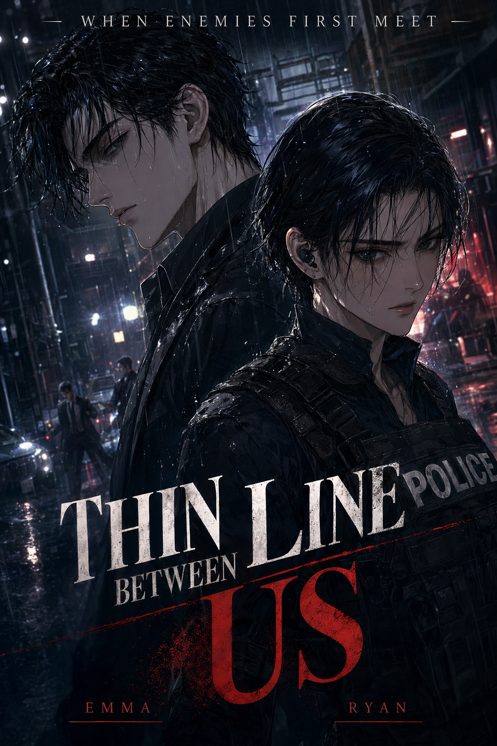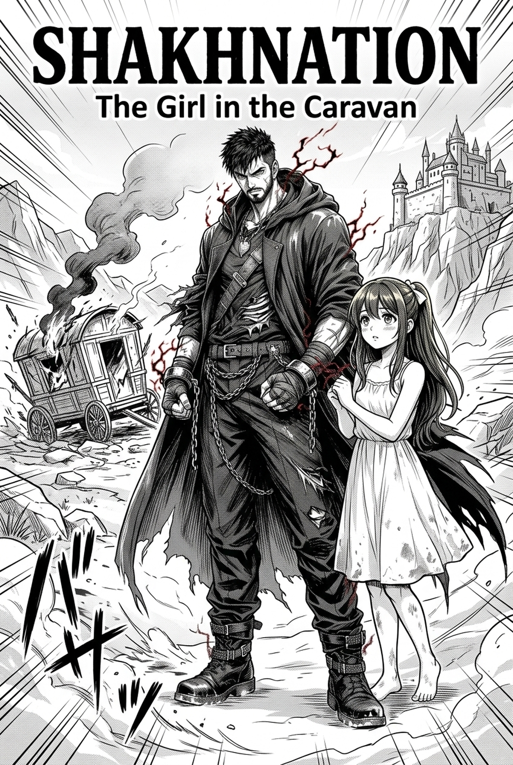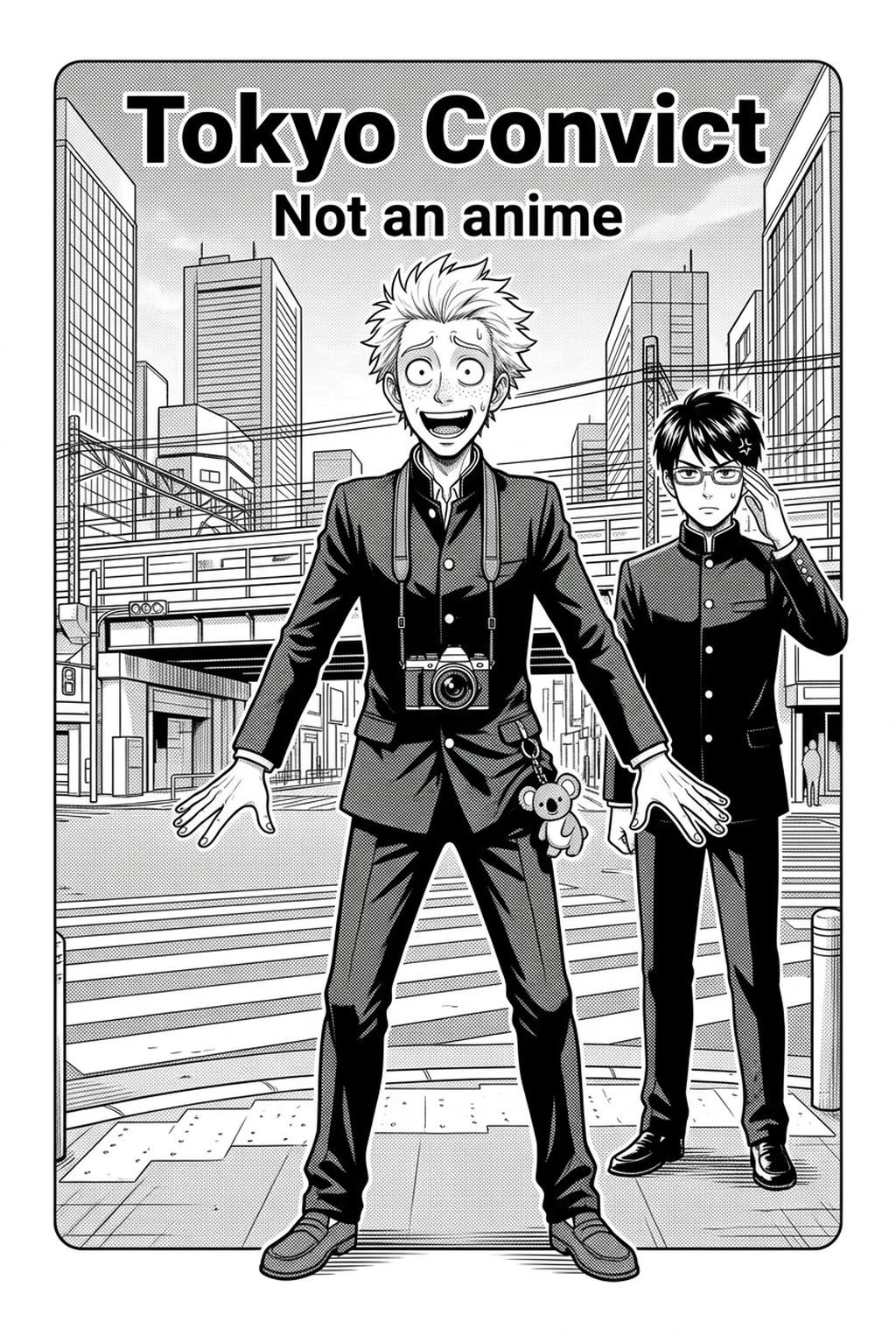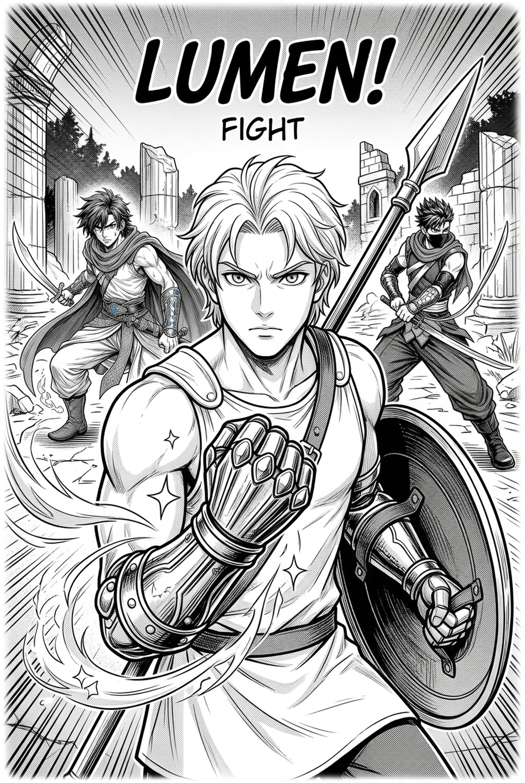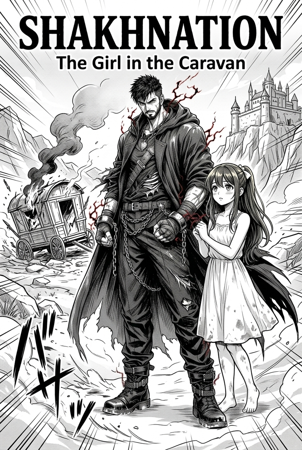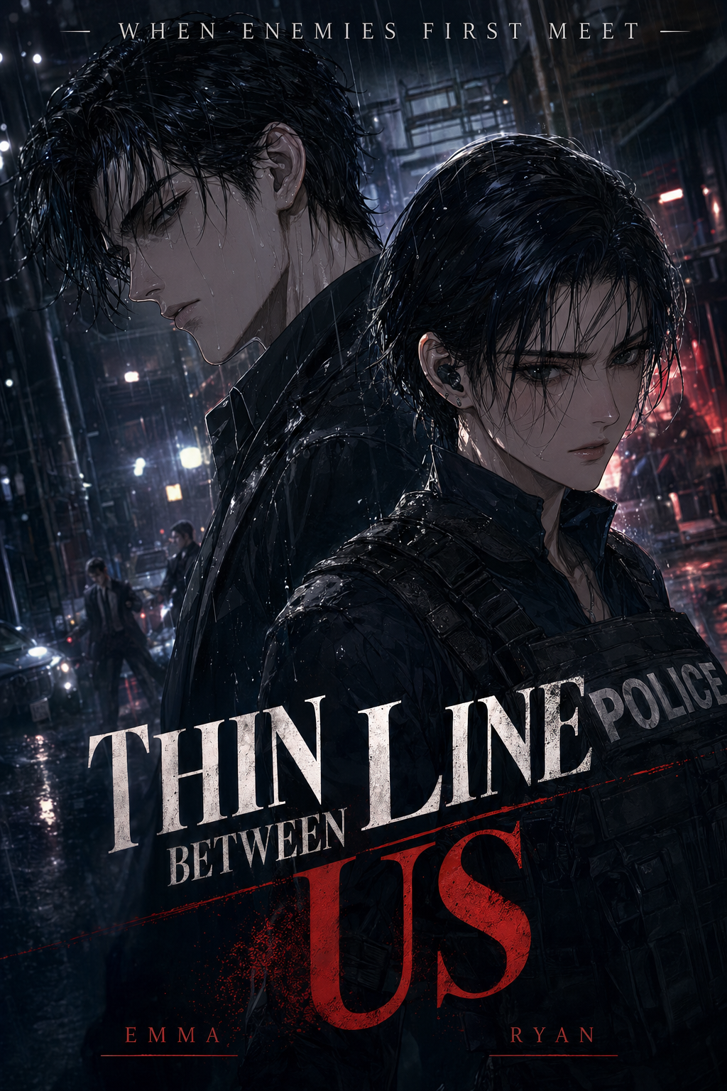
Defining the Role and Professional Responsibilities
The primary responsibility of a manga colorist is balancing atmospheric mood with readability through precise palette choices that anchor the reader’s eye. This process requires more than just filling in shapes; it demands a deep integration with the original ink structure to ensure that highlights and shadows don't obscure the line work.
- Flatting and blocking: The foundational stage where base colors are applied to each distinct object or character piece in the panel. * Cell shading application: The addition of hard-edged shadows that provide depth, typically following the light source established during the penciling phase. * Atmospheric adjustments: Utilizing color temperature changes to distinguish between daytime scenes, nighttime flashbacks, or high-tension emotional close-ups. * Line work integrity: A critical discipline ensuring the original black ink remains crisp and distinct from the color layers, preventing a "muddy" or over-processed appearance.
Why Professional Color Improves Visual Narrative
Color palettes act as a visual narrative guide, directing the reader's eye toward key emotional beats in a panel that might otherwise go unnoticed in grayscale. For creators working in commercial vertical comic platforms or digital manga, high-quality color serves as the primary differentiator between professional-grade publications and amateur scans.
- Emotional Signaling: Using cool tones for cold, detached dialogue sequences versus warm, saturated hues for high-energy combat or heartwarming character interactions. * Commercial Standards: Professional publishers look for uniform character color profiles across hundreds of pages, which is a major hurdle for independent artists working without a digital assistant. * Pacing and Readability: Strategic color choices help distinguish foreground subjects from background environment density, preventing the reader from losing track of character positions during fast-paced movement.
Integrating Modern Tools into the Creative Production Process
Mangaka acts as a digital assistant that automates the tedious flatting phase while keeping the original line work untouched by the color-processing engine. By using this tool, you can define specific color zones on your B&W inked pages, which significantly cuts down the hours spent on tedious layer separation and base filling.
The core technology behind this process focuses on maintaining the source context of your ink, meaning it identifies the boundaries of your line work without flattening the underlying perspective. You can manga colorist with Mangaka by uploading your standard files, allowing you to focus your creative energy on complex color theory rather than manual digital labor. Because the tool preserves the ink as the top-level entity, your art keeps its authentic, hand-drawn character even after the color palette is applied.
Specific Use Cases for Modern Coloring Workflows
Vertical-scroll creators use color to denote time-shifts and pacing, requiring a "color-script" approach that traditional print manga often skips. Because mobile-first readability is the standard for most web platforms, a professional colorist must proactively adjust saturation levels to prevent color-bleed and backlight interference on small phone screens.
- Hero Panel Focus: Use your limited human time for emotional close-ups or intense key-frames, while letting AI-assisted batch processing handle repetitive background panels or minor character appearances. * Mobile-First Optimization: Test your saturation levels in sRGB to ensure that intense reds or neon blues remain legible without blurring on backlit devices. * Time-Shift Indicators: Use distinct palette shifts to signify memory sequences or dream-worlds, allowing readers to instantly understand the timeline without needing excessive dialogue headers.
- Chapter cadence. Use the AI pass for pages where speed matters most, such as repeated action poses, transformation beats, or dense speed-line panels. Keep manual cleanup for hero panels where the line style defines the emotional peak.
- Character continuity. Compare the generated lines against the same model sheet, costume notes, and facial-expression range used during sketching. This prevents a fast inking pass from drifting away from the character identity readers recognize.
- Export readiness. Check whether the final manga output can move into lettering, coloring, or final layout without rebuilding panel borders or speech-bubble space. A good manga workflow should save time while keeping the next production step predictable.
Getting Started with Digital Production Efficiency
Many creators worry that introducing automated tools will strip their art of its soul, but the reality is that the colorist’s role is shifting toward creative direction. AI does not replace your artistic intuition; it handles the repetitive grunt work so you can dedicate more time to color-grading, atmospheric mood, and character consistency.
- Preserving Line Work: Ensure your ink layer is exported at high resolution, as the AI requires clear line boundaries to define where colors should stop and start. * Delivery Formats: Standardize your export settings to 300 DPI for high-definition viewing, typically outputting to PNG for maximum compatibility across various digital reading platforms. * Consistency Maintenance: Keep a master character color profile sheet to ensure your protagonist’s hair, eyes, and clothing colors remain identical throughout every chapter.
Creators should compare the generated line art with the original sketch and confirm that facial expressions, props, speed lines, and speech-bubble space still support the scene. A repeatable review pass should cover character consistency, panel readability, background clarity, and whether the final file is ready for coloring, lettering, or editor feedback.
Creators should save approved examples of line weight, face detail, clothing folds, and background density. Those references keep later chapters closer to the intended style. For collaboration, creators should mark which panels are final and which panels still need redraws. Clear status labels prevent an assistant, editor, or colorist from polishing the wrong version.
The Bottom Line
Achieving a professional finish in your manga production does not require abandoning your traditional inking style or spending thousands on manual labor. By integrating AI-assisted workflows into your design process, you can maintain the authentic ink feel that defines your art while meeting the growing market demand for full-color pages. Start your journey toward faster, higher-quality production by manga colorist to see how effectively technology can bridge the gap between B&W ink and vibrant, commercial-ready digital color.
Related articles
What Is an AI Manga Colorist and How Does It Work in 2026?
Use Our AI Manga Colorist: Instant Color for Panels 2026
Streamline Your Manga Colorist Workflow with Mangaka AI 2026