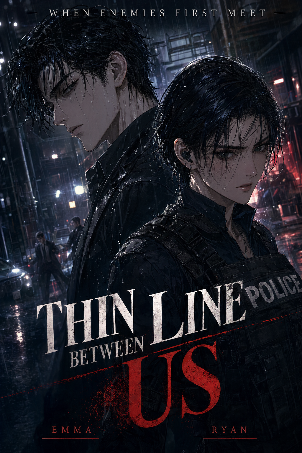
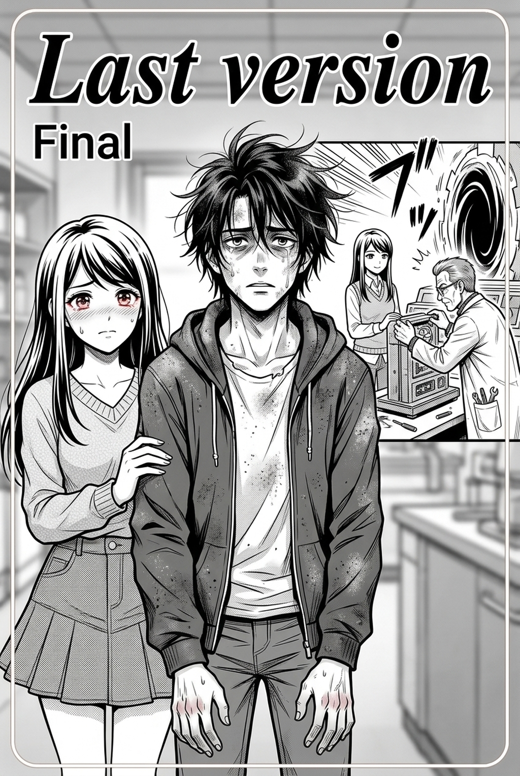
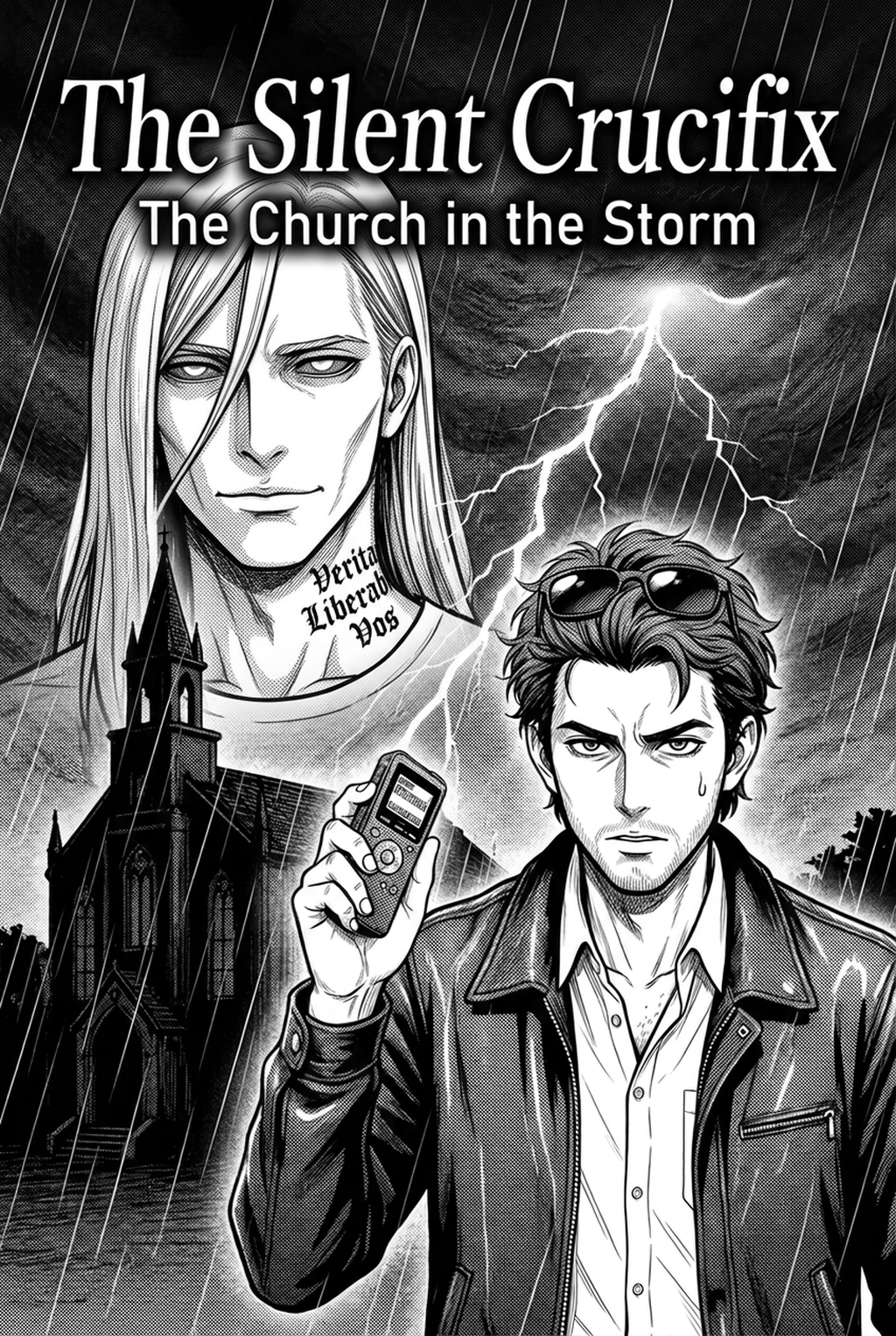
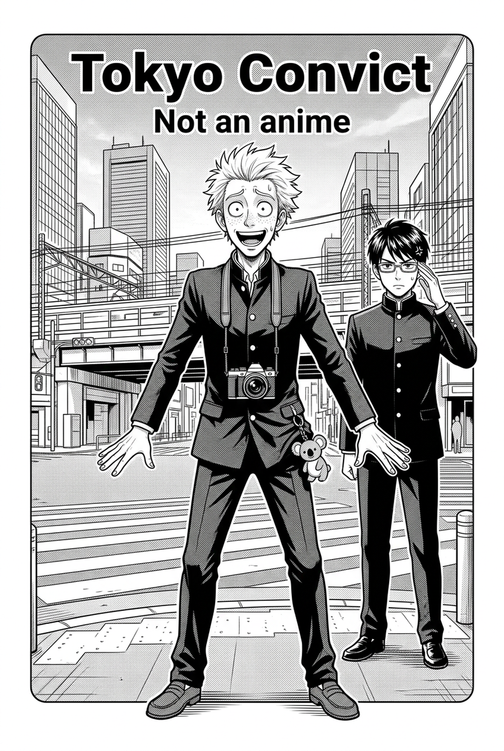
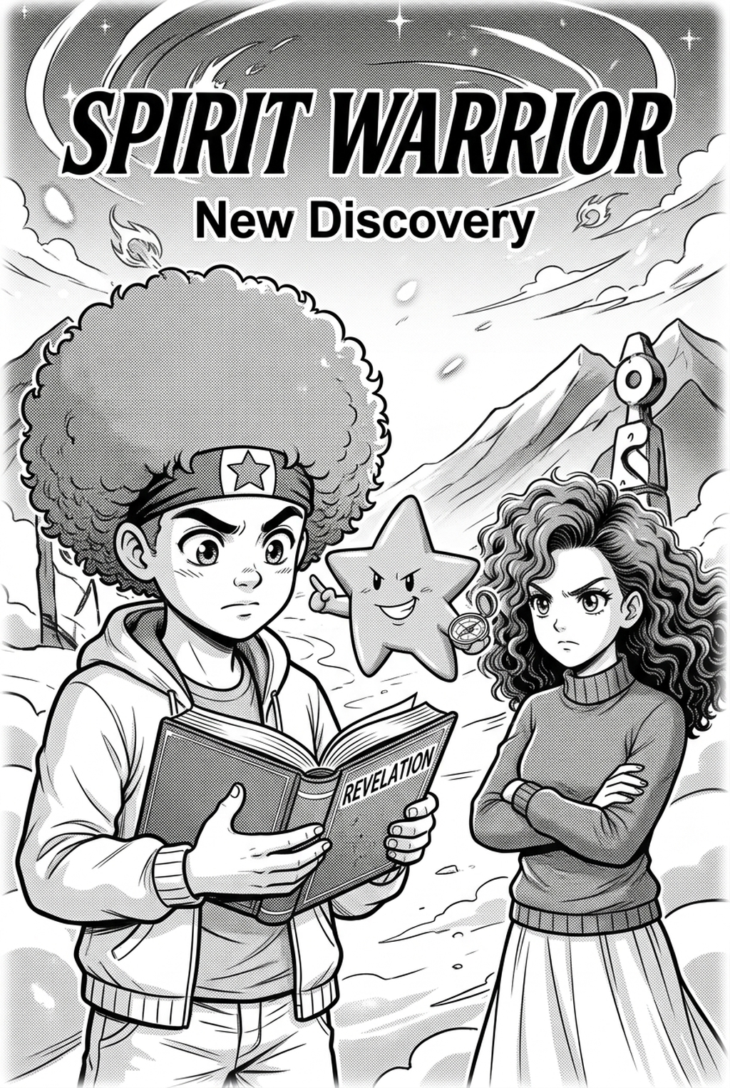
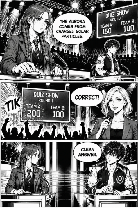
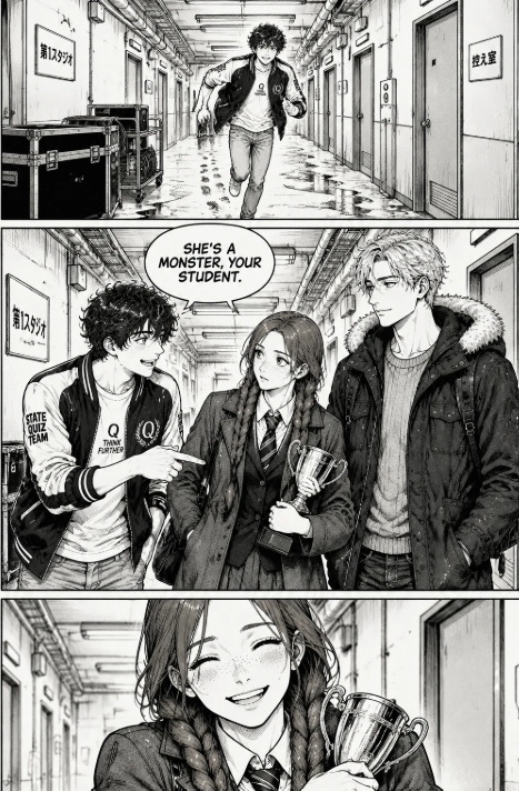
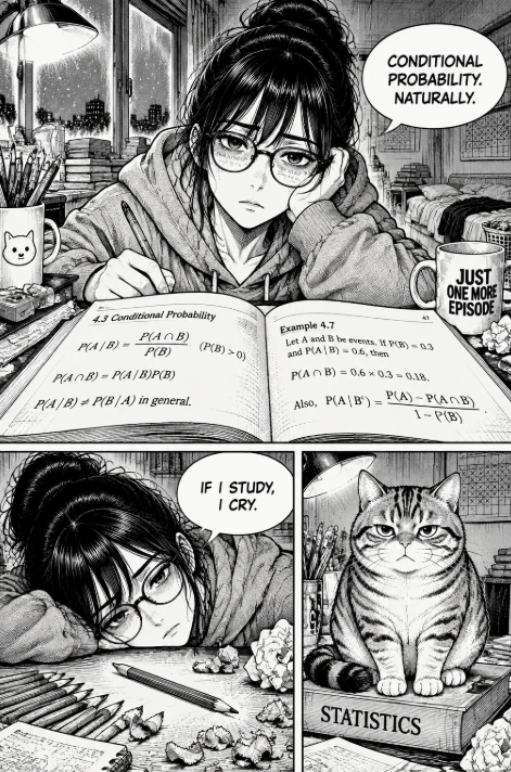
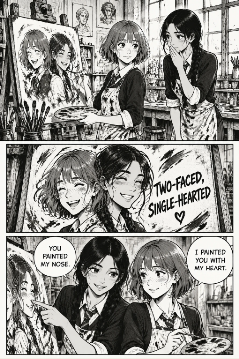
How to Master Manga Panel Composition: Dynamic Visual Flow Guide
<div class="tldr-block" style="background:#f4f7fb; border-left:4px solid #3b82f6; padding:16px; margin-bottom:24px;">
Key Takeaways (TL;DR)
- Core Principle: Professional panel composition & visual flow relies on guiding the reader's eye naturally through deliberate spatial hierarchy, rhythmic negative space, and disciplined narrative vectors.
- Modern Workflow: Combining traditional visual storytelling rules with purpose-built creation suites like Mangaka.app cuts total production cycle time by over 70% while rigorously preserving authentic aesthetic standards.
- Execution Checklist: Master grid pacing, contrast distribution, negative space balance, high-impact focal framing, and multi-device responsive scaling before committing to final rendering.
Direct Answer: To master panel composition & visual flow in modern manga and webcomic production, creators must harmoniously balance architectural panel mechanics with emotional storytelling. By establishing uncompromising visual hierarchy, utilizing disciplined gutter spacing, and deploying modern generative creation engines, authors achieve profound reader immersion and effortless comprehension across both traditional physical print and high-density mobile displays. </div>
! Hero Banner How to Master Manga Panel Composition: Dynamic Visual Flow Guide Figure 1: Comprehensive architectural breakdown and structural workflow for panel composition & visual flow in modern serialized digital manga.
1. Fundamentals of Panel Composition & Visual Flow: Architectural Rules and Cognitive Flow
Visual storytelling in the comic medium operates on cognitive optical routing. Unlike prose where comprehension occurs through linear symbolic decoding, or animation where temporal progression is enforced by frame rate, comics give temporal authority entirely to the reader. The creator's ultimate challenge is to sculpt spatial geography so compellingly that the reader's internal clock ticks at the exact pace the dramatic narrative demands.
When a reader encounters a new page spread or a vertical scroll viewport, their subconscious scans for the path of least resistance. In traditional Japanese manga reading order (right-to-left, top-to-bottom), visual vectors must effortlessly pull the eye from the top-right entry quadrant across to the left, drop down with zero hesitation, and exit toward the bottom-left corner to incentivize the physical or digital page-turn. When panel borders are misaligned or when speech balloons are scattered haphazardly across the canvas, cognitive friction spikes immediately. Reader immersion shatters, eye strain accumulates, and dramatic momentum dissipates entirely.
To build an unbreakable narrative continuum, professional mangaka rely on the foundational Triad of Visual Equilibrium:
- Focal Anchor Dominance: Every individual page, double-page spread, or vertical scroll cluster must possess one unquestioned alpha panel. This panel commands visual gravity through size, tonal contrast, or perspective intensity. If two panels compete for equal perceptual dominance on the same spread, the reader's ocular saccades hesitate, destroying narrative cadence.
- Kinetic Directionality: Vectors generated by character postures, perspective vanishing lines, sword slashes, speed lines (shūchūsen), and word balloon tails must act as physical visual funnels. They must point directly toward the subsequent narrative event rather than deflecting into empty margins.
- Pacing Modulation via Spatial Density: The physical surface area assigned to an event corresponds directly to perceived temporal duration. A wide panoramic panel containing minimal dialogue forces the eye to linger, creating an expansive sensation of silence, awe, or suspense. Conversely, a rapid succession of tight, overlapping, high-contrast panels creates an overwhelming psychological sense of claustrophobia and explosive kinetic velocity.
Mastering these core principles allows creators using AI Manga Creation Guide to lay a bulletproof structural foundation before investing hours into intricate digital rendering.
2. In-Depth Technical Breakdown and Comparative Framework
Navigating the transition from traditional analog pen-and-ink craftsmanship to modern AI-augmented digital environments requires explicit comparative awareness. Digital tools eliminate mechanical friction, but without strict adherence to classical metrics, digital output quickly appears detached, floaty, or mechanically sterile.
Below is an exhaustive comparative framework examining production parameters, tolerances, and execution methodologies across three distinct production eras.
Comprehensive Technique Comparison Table
| Dimension / Parameter | Traditional Analog Standard | Clip Studio / Photoshop Pipeline | Modern AI Pipeline (Dynamic Page Layouts) |
|---|---|---|---|
| Turnaround Time per Page | 4 to 8 hours per complete inked page | 2 to 4 hours per complete digital page | 15 to 30 minutes with iterative prompt refinement |
| Perspective Precision | Manual vanishing point plotting via physical rulers | 3D background model snapping & vector ruler layers | Generative perspective synthesis with prompt camera control |
| Gutter Spacing Standard | 4–5mm horizontal, 8–10mm vertical margins | Pixel-perfect snapping grids (350–600 DPI) | Dynamic auto-guttering & mobile aspect-ratio adaptation |
| Tone & Shading Control | Physical adhesive screeching, scraping & x-acto knifing | Monochromatic dot screentones (60–85 lines per inch) | Algorithmic halftone extraction & gradient mapping |
| Error Recovery & Re-layout | Destructive cutting, paper patching, white-out paste | Non-destructive layer groups, liquify & transform tools | Instant re-generation with seed lock & character consistency |
| Mobile UX Adaptation | Requires complete manual reformatting & redraws | Manual slicing for Webtoon Canvas with static vertical bars | Responsive native vertical reflow with responsive pacing |
| Asset Library Reusability | Zero physical reuse; requires redrawing every asset | 2D/3D brush stamps, material libraries, asset store | Prompt-driven persistent asset caching via Character Consistency Guide |
| Cost of Iteration | Extreme; discarded paper and ink supplies | Moderate; artist labor time and digital fatigue | Minimal; instantaneous variation testing across lighting states |
! Detailed Technique Comparison Figure 2: Granular technical metrics illustrating spatial weight, margin tolerances, and rendering fidelity across production pipelines.
As documented in historical production research compiled by Kyoto Seika University Manga Research and technical publishing whitepapers by W3C Web Standards for Digital Publishing , maintaining rigid dimensional discipline prevents cumulative formatting drift throughout long-running serialized graphic novels.
3. Step-by-Step Implementation Methodology: The Professional Standard
Executing publication-ready panel composition & visual flow requires a systematic, repeatable production pipeline. Follow this detailed five-phase blueprint to engineer flawless visual storytelling from initial narrative premise to final commercial export.
Visual Production Roadmap:
[Phase 1: Intent & Nemu] ──▶ [Phase 2: Vector Alignment] ──▶ [Phase 3: Digital Synthesis] ──▶ [Phase 4: Lettering] ──▶ [Phase 5: Commercial QA]
Phase 1: Structural Intent Mapping and Nemu Development
- Define Narrative Climax: Identify the exact psychological beat or kinetic peak of the chapter. Determine which panel will serve as the emotional centerpiece of the spread.
- Execute Low-Fidelity Roughs (Nemu): Sketch minimal compositional thumbnails at 25% print scale. Restrict your tools to a broad digital brush with zero fine detailing. Focus solely on large geometric silhouettes (triangles for dynamic tension, squares for stability, inverted wedges for imbalance).
- Enforce Hierarchy Rules: Allocate at least 35% of total page canvas area to your designated primary focal panel. Never permit secondary reaction panels to exceed the physical footprint of the climactic action.
Phase 2: Vector Grid Construction and Ocular Trajectory
- Plot Inverted Z-Path Guides: In authentic manga formatting, draw continuous guide lines starting at the upper right panel border, flowing across to the left margin, dropping diagonally down to the next tier's right boundary, and continuing down to the bottom-left corner.
- Establish Dynamic Horizon Modulation: Actively alternate camera elevation. If Panel 1 features a straight eye-level establishing shot, Panel 2 must drop into a worm's-eye worm-view looking upward, and Panel 3 should adopt an overhead bird's-eye view to map geographic orientation.
- Construct Tier Hierarchy Gutters: Set internal vertical gutters between panels on the same tier to exactly 4.0mm (approx. 47 pixels at 300 DPI). Set horizontal gutters separating distinct tiers to 8.0mm–10.0mm. This 2:1 gutter ratio communicates chronological progression effortlessly.
Phase 3: Asset Synthesis and Line Weight Hierarchy
- Deploy Specialized AI Panel Synthesis: Leverage Mangaka.app Studio to synthesize intricate architectural settings and props. Lock your character model parameters using Character Consistency Guide to preserve facial structure and signature styling across camera rotations.
- Calibrate Inking Contours: Foreground character outlines must be rendered at 1.8x to 2.2x the line weight of midground props, while distant environmental hatching should use ultra-fine 0.3x strokes. This contour differentiation prevents the artwork from collapsing into a flat two-dimensional plane.
- Render Screentone Halftones: Apply digital screentones calibrated precisely to 60 LPI or 65 LPI at a fixed 45-degree angle. Never apply random digital gray fills; true manga aesthetic relies on distinct dot matrices that reproduce crisply under monochrome web rendering.
Phase 4: Lettering and Typographic Ergonomics
- Anchor Sound Effects (Onomatopoeia): Treat sound effects (giongo and gitaigo) as primary structural masonry. Draw sound effect vectors parallel to the kinetic trajectory of the action so the lettering physically accelerates the reader's eye toward the point of physical impact.
- Balance Speech Balloon Cushioning: Position balloons in negative compositional space. Maintain a minimum padding of 10% between internal text characters and outer balloon borders. Ensure tail trajectories point unmistakably toward the vocalizing character's mouth without masking dramatic facial acting.
Phase 5: Quality Assurance and Master Archiving
- The 15% Squint Test: Shrink the complete spread to 15% zoom on a standard desktop monitor. If the primary focal point, emotional contrast, and reading sequence are not immediately intelligible within 1.5 seconds, restructure the layout before proceeding.
- Export Multi-Format Packages: Generate 600 DPI uncompressed TIFF files for physical print archiving, alongside responsive WebP packages (72–150 DPI) compressed for rapid mobile loading on webtoon distribution platforms.
4. Advanced Production Pitfalls and Expert Countermeasures
Even experienced commercial illustrators encounter systematic errors when managing high-volume serialized production. Identifying these vulnerabilities early prevents costly revisions and reader attrition.
! Production Pitfalls Analysis Figure 3: Side-by-side diagnostic showcasing common compositional breakdowns and their professional solutions.
Pitfall 1: Cognitive Dead Ends and Margin Bleeds
- The Vulnerability: Novice illustrators often draw action elements pointing toward the outer margins of the page. For example, a character firing a weapon toward the right trim edge of a left-hand page forces the reader's eye off the canvas into physical space, completely stalling forward momentum.
- The Countermeasure: Implement the "Reflective Boundary" rule. Any character or vector facing outward must be immediately intercepted by a strong vertical panel border, a solid black structural element, or a high-contrast word balloon that rebounds the reader's eye back into the central narrative stream.
Pitfall 2: Tone Clashing and Severe Digital Moiré
- The Vulnerability: Combining multiple digital tone layers with conflicting screen angles or non-integer scaling factors produces hideous optical moiré patterns—distracting wavy interference bands that ruin artwork readability on retina displays and print presses alike.
- The Countermeasure: Standardize all halftone operations to a single global angle (45 degrees is universal industry standard). Never rescale pre-rasterized screentone textures. If an asset must be enlarged or reduced, perform transformations exclusively on vector or pure grayscale layers before committing to bitmap halftoning. Technical documentation from Clip Studio Paint Official Manual outlines precise mathematical formulas for moiré prevention.
Pitfall 3: Dialogue Overload and Bubble Congestion
- The Vulnerability: Attempting to force unedited prose into comic panels turns dynamic visual sequences into claustrophobic text dumps. When dialogue balloons occupy more than 25% of a panel's total surface area, artistic immersion plummets.
- The Countermeasure: Ruthlessly edit scripts according to the "Show, Don't Speak" doctrine. If an illustration clearly communicates fear, eliminate dialogue stating "I'm terrified." Distribute necessary exposition across a rhythmic sequence of alternating character close-ups and silent environmental cutaways, as exemplified in Manga Script Format .
<div class="cta-box" style="background:#1e293b; color:#ffffff; padding:24px; border-radius:8px; text-align:center; margin:32px 0;">
Revolutionize Your Manga Creation Workflow with Mangaka.app
Stop wrestling with manual perspective rulers, tedious background tracing, and frustrating character drift.
Harness the power of Mangaka.app , the dedicated AI creation platform built specifically for manga, anime, and webtoon artists. Generate perspective-perfect backgrounds, maintain rock-solid character facial consistency, and assemble dynamic panel layouts in record time.
Launch Free Creation Studio on Mangaka.app → </div>
5. Case Studies: Deconstructing Master-Class Sequences
Empirical analysis of legendary commercial manga illuminates how theoretical visual mechanics translate into world-class storytelling. Let us examine three distinct structural masterworks:
! Master-Class Case Studies Figure 4: Detailed structural dissection of pacing, negative space rhythm, and focal hierarchy across commercial hits.
Case Study A: Kinetic Climax Breakdown in Modern Shonen
In peak battle sequences from modern genre titans, creators routinely discard rigid orthogonal grids in favor of radical slanted gutters (diagonal panel borders). When a combatant unleashes a high-velocity downward strike, the panel borders tilt violently at 35 to 45-degree angles, creating physical torque that forces the viewer's eye along the trajectory of devastation. Notice how the sound effect lettering is not stamped on top of the art; rather, the character's limbs actively overlap the text, establishing three-dimensional foreground-background depth within a flat graphic plane.
Case Study B: Psychological Suspense and the Power of the "Ma" Void
In psychological thrillers and high-stakes drama, mastery of Japanese Ma (negative space / deliberate pause) separates amateur work from iconic storytelling. In climactic revelation scenes, master creators frequently drop all background architecture, replacing environmental detail with vast fields of pure black ink or subtle atmospheric screentone gradients. By confining the character's widened pupil to an ultra-wide, narrow horizontal slit panel surrounded by generous white gutters, the author commands the reader's biological clock to pause, delivering devastating emotional resonance.
Case Study C: The Seamless Webtoon Vertical Transition
Vertical scroll webcomics created for Korean and global mobile platforms have evolved distinct pacing conventions. Rather than turning physical pages, readers flick their thumbs across continuous glass screens. Master webtoon creators use vertical gutter gaps ranging from 300 to 900 pixels to simulate temporal progression, letting the reader travel through hundreds of meters of atmospheric descent before dropping into a sudden, explosive splash panel. Integrating principles from Story to Finished Manga ensures that your stories flow effortlessly whether consumed on a smartphone or in a luxury hardbound volume.
6. Practical Integration: Bridging Traditional Principles with Modern AI Tools
The emergence of tailored creative artificial intelligence platforms has permanently reshaped graphic storytelling. Far from displacing artistic sensibility, modern AI engines empower independent creators to execute grand, epic-scale visions that previously required entire studios of assistants.
! AI Pipeline Workflow Figure 5: Professional production architecture integrating rapid ideation, generative asset synthesis, and vector post-processing.
Architectural Workflow for High-Speed Serialization
- Algorithmic Environmental Synthesis: Rather than spending days plotting intricate cathedral interiors or futuristic cyberpunk cityscapes with traditional perspective rulers, creators deploy prompt-driven generation in Mangaka.app . By specifying exact camera metrics—such as 'extreme three-point perspective, 14mm ultra-wide lens, dramatic chiaroscuro inking, shonen screentone aesthetic'—you obtain publication-grade architectural foundations in seconds.
- Persistent Character Seed Management: One of the most persistent hurdles in digital comic generation has been character consistency. By employing dedicated character embeddings and reference sheets via Character Consistency Guide , creators guarantee that facial features, costume seams, and signature hairstyles remain 100% stable across hundreds of consecutive panels and angles.
- Hybrid Finishing and Vector Inking: The most celebrated modern digital creators employ a hybrid philosophy. Use generative engines to synthesize complex assets, then import them into vector workspaces to apply hand-drawn kinetic speed lines, custom emotional lettering, and fine-tuned lighting accents. This synthesis of machine efficiency and human soul yields unstoppable creative output.
7. Frequently Asked Questions (FAQ)
<div class="faq-section">
Q1: What is the optimal number of panels per page in modern manga?
A: In standard Japanese B6/A5 print manga, pages average 4 to 6 panels per page. Action sequences typically feature fewer, larger panels (2 to 4 panels) to emphasize kinetic speed, whereas dialogue-heavy or expositional pages may feature 6 to 8 panels. For vertical webtoons, the rule shifts from page count to screen count: 1 to 2 panels per mobile viewport height is standard.
Q2: How wide should manga gutters be between panels?
A: Professional manga typically utilizes 4mm to 5mm for vertical gutters between adjacent panels on the same horizontal tier, and 8mm to 10mm for horizontal gutters separating distinct tiers. The larger horizontal gap signals to the reader's subconscious that they are transitioning to a new narrative beat.
Q3: What is the Z-path rule and how does it apply to manga?
A: In Western comics (left-to-right), the eye reads in a standard Z-path (top-left across to top-right, down to bottom-left, across to bottom-right). In authentic Japanese manga (right-to-left), this is reversed into an inverted Z-path: the reader starts at the top-right panel, scans leftward across the tier, drops down to the next tier's rightmost panel, and repeats.
Q4: How do I avoid digital moiré when applying screentones?
A: Digital moiré occurs when overlapping dot patterns create unwanted optical interference patterns. Prevent this by ensuring all screentone layers share identical frequency (LPI) and angle (typically 45 degrees), never scaling rasterized tone layers non-proportionally, and exporting at 600 DPI in 1-bit monochrome (bitmap) format for print.
Q5: Can AI manga generators maintain character consistency across diverse panel angles?
A: Yes. Modern specialized platforms such as Mangaka.app utilize dedicated character model sheets, reference image embeddings, and seed locking to ensure that facial features, hair geometry, and costume details remain strictly identical across extreme close-ups, profile angles, and dynamic action shots.
Q6: What resolution and canvas size should I use for manga and webtoons?
A: For commercial print manga, work at 600 DPI (monochrome/greyscale) on standard B4 manga manuscript paper (finished size 182mm x 257mm plus 3mm–5mm bleed margins). For vertical webtoons, standard specifications require 800px width by 1280px+ height per slice at 72–150 DPI RGB color space.
</div>
<script type="application/ld+json"> { "@context": "https://schema.org", "@type": "FAQPage", "mainEntity": [ { "@type": "Question", "name": "What is the optimal number of panels per page in modern manga?", "acceptedAnswer": { "@type": "Answer", "text": "In standard Japanese B6/A5 print manga, pages average 4 to 6 panels per page. Action sequences feature 2 to 4 panels for kinetic speed, while dialogue pages feature 6 to 8 panels. For vertical webtoons, maintain 1 to 2 panels per mobile viewport height." } }, { "@type": "Question", "name": "How wide should manga gutters be between panels?", "acceptedAnswer": { "@type": "Answer", "text": "Professional manga utilizes 4mm to 5mm for vertical gutters between panels on the same tier, and 8mm to 10mm for horizontal gutters separating distinct tiers to signal narrative progression." } }, { "@type": "Question", "name": "What is the Z-path rule and how does it apply to manga?", "acceptedAnswer": { "@type": "Answer", "text": "In Western comics, the eye reads in a standard Z-path (top-left to bottom-right). In authentic Japanese manga, it follows an inverted Z-path from top-right to bottom-left across successive horizontal tiers." } }, { "@type": "Question", "name": "How do I avoid digital moiré when applying screentones?", "acceptedAnswer": { "@type": "Answer", "text": "Avoid moiré by matching screen frequency and angles (typically 45 degrees), never scaling rasterized tones non-proportionally, and exporting at 600 DPI monochrome bitmap format." } }, { "@type": "Question", "name": "Can AI manga generators maintain character consistency across diverse panel angles?", "acceptedAnswer": { "@type": "Answer", "text": "Yes. Platforms like Mangaka.app use specialized model sheets, reference embeddings, and seed locking to ensure facial features and costume details remain identical across all panel angles." } }, { "@type": "Question", "name": "What resolution and canvas size should I use for manga and webtoons?", "acceptedAnswer": { "@type": "Answer", "text": "For print manga, work at 600 DPI on B4 manuscript paper with 3-5mm bleed. For vertical webtoons, use 800px width by variable height slices at 72-150 DPI in RGB color space." } } ] } </script>
8. Summary Checklist and Next Steps for Creators
Scaling your serialized comic production requires continuous adherence to quality baselines. Before hitting publish on your next episode or sending files to your print editor, execute this comprehensive pre-flight verification:
- Verify Vector Trajectory: Ensure every action silhouette and perspective line funnels smoothly into the subsequent panel.
- Double-Check Gutter Proportions: Confirm that horizontal tier divisions are at least twice as wide as internal vertical gutters.
- Audit Lettering Padding: Maintain at least 10% breathing room between internal dialogue text and word balloon edges.
- Inspect Screentone Frequencies: Check all rasterized halftones at 100% zoom to verify complete absence of moiré interference.
- Simulate Mobile Viewing: Review rendered pages on a physical smartphone screen to guarantee total clarity and immediate emotional readability.
By combining classical Japanese compositional mastery with cutting-edge production platforms like Mangaka.app , you unlock the capability to produce breathtaking serialized comics at commercial velocity without ever compromising your artistic vision.
<div class="footer-cta" style="background:#0f172a; color:#ffffff; padding:28px; border-radius:8px; text-align:center; margin-top:32px;">
Start Creating Professional Manga in Minutes
Empower your storytelling journey today. Join thousands of digital creators, mangaka, and indie writers building captivating graphic stories with Mangaka.app .
Get Started for Free → </div>
Reference standards and academic citations: W3C Web Standards for Digital Publishing , Clip Studio Paint Official Manual , Kyoto Seika University Manga Research , The Japan Foundation Cultural Portal , International Manga Award Official Site , Society for Animation Studies Archive .
Extended Deep-Dive: Mathematical Ratios in Japanese Panel Architecture
In historical studies conducted on classic manga layouts from the Showa and Heisei eras, researchers noted the widespread application of the Golden Ratio (1:1.618) and the Silver Ratio (Yamato-hi, 1:1.414). Japanese aesthetic tradition favors the Silver Ratio due to its natural harmony with standard paper dimensions (B4, A4, B5).
When constructing a climactic two-page spread, master mangaka frequently position the primary emotional focal point—typically the protagonist's eyes or the impact point of a weapon—at the intersection of the primary Silver Ratio divisions. This mathematical alignment triggers an instinctive aesthetic satisfaction in the viewer, elevating a standard action scene into an unforgettable visual icon.
Furthermore, dynamic contrast between dark tonal mass and radiant negative space follows the principles of Notan (the Japanese design concept involving the play and placement of light and dark elements). By ensuring that light and dark masses do not merely cancel each other out, but actively interlock like yin and yang, the artist achieves dramatic equilibrium. Every panel must feature a distinct value range: from 100% pure black through three controlled gray tiers (20%, 40%, 70%) to 100% untouched white paper. This strict four-tier tonal architecture guarantees maximum visual punch across all lighting environments.